

Choosing a bedroom paint color feels harder than it should, because the stakes are oddly personal. This is where you wake up and where you fall apart at the end of a long day. It’s the last thing you see at night and the first thing you see in the morning.
So here’s my promise. This guide won’t hand you a gallery of pretty rooms and wish you luck. It walks you through how to think about color in a bedroom, which specific shades work and why, how to match them to your light, your furniture and your mood, and how to avoid the mistakes that cost people a weekend and a second can of paint.
Use it however suits you. Skim to the color you’re curious about, or read it start to finish and treat it as a short course. Either way, you’ll leave with a shortlist, a plan for testing it, and the confidence to commit.
Also Read: Corner Bed Ideas: The Ultimate Guide to a Smarter, Cozier Bedroom Layout
Start Here: What Do You Want Your Bedroom to Feel Like?
Before any shade names, answer one question: how do you want to feel when you walk into this room?
It sounds soft and a bit lifestyle-blog, but it’s the most practical filter there is. “Blue” is not a decision. “Quiet, cool and a bit hotel-like” is, and it points you toward a handful of colors immediately.
Here are the feelings people most often want from a bedroom, and where to look for each:
- Calm and airy: soft blues, pale sage, warm whites, light greige
- Cocooned and enveloping: deep greens, navy, chocolate, mushroom, plum
- Warm and romantic: blush, clay pink, terracotta, soft cream, caramel
- Fresh and uplifting: pale yellow, light aqua, soft green
- Modern and quiet: warm gray, stone, taupe, soft charcoal
- Dramatic and a bit indulgent: ink blue, black-green, aubergine, deep brown
Take two minutes and write down three words describing the mood you’re after. Keep them nearby while you read. When a shade looks gorgeous in a photo but doesn’t match your three words, it isn’t the one, however good it looks.
The Quick Decision Path
If you want a fast answer, this gets you most of the way:
- Small, dim room that needs to feel bigger? Go for a light, warm color with a high LRV (more on that in a moment), or commit fully to a deep, dark shade. The middle ground is where small rooms look worst.
- Light-filled room, and you want calm? Soft blue, sage or a cool greige will all behave beautifully.
- North-facing room that feels cold? Warm it up with creamy whites, soft beige, clay or warm greige. Avoid icy grays and cool blues.
- Love color but fear commitment? Choose a muted, slightly grayed color like dusty sage or smoky blue. They’re forgiving and much easier to live with than bright ones.
- Sleep is your priority? Stick with soft blues, muted greens, warm neutrals, or very deep, low-saturation darks.
Now let’s get into why those answers work.
How to Choose a Bedroom Paint Color (The Part Most Guides Skip)
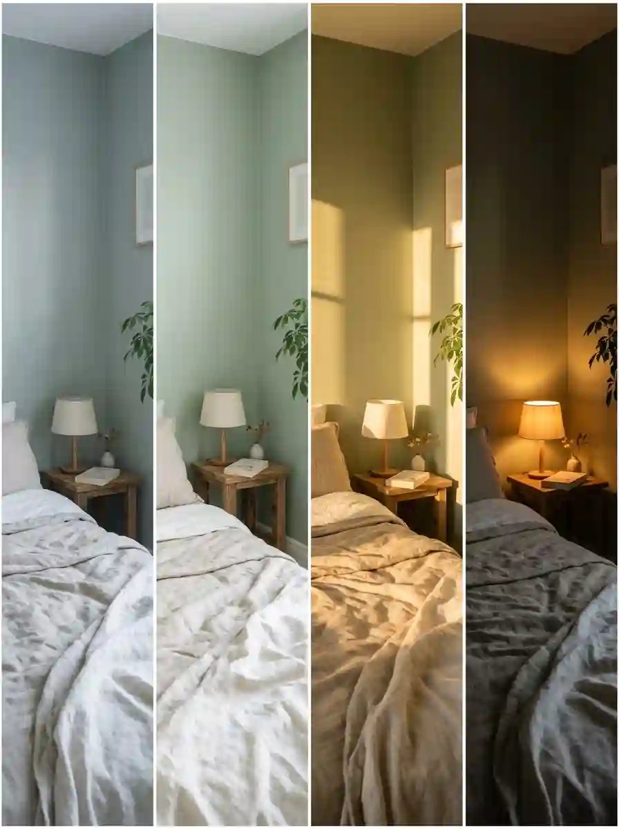
Most advice stops at “pick a color you love.” That’s fine as far as it goes, but it ignores the reasons the same paint can look elegant in one house and sad in another. Three ideas do most of the work: light, undertone and LRV.
1. Your Light Changes Everything
Paint doesn’t have a fixed color. It reflects whatever light hits it, so the same can looks different depending on which way your windows face and what time of day it is.
Here’s roughly what to expect:
- North-facing rooms get cool, indirect, slightly gray light. Colors tend to look flatter and cooler than on the swatch. Warm shades (cream, soft beige, clay, warm greige) help balance this. Cool grays and icy blues can look dull or even a bit depressing.
- South-facing rooms get warm, bright light for much of the day. Almost anything works here, and cooler colors like blues and sage look lovely because the light balances them.
- East-facing rooms are bright and warm in the morning, then cooler and softer by afternoon. A good option if you wake early and want a gentle start. Colors can look lively at breakfast and quiet by evening.
- West-facing rooms are dim in the morning and glow orange-gold in the late afternoon. Cool and neutral colors do well. Be careful with very warm colors, which can look too intense at sunset.
(If you live in the southern hemisphere, flip the north and south advice. Same logic, opposite sun.)
The part nobody mentions is artificial light. You spend most of your bedroom time in the evening, under lamps. Warm bulbs (around 2700K) pull paint toward yellow and cream, while cooler bulbs (4000K and up) make it look crisper and bluer. Judge your color under the same bulbs you’ll actually use.
2. Undertones: The Reason Your “Gray” Looks Purple
Every paint color has an undertone, a subtle hint of another color hiding inside it. It’s why one beige looks pink next to your sofa and another looks green.
- Whites and creams can lean yellow, pink, gray, blue or green.
- Grays often carry blue, green, purple or brown undertones.
- Beiges and greiges can swing pink, yellow, or green.
- Blues lean green (teal-ish) or purple, or sit gray.
- Greens lean yellow (olive, warmer), blue (cooler), or gray (muted, sophisticated).
The easiest way to spot an undertone is to hold a swatch against a clean piece of plain white paper. The undertone suddenly shows itself. You can also compare two or three similar swatches side by side. One will clearly look pinker, greener or bluer than the others.
Why does it matter? Because undertones clash or harmonize with everything else in the room: your flooring, wood furniture, bedding, curtains, even skin tones in the warm light. A cool, blue-leaning gray beside warm honey oak flooring can feel like two different design ideas fighting. A warm greige with the same floor looks like it was meant to be.
3. LRV: The Number That Predicts How Light a Color Will Look
LRV stands for Light Reflectance Value. It’s a number from 0 (absolute black) to 100 (pure white) telling you how much light a color bounces back into the room.
- LRV 70 and above: very light. Whites and pale tints. Bounces plenty of light and keeps a small room open.
- LRV 50–70: light to mid-tone. Most soft, calm bedroom colors sit here.
- LRV 30–50: mid to mid-dark. Rich but still livable in decently lit rooms.
- LRV under 30: dark. Cocooning, dramatic, and dependent on your light and lamps to look good.
Most paint brands print the LRV on the back of the swatch or list it on their website. It’s one of the most underrated tools you have. If you’re torn between two shades, the LRV tells you immediately which one will make your room feel brighter.
Keep in mind that LRV is a guide, not a guarantee. Your actual room will always add its own variables, which is why testing matters. (We’ll get to that.)
Also Read: Sloped Ceiling Bedroom Ideas: The Ultimate Guide to Turning Awkward Angles Into a Cozy Sanctuary
What Does Color Actually Do to Your Sleep and Mood?
Let’s be honest about what the science does and doesn’t say, because there’s a lot of overconfident nonsense online about colors “curing insomnia.”
What’s reasonably well supported: we tend to associate certain colors with certain feelings. Soft blues and greens are widely linked with calm and nature. Warm, muted tones feel safe and cozy. Very bright, saturated colors (hot red, neon yellow, electric orange) tend to feel stimulating. That’s why they rarely make good bedroom walls.
What’s less certain: any claim that one specific shade will definitely lower your heart rate or fix your sleep. Reactions to color are partly cultural and partly personal. If a particular blue reminds you of a bad hospital stay, it won’t relax you, no matter what a chart says.
Here’s a more useful way to think about it. Sleep-friendly bedrooms tend to share three traits:
- Low visual noise. Muted, slightly softened colors don’t compete for your attention. High contrast and bright saturation do.
- Soft contrast. When walls, ceiling, trim and bedding sit close in tone, your eyes can rest. Harsh black-and-white contrast is energizing.
- Warmth in the evening. Lamp light on warm-toned walls feels welcoming and winds you down.
So the real answer to “what’s the most relaxing bedroom color?” is whichever muted, soft-contrast shade makes you personally feel safe. For most people that lands on soft blue, sage, warm neutral or a deep, low-saturation color. Which brings us to the shades themselves.
The Best Bedroom Paint Colors, Shade by Shade
For each color family below, I’ve included what it feels like, who it suits, the undertone to watch, and a few specific shades to start your sampling. Brand names and codes are a starting point. Always sample before you commit, because lighting and your phone screen will skew things.
1. Soft Blue: The Classic That Earns Its Reputation
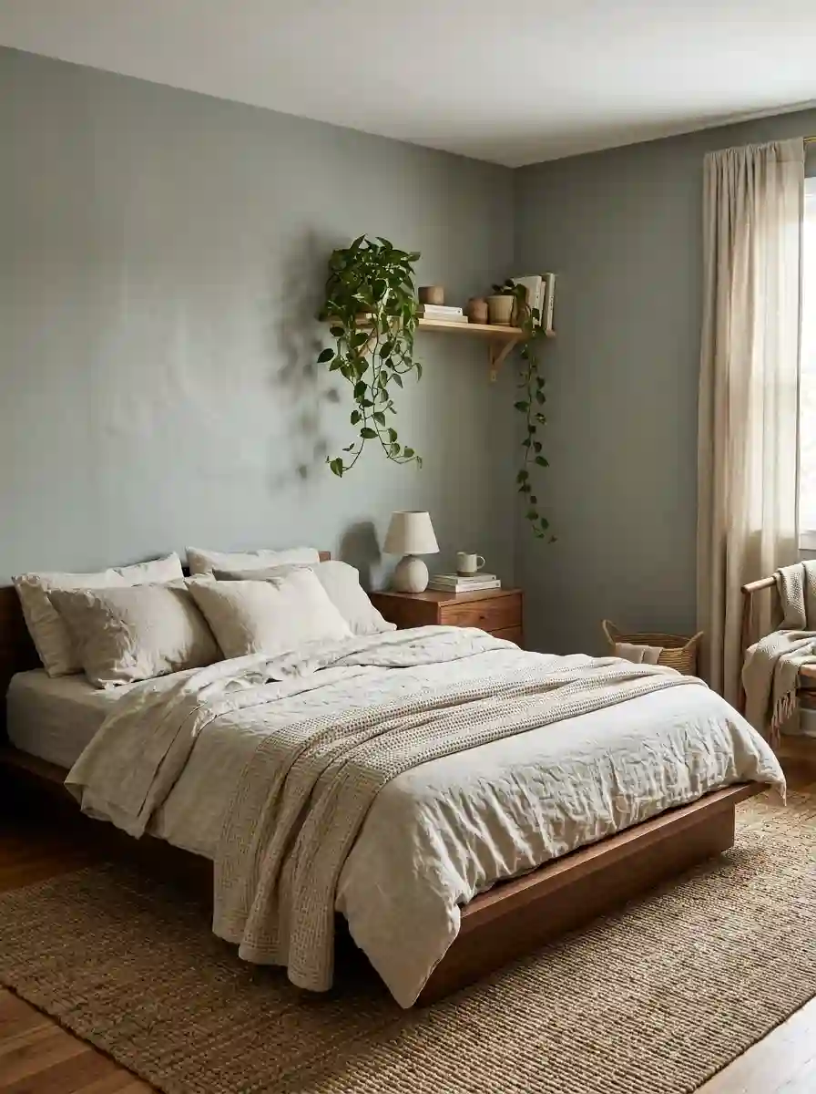
Blue is the safest bedroom bet for a reason. It’s calming, it’s easy to live with, and it works in almost every style from coastal to traditional to minimalist.
The mood: quiet, fresh, spacious. Think early morning by the water.
Best for: east- or south-facing rooms, anyone wanting a calm, uncomplicated space, and rooms with white or natural wood furniture.
Watch out for: blues can turn cold or icy in north-facing rooms. A touch of gray or green in the shade helps soften them.
Shades worth sampling:
- Benjamin Moore Palladian Blue (HC-144): a pale, airy blue-green that feels like a spa.
- Benjamin Moore Wythe Blue (HC-143): slightly deeper and more traditional.
- Sherwin-Williams Rainwashed (SW 6211): a gentle blue-green with gray in it. Very forgiving.
- Farrow & Ball Pigeon: a soft gray-blue that looks sophisticated rather than sweet.
Pairs well with: crisp white or ivory bedding, natural linen, light oak or ash, brushed brass or soft nickel hardware, a little warm blush or sand for contrast.
A small tip: if you want blue but worry it’ll feel too “nursery,” pick one with gray in it. That single change moves it from baby blue to grown-up.
2. Sage and Earthy Green: Nature’s Neutral
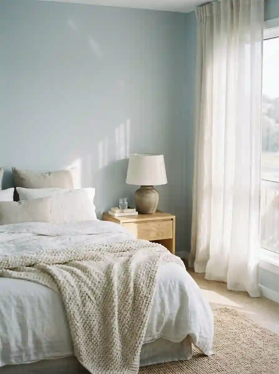
If there’s a color that has quietly become the new default for calm bedrooms, it’s muted green. It sits right between cool and warm, so it suits just about any décor. It also has a soothing, grounded quality that feels almost like bringing the outdoors in.
The mood: restful, organic, quietly confident.
Best for: almost any room, but especially ones with wood furniture, plants, or natural textiles. It’s also a brilliant choice if you want color but don’t want blue.
Watch out for: green with strong yellow in it can look sickly under warm lamp light. Muted, gray-leaning greens are the safest.
Shades worth sampling:
- Sherwin-Williams Sea Salt (SW 6204): a pale gray-green with a hint of blue. It’s very popular, and adapts to light beautifully.
- Sherwin-Williams Evergreen Fog (SW 9130): deeper, grayer, and moodier, a great step up from pale sage.
- Benjamin Moore Healing Aloe (1562): a soft, airy green-blue.
- Farrow & Ball Cooking Apple Green or Vert de Terre: richer, more earthy options if you want more presence.
Pairs well with: oatmeal, cream, soft white, warm wood (walnut, oak), terracotta and clay accents, black or bronze metal for a grounded edge.
Designers describe this current green trend as being less about bright, zingy greens and more about earthy, olive-adjacent, gray-toned ones. Strongly yellow-green shades like chartreuse tend to feel too energetic for a room where you’re trying to switch off.
Also Read : Beige and White Bedroom Ideas for a Soft, Airy Calm
3. Warm Neutrals: Greige, Mushroom and Soft Taupe
Neutrals don’t have to mean boring. The current favorites are warm, slightly earthy shades like mushroom, taupe and greige. These have replaced the cool, flat grays that dominated for years. They bring warmth and depth without any fuss.
The mood: grounded, calm, quietly luxurious.
Best for: anyone who wants a timeless backdrop, rooms with lots of texture, and people who change their bedding often and want paint that won’t compete.
Watch out for: pinkish undertones can show up unexpectedly in beige, especially in evening light. Always test next to your flooring and fabric.
Shades worth sampling:
- Sherwin-Williams Accessible Beige (SW 7036): a classic warm greige, nicely balanced.
- Sherwin-Williams Dovetail (SW 7018): a deeper, richer gray-taupe.
- Benjamin Moore Revere Pewter (HC-172): one of the most popular greiges around. Works in a huge range of light.
- Farrow & Ball Setting Plaster or Elephant’s Breath: warm, slightly pink-tinged neutrals with a soft, chalky finish.
Pairs well with: cream and ivory bedding, tan leather, rattan, black iron accents, deep green or rust textiles, any wood tone.
The trick with neutrals is adding depth through layers. A taupe wall with five different shades of cream, oatmeal and sand in the bedding looks rich and intentional. The same wall with a single flat white duvet can look a little empty.
4. White and Cream: Clean, Bright and Surprisingly Tricky
White seems like the no-brainer choice, and then you hold up eight white swatches and realize they all look different. That’s because whites have the most pronounced undertones of any color.
The mood: clean, light, spacious, hotel-fresh.
Best for: small or dim rooms, anyone who loves changing décor, rooms with strong architecture, and minimalists.
Watch out for: stark, bright whites can feel clinical, especially under cool bulbs. Choose a softer white with a little warmth unless you really want that crisp gallery look.
Shades worth sampling:
- Benjamin Moore White Dove (OC-17): a soft, warm white that works nearly everywhere.
- Sherwin-Williams Alabaster (SW 7008): a creamy, gentle white with a hint of warmth.
- Benjamin Moore Simply White (OC-117): brighter but still friendly.
- Farrow & Ball Wimborne White or Pointing: softly warm whites with a tiny bit of yellow.
Pairs well with: layered whites and creams in bedding, natural wood, black frames, woven textures, plants.
A designer-style trick: paint the walls, ceiling and trim in slightly different whites from the same family. The subtle shift gives the room dimension without any heavy contrast.
5. Blush, Clay and Soft Terracotta: Warm Without the Sugar

Pink in a bedroom has grown up. Forget bubblegum. The current approach is dusty, earthy pinks that act almost like neutrals, soft clay, muted rose and peachy-beige. They flatter skin tones and bring a glow in evening light.
The mood: warm, romantic, soft and welcoming.
Best for: north-facing rooms (the warmth balances the cool light), anyone wanting a gentle color that isn’t blue or green, and couples who want a cozy feel.
Watch out for: too much pink can feel sweet. Choose shades with brown, gray or orange in them rather than clean, bright pinks.
Shades worth sampling:
- Farrow & Ball Setting Plaster: a soft, pinky-beige. Very livable.
- Farrow & Ball Sulking Room Pink: richer and more dramatic.
- Farrow & Ball Dead Salmon: muted, earthy and slightly smoky.
- Sherwin-Williams Faint Coral or similar peachy neutrals: gentle and warm without being obvious.
Pairs well with: cream, caramel, rust, olive or deep green accents, walnut, brass, and natural linen.
6. Deep Navy and Ink Blue: Drama You Can Sleep In
Dark blue is one of the most reliable ways to make a bedroom feel expensive and enveloping. It absorbs light, softens corners, and makes the walls fade into the background so your bedding and art take center stage.
The mood: cocooning, sophisticated, a bit dramatic.
Best for: larger rooms, rooms with decent natural light, people who mostly use the bedroom at night, and anyone who wants a snug, den-like feel.
Watch out for: in dim rooms with little natural light, navy can look flat and heavy. If you go dark, go all in (walls, trim, even ceiling) so the room feels deliberate instead of gloomy.
Shades worth sampling:
- Benjamin Moore Hale Navy (HC-154): a classic deep navy that looks rich and slightly gray.
- Sherwin-Williams Naval (SW 6244): a bold, saturated navy.
- Farrow & Ball Hague Blue or Stiffkey Blue: inky, slightly green-leaning blues.
- Farrow & Ball Inchyra Blue: a deep, blue-green-black that feels almost like a midnight forest.
Pairs well with: crisp white or ivory bedding, brass or gold hardware, warm wood, tan leather, a touch of rust or mustard for contrast.
A common worry is that dark colors make a bedroom feel smaller. Often the opposite happens. Dark, matte walls blur the corners and edges of a room, so the boundaries seem to disappear. It’s the same logic as a cinema or a cozy cocktail bar.
7. Moody Forest Green and Black-Green
Where sage is airy, forest green is deep, rich and slightly theatrical. It’s a fantastic choice if you want drama but find navy a bit predictable.
The mood: enveloping, rich, a little bit old-library.
Best for: period homes, rooms with dark wood or leather, anyone wanting a bold but natural color.
Watch out for: very dark greens can look nearly black at night. That’s fine if you want it. Just sample to be sure.
Shades worth sampling:
- Benjamin Moore Hunter Green (2041-10) or Salamander (2050-10): deep and very dark.
- Sherwin-Williams Rookwood Dark Green (SW 2816): a historic-feeling deep green.
- Farrow & Ball Studio Green or Green Smoke: muted, grayed and elegant.
Pairs well with: cream, ivory, blush, tan, brass, dark wood, rattan, heavy linen.
Read Also : Ultimate Boys Bedroom Ideas: 60 Genius Ways To Design A Room He Will Actually Love
8. Chocolate and Soft Brown
Brown is back, and it’s not the dated brown you’re thinking of. Today’s version is a rich chocolate, a soft mocha or a cooler mushroom brown. It feels like wrapping yourself in a cashmere blanket.
The mood: warm, grounded, intimate.
Best for: rooms with good light, anyone who loves earthy, natural decor, and people wanting a deep color that isn’t blue or green.
Watch out for: brown can quickly feel heavy if you also use dark flooring and dark furniture. Add lighter textiles and plenty of warm lamp light to balance it.
Shades worth sampling:
- Sherwin-Williams Cavern Clay or similar warm browns for earthy richness.
- Farrow & Ball Salon Drab or London Clay: deeper, smoky browns.
- Benjamin Moore Chocolate Truffle-style deep browns: check your brand’s range for dark cocoa shades.
Pairs well with: cream, caramel, soft pink, olive, brass, boucle, and anything tactile.
9. Plum, Aubergine and Berry
Deep purple-leaning colors read as luxurious without feeling as cold as navy. They feel almost like velvet.
The mood: indulgent, creative, intimate.
Best for: people who want drama and aren’t afraid of a strong choice, master bedrooms, and rooms where you want a hotel-suite-at-night feeling.
Watch out for: the undertone matters a lot. Brown-leaning plums look warm and chic. Blue-leaning purples can feel cold. Test carefully.
Shades worth sampling: look in your brand’s range for deep, brownish aubergine shades such as Farrow & Ball Brinjal or Sherwin-Williams deep plum options.
Pairs well with: cream, soft gray-green, brass, blush, walnut, and rich textures like velvet and wool.
10. Lavender and Lilac
Lavender is calming, but only in its softest, grayest form. A hazy, dusty lilac can look sophisticated and restful. A bright one looks like a teenager’s room from the early 2000s.
Best for: anyone wanting a gentle, slightly romantic color, and rooms with plenty of light.
Tip: choose a lilac with plenty of gray in it, and pair it with creams, soft greens and natural wood to keep it grown-up.
11. Gray: Is It Really Out?
The honest answer: cool, flat gray has lost its crown, but gray itself isn’t dead. What’s fading is the stark, blue-gray look that dominated for a decade. What’s thriving is warm gray, greige and gray with a hint of green or brown.
If you love gray, choose one with some warmth. Benjamin Moore Revere Pewter and Sherwin-Williams Repose Gray (SW 7015) are good examples. Both feel soft rather than cold.
If you’re in a north-facing room, be extra careful. Cool gray in cool light can feel quite gloomy.
12. Black and Charcoal
Painting a bedroom black or deep charcoal is bolder than it sounds, and often much better than people expect.
The mood: moody, modern, dramatic.
Best for: people who like a dark, cave-like room for sleeping, and rooms with large windows and good natural light by day.
Watch out for: you’ll need good lighting layers (bedside lamps, wall lights) because dark walls absorb light.
Pairs well with: warm wood, brass, crisp white or cream bedding, and plants.
If true black feels too stark, try a soft black or an inky charcoal with a hint of blue or green. It’s easier on the eyes.
13. Yellow: Only If You Pick Carefully
Yellow in a bedroom is a gamble. Strong, bright yellow is far too stimulating. But a soft, buttery or creamy yellow can feel like morning sunshine.
Best for: north-facing rooms that need warmth, and people who wake up to dull light.
Tip: choose a pale, creamy tone and pair it with white and soft green. Avoid anything that looks like a highlighter.
Bedroom Paint Colors by Room Size and Light
Now let’s put that all together with the real-world conditions of your room.
Small Bedroom Color Ideas

Small rooms are where the “paint it white” myth does the most damage. Yes, light colors help, but you have two valid strategies:
Strategy 1: Go light and keep it consistent. Choose a soft, light, warm color (white, cream, pale greige, pale blue-gray) with an LRV above 60. Paint the ceiling and trim in a close tone so the edges blur and the room feels taller and bigger.
Strategy 2: Go dark and commit. A deep navy, green or charcoal on all surfaces blurs the room’s boundaries. Done well, it feels intimate and designed, not cramped.
What doesn’t work well is the middle: a mid-tone beige or gray that neither reflects light nor creates drama. It tends to make a small room feel dull and boxy.
A few extra tips:
- Use a single color across walls, ceiling and trim for a seamless look.
- Choose a soft sheen (eggshell or satin) to bounce a bit of light.
- Keep furniture and bedding in related tones so nothing chops the room into pieces.
- Mirrors opposite windows double the effect of light-colored walls.
Large Bedroom Color Ideas
Big rooms can handle more depth, and they sometimes need it. A huge, pale room can feel echoey and cold. Consider mid to deep tones (sage, clay, taupe, navy) to bring the room in and make it feel snug. You can also use two-tone walls (a deeper color below a picture rail, lighter above) or paint just the wall behind the bed to add structure.
Must Read : 45 Sophisticated Teal Bedroom Ideas For Adults That Turn Any Room Into A Serene Retreat
Dark or Low-Light Bedrooms
If your room barely gets sun, don’t fight it. Two good routes:
- Warm and bright: cream, soft white with warmth, clay pink, soft yellow-beige. They lift the room and fake warmth.
- Dark and cozy: embrace the shadows with deep green, navy or chocolate. A dark room painted dark looks deliberate and cinematic. A dark room painted a middling color looks accidental.
Bright, Sunny Bedrooms
Lucky you. Almost any color works, and cool shades like blue, sage and gray-green shine because the strong light balances them. Be cautious with very light colors in direct sun. They can glare, so go for a softer, slightly deeper tone.
Bedrooms With Sloped Ceilings or Odd Corners
Attic rooms and rooms with awkward angles look best when you paint walls and ceiling the same color. It makes the angles feel like a cozy envelope instead of a series of chopped-up surfaces. Soft, light colors are most popular, though deep colors are surprisingly dramatic in attic bedrooms.
Bedroom Color Combinations That Actually Work

Choosing one color is half the job. The other half is making it work with everything else. These pairings are reliable starting points.
Soft Blue + White + Natural Oak
Fresh, calm, classic. Good for coastal or Scandinavian bedrooms. Add a hint of warm sand or blush to stop it looking too cool.
Sage Green + Oatmeal + Walnut
Earthy, organic, relaxed. A very forgiving combination that suits almost any style. Add black metal or aged brass for definition.
Clay Pink + Cream + Brass
Warm, soft and romantic without being sugary. Terracotta or olive accents bring it to life.
Navy + Ivory + Tan Leather
Elegant and confident. Brass lamps and warm wood stop it feeling cold.
Warm Greige + Cream + Black Accents
Modern and quiet. Works well in minimalist rooms. Add texture through bouclé, linen and wool to avoid flatness.
Forest Green + Blush + Gold
Rich and slightly vintage. Great for a statement bedroom.
Chocolate Brown + Caramel + Cream
Warm, tactile and luxurious. Add pale linen to keep it airy.
Soft White + Sage + Wood
A gentle, spa-like blend. Perfect for small rooms where you want calm without heaviness.
The 60-30-10 Rule (and How to Bend It)
Designers often use a simple guide: 60% dominant color (walls and large pieces), 30% secondary (bedding, curtains, rug), 10% accent (cushions, art, lamps). It’s a useful frame. But don’t treat it as law. If your walls are a rich, deep color, you might want your bedding lighter to balance. If your walls are white, you can go bolder with your 30 and 10.
Matching Paint With Your Furniture and Floors
This is where a lot of well-meaning choices go sideways. A few quick guidelines:
- Warm wood (oak, honey, walnut): pairs beautifully with warm neutrals, sage, blush, cream, deep green, and soft blue. Be careful with cool grays.
- Dark wood or espresso: looks striking with creamy whites, soft sage, blush, and gold-leaning colors.
- White or painted furniture: works with nearly everything. Deep navy, sage and clay look especially good as a contrast.
- Gray or whitewashed flooring: can handle cooler colors, but look out for clashing undertones.
- Black metal bed frames: are happy with almost any color. They add a graphic edge to soft walls.
Accent Walls, Color Drenching, Two-Tones and Other Techniques

A color is only half the idea. How you apply it changes the look completely.
The Accent Wall
The accent wall (usually behind the bed) is the classic, and it’s still a good option. It adds interest without committing the whole room. A few tips:
- Choose the wall behind the bed, not a side wall. It becomes a natural focal point.
- Pick a color that’s a deeper or more saturated version of the room’s palette, so it feels planned.
- Avoid putting an accent on a wall with several windows or doors. It breaks up the effect.
Designers lately say the accent wall feels a little dated if done with a random, unrelated color. If you want one, tie it to the room with matching tones in bedding or art.
Color Drenching
Color drenching means painting everything, including walls, ceiling, trim, even doors, in one color or very close tones of it. It’s the current favorite look in design circles, and it works especially well in bedrooms because it creates a cocoon.
It sounds extreme, but it’s easier to live with than you’d think. There’s no harsh line to draw the eye, so the room feels calm and cohesive. It’s also forgiving of imperfect walls and awkward corners.
Best colors for drenching: mid to deep tones with some softness, such as sage, clay, taupe, navy, olive and chocolate. Use a slightly different sheen on trim (satin or semi-gloss) for subtle depth.
Two-Tone Walls
Painting the lower part of the wall a deeper color and the upper part lighter (or the reverse) adds a classic, architectural feel. A horizontal line at chair rail height or about two-thirds of the way up works well. It’s great for adding character to plain rooms.
Painting the Ceiling
A ceiling doesn’t have to be white. In a bedroom, where you often lie looking up, a softly colored ceiling can feel special. Try:
- A pale tint of your wall color for a gentle, blended effect.
- A soft blue for a sky-like feeling.
- The same color as the walls for a drenched, cocoon look.
Limewash and Textured Paint Finishes
Limewash and mineral paints create soft, cloudy variations in color that look like aged plaster. They’re having a big moment in bedrooms, particularly in earthy tones like clay, sage, soft blue and warm white. They add depth that flat paint can’t match. The catch: they’re trickier to apply and usually need a particular technique, so consider hiring a pro or practicing on a spare board first.
Painting the Headboard Wall as a Faux Headboard
A budget trick: paint a tall rectangle or arch behind the bed in a deeper tone. It acts as a headboard, adds depth, and costs the price of a sample pot.
Also Read : Beige and Black Bedrooms: Bold Contrast with a Luxurious Calm
Bedroom Paint Colors by Who’s Sleeping There
The Primary (Master) Bedroom
This is your retreat. Choose for rest and personal comfort rather than trend. Calm blues, sage, warm neutrals, soft clay or deep, cocooning shades all work well. If you share the room, make the decision together. A color one of you finds relaxing may feel oppressive to the other, so test samples side by side.
Guest Bedrooms
Aim for welcoming and neutral without being bland. Soft warm white, light greige, pale sage or gentle blue all suit different guests. You can add personality through textiles and art, which are easy to change.
Kids’ Bedrooms
Kids’ tastes change quickly, so avoid anything too themed. Soft, cheerful colors like pale green, sky blue, warm sand and soft coral give you room to add playful bedding and decor. Choose washable, scuff-resistant paint, because walls in kids’ rooms take a beating.
Teen Bedrooms
Give them input. A teenager who picks their own color will care for the room more. Deep, moody shades like forest green and navy are popular, and muted pastel shades like soft lilac or sage are often a hit too. A reliable compromise: neutral walls with one personalized feature (like a painted arch or bold headboard wall) they can change later.
Nurseries
Think calm, gentle and soft. Warm whites, sage, soft blue-gray, blush and pale sand are timeless. Choose low-VOC or zero-VOC paint and let it cure well before the baby moves in.
Choosing the Right Paint Finish for a Bedroom
The sheen matters as much as the color. It changes how light plays on the wall and how well the paint holds up.
- Flat or matt: the most popular for bedroom walls. It hides imperfections, gives rich color depth and feels soft and calm. Slightly less washable, though modern matt paints have improved a lot.
- Eggshell: a touch of sheen, more washable than flat. A great all-rounder, especially for kids’ rooms or busy households.
- Satin: more durable and easy to clean. Works well on trim and doors, and sometimes on walls in high-traffic rooms.
- Semi-gloss: best for trim, doors and skirting boards. Too reflective for walls in most bedrooms.
For ceilings, flat or matt is usually best because it hides flaws and reduces glare.
A tip for dark colors: matt or a very low sheen makes deep colors look richer and more velvety. Higher sheen shows every roller mark and imperfection on dark walls.
How to Test Paint Colors Properly (And Avoid an Expensive Mistake)

This is the step most people skip, and the one that matters most. A color on a tiny chip or a screen tells you very little.
Here’s a simple process that works:
- Narrow to two or three colors. Any more than that and you’ll overwhelm yourself.
- Get proper sample pots, not just chips. Many brands sell small tester pots, and peel-and-stick sample sheets are a tidy alternative.
- Paint large squares, at least 30 x 30 cm (about 12 x 12 inches), or use large sample boards. Tiny dabs mislead.
- Apply two coats. One coat often looks patchy and different from the final result.
- Put samples on different walls. Light varies from wall to wall, so test where the color will actually live, including near corners, windows, and behind the bed.
- Leave a border of white around each patch if you can. Painting directly on a colored wall changes how the sample looks.
- Check at different times: morning, midday, evening, and at night under lamps. That last one matters most for a bedroom.
- Live with them for at least a few days. Your gut reaction will settle. The color you still like on day three is usually the one.
If you’re using sample boards, move them around the room, and hold them next to your bedding, curtains and furniture. It’s the closest thing to a preview you can get.
Digital visualizers and apps can help narrow down options, but treat them as a rough guide, not a final answer. Screens vary a lot.
Common Bedroom Paint Mistakes (and How to Dodge Them)
1. Choosing from a tiny chip. Colors look more intense and often a bit different on a full wall. Always test large samples.
2. Ignoring undertones. The beige that looked perfect in the shop turns pink at home. Compare against white paper and against your furniture.
3. Forgetting artificial light. You’ll use the bedroom most when it’s dark. Test under your bedroom lamps.
4. Picking the “trend” over your own taste. If you hate it by month three, it was never the right choice. Trends are useful as inspiration, not instructions.
5. Going too bright or saturated. Bright, high-energy colors can feel jarring in a place meant for rest. Mute them.
6. Skipping primer on a dramatic color change. Going from dark to light (or the reverse) usually needs primer, or you’ll be painting four coats.
7. Forgetting about the ceiling and trim. A perfect wall color next to a stark, cold white ceiling can look cheap. Choose a ceiling and trim color that feels part of the same design.
8. Painting before planning the textiles. Choose your paint and your bedding together, or at least check them side by side. Surprises are expensive.
9. Not buying enough paint. Running out halfway means a possible batch mismatch. Calculate generously, and keep the receipt for any returns.
10. Rushing the prep. Patch holes, sand rough spots, wipe dust, and cover floors. Prep is dull but it’s what makes a finish look professional.
Colors That Are Fading Out (And What to Do Instead)
I don’t want to be preachy here. If you adore a color, it’s right for your room. But if you want your bedroom to feel current for years, here’s what designers are quietly moving away from:
- Flat, cool gray everywhere. Swap for warm greige, mushroom or gray-green.
- Bright, zesty greens like chartreuse. Too energetic for rest. Try olive, sage or forest green.
- Very sugary pinks. Go for dusty clay, rose-beige or earthy blush.
- Stark, cold whites with no warmth. Choose a soft white with cream or a gentle yellow undertone.
The principle behind it all is simple: bedroom color has moved toward softness, warmth and depth, and away from loud or clinical. Pay more attention to feeling than to trends, and you’ll rarely go wrong.
Must Read : 60 Gorgeous Bedroom Wallpaper Ideas That Will Instantly Transform Your Sleep Space
Budget and Practical Tips for Painting Your Bedroom
How Much Paint Do You Need?
A rough rule: a standard bedroom (about 3.5 x 4 m, or 12 x 13 ft) usually needs around 2.5 to 4 liters (roughly 1 gallon) per coat for walls, so two coats means about a gallon or two. Dark colors and bold changes may need more coats. Always check the coverage on the can and measure your own walls.
Where to Save and Where to Spend
- Spend on: good-quality paint (better coverage and durability), primer when needed, quality rollers and brushes, and decent painter’s tape.
- Save on: DIY labor on simple walls, using an existing ladder, and choosing a sample pot as a testing tool instead of buying multiple large cans.
Matching a Color Across Brands
Many paint shops can match a color from a sample, a chip or even a small painted piece. If you love a shade from a premium brand but want a budget version, ask a store with a color-matching machine. Results are usually close, but never exact, so test the matched version.
Low-VOC and Healthy Paint Choices
Since bedrooms are where you sleep, low-VOC or zero-VOC paints are a smart pick, especially for nurseries, children’s rooms, or anyone sensitive to smell. Open windows during and after painting, and give the room time to air out before sleeping in it.
A Simple Painting Order
- Clear or cover furniture and floors.
- Clean and patch the walls.
- Tape edges.
- Prime if needed.
- Paint the ceiling first, then walls, then trim.
- Let each coat dry fully as directed.
- Remove tape while the last coat is slightly tacky, for crisp lines.
Final Words: Bringing It All Together
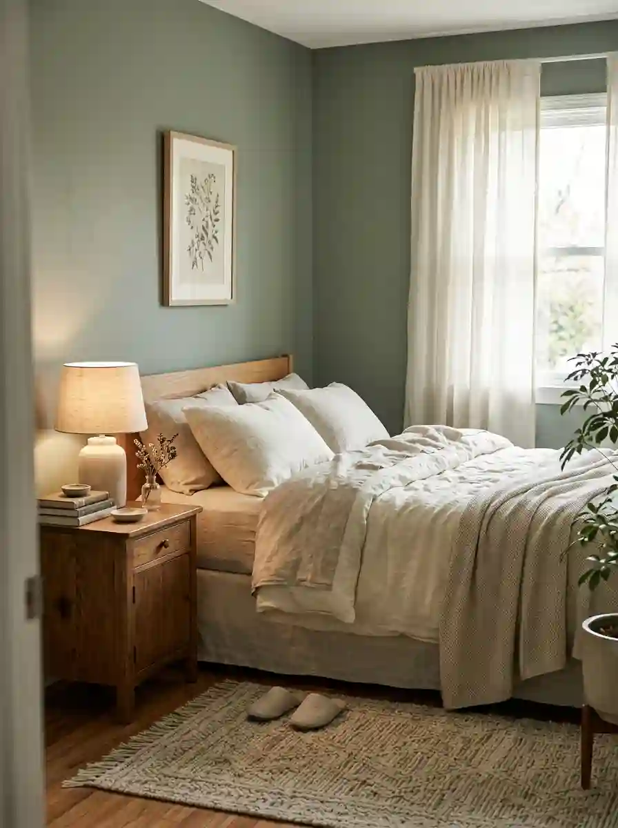
Here’s the thing about a finished bedroom: the paint is only the starting point. The room comes alive through textures, lighting and the small things that make it yours. Once your color’s on the wall, layer in:
- Soft lighting. Bedside lamps and warm bulbs matter more than overhead light.
- Natural textures. Linen, wool, cotton, wood, rattan and ceramics soften any color.
- A few personal touches. Art, books, plants, things that remind you of people and places.
- Tonal layering. Three or four related shades in your bedding make a room feel designed.
Frequently Asked Questions
What is the most relaxing bedroom paint color?
Soft blues, muted greens and warm neutrals are the most widely loved for calm. But the “most relaxing” color is the one that makes you feel safe. Muted, low-contrast shades usually work best.
What color should I paint a small bedroom?
Either go light and warm (soft white, pale greige, pale blue-gray) or commit to a deep, dark shade across walls, ceiling and trim. Avoid the dull middle ground.
Can I paint a bedroom a dark color?
Absolutely. Dark colors like navy, forest green and charcoal can make a bedroom feel cozy and sophisticated, as long as you use matt paint, layered lighting and warm textiles.
What bedroom color is best for sleep?
Calm, muted shades such as soft blue, sage green, warm neutrals and deep, low-saturation darks tend to suit a sleep space. Avoid bright, saturated colors like vivid red or neon yellow.
Is gray still a good bedroom color?
Warm gray and greige are still good. Cool, flat, blue-leaning gray has lost popularity and can feel cold, particularly in north-facing rooms.
Should the ceiling be white?
Not necessarily. A softly tinted ceiling, or one matching the walls, often looks more refined. White is a safe choice, but it’s not the only one.
Should I paint the trim and doors the same color as the walls?
It’s a popular modern approach, especially with drenching. It creates a seamless, calm look. Use a slightly higher sheen on trim for subtle contrast.
How do I choose between two similar colors?
Compare their LRV, test large samples on different walls, and look at them at night under lamps. Leave them for a few days and see which one still feels right.
What colors go with a gray bed or gray furniture?
Warm whites, soft blues, sage, blush and deep greens all work. Choose a wall color with similar undertones to the gray to avoid a clash.
How often should I repaint a bedroom?
Usually every five to seven years, or sooner if there’s wear, stains or a change of style. Good-quality paint and a washable finish stretch that timeline.
Final Thoughts: Choose the Feeling First
If you remember one thing from all this, make it this: don’t choose a color, choose a feeling. Calm, cocooned, warm, fresh. Once you know that, the shade nearly picks itself, and a sample pot confirms it.
Look at your light, check your undertones, test big samples at night, and keep your palette soft and layered. Whether you land on a misty blue, a quiet sage, a warm greige, or a deep, dramatic navy, you’ll be walking into a room that feels like yours.
And if you’re still torn between two colors? Paint both samples, give it three days, and go with the one you miss when it’s gone.
I can also put this into a Word doc or a ready-to-publish HTML page with the image placeholders formatted, if you’d like.





3 Comments on “Bedroom Paint Color Ideas: 40+ Shades, Combinations and Expert Tips for a Room You’ll Actually Sleep Well In”