
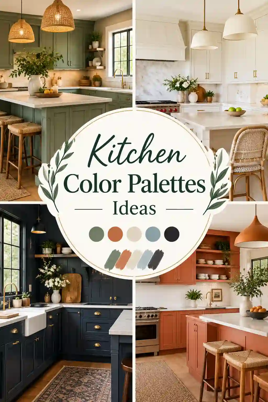
Picking a kitchen color palette feels like it should be fun, and then you stand in front of a wall of paint chips at the hardware store and everything looks like a slightly different shade of beige. Sound familiar? You are not alone. The kitchen is the one room where color has to do a lot of jobs at once. It has to look good in the morning light, still feel welcoming at 9 p.m. under warm bulbs, hide the occasional tomato-sauce incident, and play nicely with a countertop, a floor and a set of appliances you probably can’t change this year.
That’s exactly why this guide exists. Below you’ll find 25 kitchen color palettes ideas that work in real homes, not just in styled photo shoots. Every palette comes with a full recipe: cabinet color, wall color, backsplash, countertop, hardware metal and a few paint names to start your sample hunt. Before the palettes, we’ll walk through the basics that designers rely on (undertones, light, the 60-30-10 rule and fixed elements), because a gorgeous palette in the wrong light is a very expensive mistake.
Also Read: Small Kitchen Organization: 27 Genius Ideas That Will Finally Fix Your Tiny Kitchen
Whether you’re planning a full remodel, repainting tired cabinets over a long weekend, or just trying to make a rental kitchen feel less beige, you’ll leave with a clear direction and the confidence to commit.
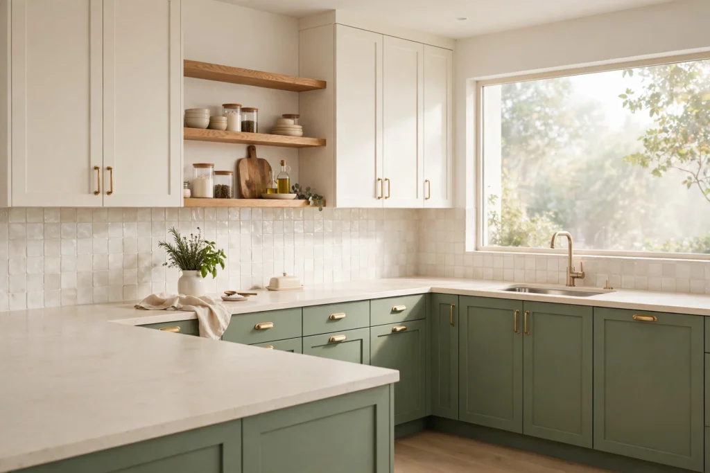
Why Your Kitchen Color Palette Matters More Than Any Other Room
In a bedroom or living room, color is mostly about mood. In a kitchen, color is about mood and function. A few things make the kitchen unusual.
First, it holds more surfaces than any other room in the house: cabinets, countertops, backsplash, flooring, appliances, sink, faucet, lighting and often a window wall. Each one has its own color and its own undertone, and they all have to get along.
Second, the kitchen is expensive to change. Repainting a bedroom costs a weekend and a few cans of paint. Replacing quartz countertops because they clash with your new cabinet color costs real money. Good palette planning is basically insurance.
Third, kitchens are now social spaces. Open-plan layouts mean your kitchen palette is visible from the sofa, the dining table and sometimes the front door. The colors need to flow into the rooms around them instead of fighting them.
Finally, color changes how a kitchen feels to work in. Light, warm colors make a compact space feel more open. Deep, saturated colors add drama and a sense of cocooning. Neutral colors keep the focus on food and people. Choose well, and the room works harder for you every single day.
Kitchen Color Basics: What to Understand Before You Choose a Palette
Skip this section and you’ll probably still pick a pretty color. Read it and you’ll pick the right one.
Start With Undertones, Not Names
Every paint color has an undertone, a subtle hint of another color hiding underneath. A white can lean yellow, pink, gray, green or blue. A gray can lean warm (greige), cool (blue-gray) or even purple. A green can lean yellow (olive) or blue (teal-ish).
Undertones matter because they only show up next to other things. A white cabinet that looks clean and neutral in the store can look slightly green beside a warm beige countertop, or look muddy yellow beside a cool gray floor. The fix is simple: compare your paint sample directly against your countertop, flooring and backsplash tile. If the sample looks “off” next to any of them, the undertones are fighting.
A quick cheat sheet:
- Warm undertones (yellow, red, orange): cream, ivory, beige, greige, terracotta, olive, mustard. They feel cozy and work beautifully with wood, brass and natural stone.
- Cool undertones (blue, green, violet): crisp white, cool gray, navy, teal, slate. They feel clean and modern and suit chrome, nickel and black hardware.
- Neutral-leaning undertones (balanced): soft whites, true taupes, mushroom. These are the easiest to pair with other colors.
The golden rule: match undertones across the big surfaces. If your flooring is warm oak, lean warm. If your countertop has gray veining, lean cool or neutral.
Respect the Light in Your Kitchen
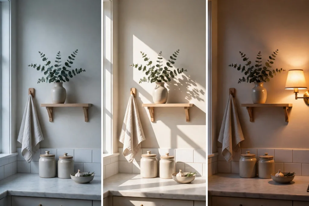
Light is the single biggest variable in how a color looks. The same paint can look like three different colors in three different kitchens.
- North-facing kitchens get cool, steady, slightly blue light. Colors look cooler and flatter here. Go warm (creamy whites, soft greige, warm greens) to counteract it, or lean in with deep, moody colors that look rich in low light.
- South-facing kitchens get bright, warm light for most of the day. Almost anything works, and cooler colors such as blue, sage and crisp white look especially fresh.
- East-facing kitchens are bright and warm in the morning and cooler in the afternoon. Neutral, balanced colors stay consistent all day.
- West-facing kitchens are dim in the morning and glow orange in the evening. Warm colors can look very warm at sunset, so test carefully before using strong reds or oranges.
Then there’s artificial light. Bulbs are measured in Kelvin. Around 2700K gives a warm, golden glow, around 3000K is soft white, and 4000K and above looks cool and bluish. Lighting specialists recommend viewing paint samples under the exact bulbs you’ll actually use, because a color can shift noticeably between warm and cool lighting. Always test at morning, noon and night.
Use the 60-30-10 Rule
This is the easiest way to keep a palette balanced.
- 60% dominant color: the main field. In most kitchens this is your wall color plus your main cabinet color.
- 30% secondary color: an island, a run of lower cabinets, a feature wall or a large backsplash area.
- 10% accent color: hardware, light fixtures, stools, textiles, a bowl of lemons, art.
You don’t have to measure with a ruler. The point is to avoid giving equal weight to three or four colors, which is what makes a kitchen feel busy. Pick a leader, a supporting character and a spark.
Must Read : Green Kitchen Ideas: The Ultimate Guide to a Fresh, Unforgettable Heart of the Home
Remember the Fixed Elements
Here’s a tip from the budget-conscious playbook: keep the expensive, hard-to-change items in neutral colors, and put the bolder hues on things that are cheap and easy to swap. Countertops, flooring and major appliances are your fixed elements. Paint, hardware, stools, rugs, dish towels and small appliances are your flexible elements.
If you’re stuck with a beige granite countertop or orange-toned oak floors, don’t fight them. Build your palette around them. Pull the undertone from the counter or floor and choose cabinet and wall colors that share it.
Think About Sheen and Finish
Color isn’t just hue. Sheen changes how color reads.
- Matte and flat finishes look velvety and hide imperfections, but they’re harder to wipe down. They’re lovely for walls and ceilings away from the stove.
- Satin and eggshell are the workhorse finishes for kitchen walls. They balance beauty and washability.
- Semi-gloss is the classic choice for cabinets and trim because it resists grease and cleans easily, though it shows brush marks and dents more.
- High-gloss lacquer reflects light and looks dramatic, especially in deep colors, but it’s unforgiving on uneven surfaces.
A deep green in matte looks soft and earthy. The same green in gloss looks formal and jewel-like. Decide on sheen before you finalize the color, and always sample in the sheen you plan to use.
Color Scheme Types, Explained in Plain English
Designers talk about color schemes using the color wheel. You don’t need a degree in art to use them. Here are the four that matter most for kitchens.
Monochromatic. One hue in multiple shades, like pale sage, mid-green and deep forest. It’s calm, cohesive and very hard to get wrong. Add texture (wood, stone, linen) so it doesn’t feel flat.
Analogous. Colors that sit next to each other on the wheel, like blue, blue-green and green. It feels natural and harmonious, and it’s a good way to add depth without drama.
Complementary. Colors opposite each other, like blue and orange, or green and red. High energy and high contrast. In a kitchen, keep one color dominant and use the other as a small accent (think navy cabinets with copper pots).
Neutral plus accent. The most popular kitchen approach. White, cream, greige or wood as the base, with one confident color as the highlight. It’s also the safest for resale.
Most of the 25 palettes below fit one of these categories. As you read, notice which type you keep gravitating toward. That’s usually a clue to your natural taste.
25 Kitchen Color Palettes Ideas to Try (With Full Recipes)
A quick note on paint names: brands reformulate, screens distort color, and every kitchen is different. Treat the names below as starting points for sampling, not guarantees. Always test in your own space.
1. Warm White and Natural Oak
The recipe: Cabinets in a soft warm white, walls in a slightly deeper cream, natural oak open shelves or butcher-block island, white quartz counters with subtle veining, brushed brass or matte black hardware.
Paint starting points: Benjamin Moore White Dove (OC-17) on cabinets, Sherwin-Williams Alabaster (SW 7008) on walls.
This is the palette that quietly replaced the stark bright-white kitchen. White is still the foundation, but it’s creamier, softer and paired with real wood so the room feels lived in rather than clinical. The wood does most of the emotional work here. It adds warmth, grain and a touch of nostalgia.
Best for: Almost everyone. It suits farmhouse, transitional and modern kitchens, and it’s a safe pick if you plan to sell within five years.
Pro tip: If your whites look yellow at night, check the bulbs. Swapping 2700K bulbs for 3000K often fixes it without repainting.
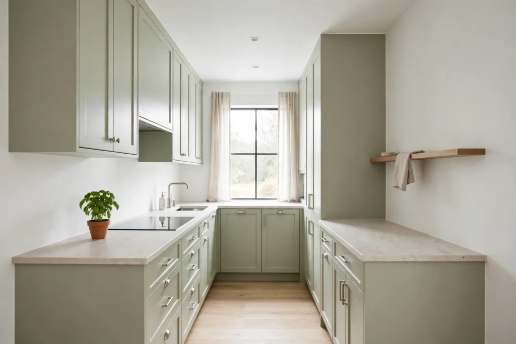
2. Sage Green and Cream
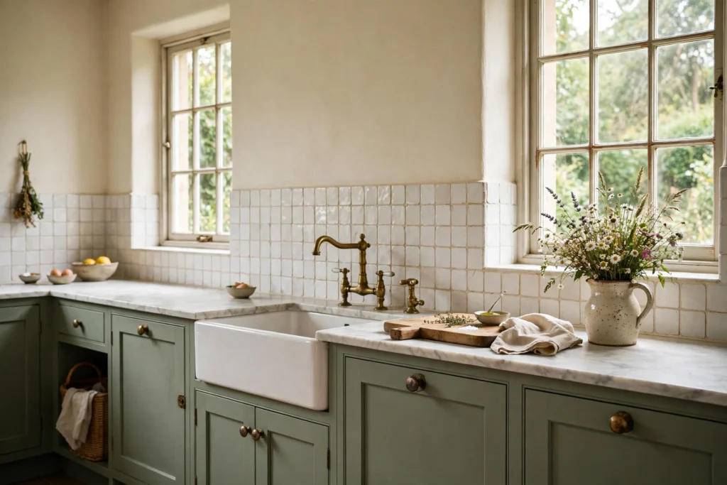
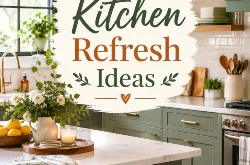
The recipe: Sage green cabinets, cream walls, honed white or cream stone counters, a handmade-look tile backsplash in warm white, aged brass fixtures, a wood cutting-board accent.
Paint starting points: Benjamin Moore Saybrook Sage (HC-114) or Sherwin-Williams Sea Salt (SW 6204) for cabinets, Sherwin-Williams Creamy (SW 7012) for walls.
Sage is the gentlest way to bring green into a kitchen. It reads as a neutral with personality, soft enough to live with every day, rich enough to feel designed. Paired with cream rather than stark white, it feels like a garden in late afternoon. If you want color without commitment, a soft green splashback or lower cabinets is a lovely, low-risk starting point.
Best for: Small to medium kitchens, cottage and farmhouse styles, and anyone who wants calm.
Pro tip: Sage shifts in light. In north-facing rooms it can turn gray, so choose one with a touch more warmth.
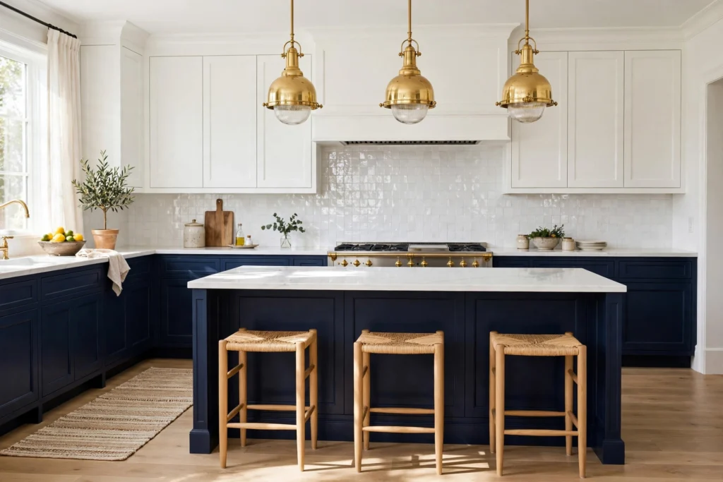
3. Navy, White and Brass
The recipe: Navy lower cabinets or island, white upper cabinets and walls, white or light gray quartz counters, white subway or zellige backsplash, warm brass hardware and pendants.
Paint starting points: Benjamin Moore Hale Navy (HC-154) for the navy, Benjamin Moore Chantilly Lace (OC-65) for crisp white.
Navy has had a long run, and it keeps earning its place because it behaves like a neutral. It’s deep and grounded, flatters wood and metal, and looks sharp against white. Navy kitchens can look especially good in smaller spaces, where they feel cozy and wrapped rather than cramped, provided there’s enough light and enough white to balance it.
Best for: Traditional, transitional and coastal kitchens. Great for adding contrast without going fully dark.
Read Also : 45 Genius Pantry Organization Ideas That Will Finally End The Daily Kitchen Chaos
Pro tip: Use navy on the lower cabinets or island and keep uppers light. It anchors the room while keeping sightlines open.
4. Greige and Charcoal
The recipe: Greige cabinets and walls, a charcoal island or range wall, white or soft gray stone counters, matte black or brushed nickel hardware, a textured gray-beige backsplash.
Paint starting points: Sherwin-Williams Agreeable Gray (SW 7029) or Benjamin Moore Revere Pewter (HC-172) as the main color, Benjamin Moore Kendall Charcoal (HC-166) on the island.
Greige, the blend of gray and beige, is the grown-up cousin of the cool gray kitchens that dominated the last decade. It’s warmer, so it feels softer and more current. Adding a charcoal accent gives the palette a modern spine without tipping into cold.
Best for: Modern and transitional kitchens, open-plan homes where the kitchen needs to blend with a neutral living room.
Pro tip: Avoid pairing greige with very cool white counters. Choose a warm white or a stone with beige veining to keep the undertones consistent.
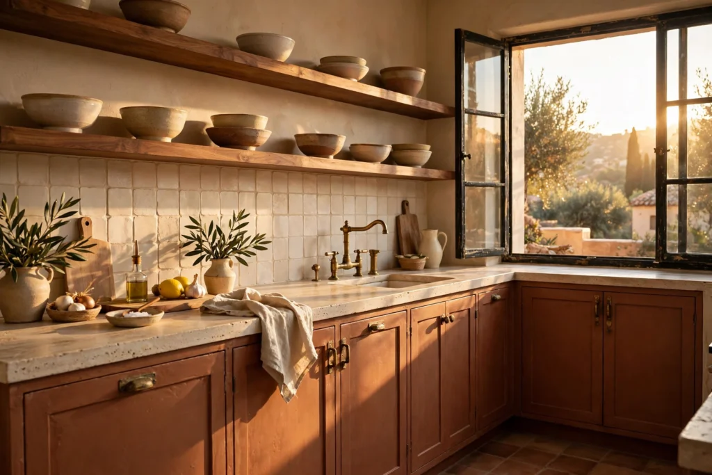
5. Terracotta and Warm Sand
The recipe: Terracotta or clay-colored cabinets, sandy cream walls, terrazzo or travertine-look counters, handmade tile in a warm white, natural wood shelving, black or aged brass hardware.
Paint starting points: Sherwin-Williams Cavern Clay (SW 7701) for cabinets, Sherwin-Williams Accessible Beige (SW 7036) on walls.
Terracotta is one of the standout comebacks of recent years. It’s earthy, slightly nostalgic and full of character, and it brings a sunbaked, Mediterranean warmth that makes a kitchen feel like a place people actually gather. Open wood shelving or a cream backsplash breaks up the color so it doesn’t overwhelm.
Best for: Kitchens with good natural light, Mediterranean, Spanish and boho styles, and homeowners who want a brave but still earthy look.
Pro tip: Terracotta can read orange in strong sun. Test a large sample and look at it at sunset before committing.
6. Black, White and Wood
The recipe: Matte black cabinets, white walls and ceiling, white or light stone counters, warm wood floating shelves and stools, brushed brass or black hardware.
Paint starting points: Sherwin-Williams Tricorn Black (SW 6258) or Benjamin Moore Soot (2129-20) on cabinets, Sherwin-Williams Pure White (SW 7005) on walls.
Black kitchens are bold but surprisingly versatile. Instead of using white cabinets with a black accent, flip it: make black the main color and use white as the highlight. The wood is essential, because it softens the contrast and keeps the room from feeling cold. Black cabinets also hide fingerprints and splatter better than you’d expect.
Best for: Contemporary and industrial kitchens, and spaces with plenty of natural light.
Pro tip: If your kitchen is small or dim, use black only on the lower cabinets or island. A fully black kitchen needs enough daylight that it won’t feel gloomy by evening.
7. Olive Green and Walnut
The recipe: Muted olive green cabinets, warm cream walls, walnut wood accents and open shelving, creamy white or honed stone counters, aged brass or bronze hardware.
Paint starting points: Sherwin-Williams Rosemary (SW 6187) for a deeper olive-leaning green, with a warm white such as Benjamin Moore Cloud White (OC-130) on walls.
Olive pairs two earthy materials, deep green and dark wood, and the result feels like a library for cooks: rich, studied and grounded. Olive greens carry a hint of yellow, so they glow beautifully with warm woods and brass. Add black accents and you get an earthy palette that evokes soil and sky.
Best for: Traditional, rustic and mid-century kitchens, and homes with warm wood floors.
Pro tip: Keep the counters light. Dark green plus dark counters plus dark wood is a lot of depth in one room.
8. Chocolate Brown and Soft Blue
The recipe: Dark wood or chocolate-brown cabinets, a soft blue painted island or walls, white or cream accents, light stone counters, brushed nickel or aged bronze hardware.
Paint starting points: Sherwin-Williams Urbane Bronze (SW 7048) for a deep brown-bronze, Sherwin-Williams Rainwashed (SW 6211) or Languid Blue (SW 6226) for the blue.
Brown and blue is a classic pairing that echoes earth and sky. It’s also surprisingly flexible. Raise the saturation of the blue for something bright and lively, or soften it for a calm, spa-like feel. Layer both with white or cream so the combination breathes.
Best for: Traditional kitchens with existing dark wood cabinets, and homeowners who want to refresh without replacing.
Pro tip: If you already have brown cabinets you love, painting the island blue is the cheapest, highest-impact way to modernize.
9. Mushroom Taupe and Soft Black
The recipe: Mushroom or taupe cabinets, a slightly lighter wall color, soft black accents on the range hood, windows or hardware, honed limestone-look counters, natural linen and woven textures.
Paint starting points: Sherwin-Williams Dovetail (SW 7018) or Benjamin Moore Pale Oak (OC-20) as the main tone, Sherwin-Williams Iron Ore (SW 7069) for accents.
Mushroom and taupe have become a secret weapon for designers who want something sophisticated but not stark. They sit between gray and brown, so they pair with almost everything. Texture does the heavy lifting: woven pendants, ceramic bowls, rattan stools and linen towels make this palette feel rich and layered.
Best for: Modern organic, Japandi and quiet-luxury kitchens.
Pro tip: Use soft black (a charcoal that isn’t pure black) for accents. Pure black can feel harsh against a gentle taupe.
10. Butter Yellow and Cream
The recipe: Soft butter-yellow cabinets or backsplash, creamy white walls, warm wood counters or butcher block, white tile, aged brass or white ceramic knobs.
Paint starting points: Benjamin Moore Hawthorne Yellow (HC-4) for the yellow, Benjamin Moore Cloud White (OC-130) for the cream.
Yellow has always been the color of sunshine, and a buttery, muted version feels like golden hour inside a kitchen. It’s cheerful without being loud, and it’s a lovely way to bring warmth to a north-facing room. Keep the yellow soft and slightly creamy. Neon lemon is a different story.
Best for: Small kitchens, cottage and vintage styles, and any room that needs a mood boost.
Pro tip: Pair yellow with plenty of white and wood so it reads as sunny rather than overwhelming. If you’re nervous, start with a yellow island or a single wall.
11. Blush Pink, Brass and Charcoal
The recipe: Plaster-pink cabinets or walls, charcoal or deep gray accents, warm brass hardware and fixtures, creamy white or marble counters, a soft white backsplash.
Paint starting points: Farrow & Ball Setting Plaster for walls and a slightly stronger pink such as Templeton Pink for cabinetry, balanced with a deep slate accent.
Pink in a kitchen can sound risky, but muted, plaster-style pinks behave almost like neutrals. They add warmth and a flattering glow, particularly beside brass and bronze. The key is dusty, not bubblegum. Add a charcoal or deep slate accent to keep the palette grown-up.
Best for: Boutique, vintage and eclectic kitchens, and people who want something distinctive but still livable.
Pro tip: Pink looks best in good light. In dim kitchens, pick a pink with a touch of beige so it doesn’t turn cold.
12. Dusty Blue and Warm Gray
The recipe: Dusty blue cabinets, warm gray or white walls, white marble-look counters, a pale gray or white tile backsplash, brushed nickel hardware, natural rattan or linen touches.
Paint starting points: Sherwin-Williams Languid Blue (SW 6226) for cabinets, Benjamin Moore Gray Owl (OC-52) for walls.
Soft, dusty blue brings freshness and calm without the weight of navy. It suits coastal and Scandinavian kitchens, and it pairs beautifully with warm gray, which stops the blue from feeling icy. Blue is also a flattering color for food photography, if that matters to you.
Best for: Coastal, cottage and Scandinavian-leaning kitchens, plus bright rooms that can carry a cooler color.
Pro tip: Avoid pairing a cool blue with a yellow-toned beige counter. Choose a white, gray or true-neutral surface instead.
Also Read : Sage Green and Pink Kitchen Ideas: The Ultimate Guide to a Warm, Unforgettable Color Pairing
13. Forest Green and Antique Gold
The recipe: Deep forest green cabinets, warm white or pale plaster walls, creamy marble or quartzite counters, antique gold or unlacquered brass hardware, a cream or pale green tile backsplash.
Paint starting points: Farrow & Ball Studio Green or Sherwin-Williams Rookwood Dark Green (SW 2816) on cabinets, with a soft white on the walls.
Velvety deep greens feel timeless rather than trendy because green is the color most connected to nature. Pair it with aged gold and you get a kitchen with the quiet confidence of a private club. Designers often point out that these deeper shades are a rejection of disposable trends, and that’s the right way to think about them: you’re choosing something substantial.
Best for: Larger kitchens, traditional and English country styles, and homes with strong natural light.
Pro tip: Satin or matte finish keeps deep green looking rich instead of shiny. Add plenty of warm lighting so the color glows at night.
14. Layered All-White
The recipe: Slightly different whites on cabinets, walls, trim and ceiling, white marble or quartz counters, white tile, plus natural textures such as wood, rattan, linen and stone to stop it feeling flat.
Paint starting points: Benjamin Moore Simply White (OC-117), Cloud White (OC-130) and Chantilly Lace (OC-65), used in different places.
The all-white kitchen remains one of the most timeless schemes, but flat white-on-white can look sterile. The designer fix is layering: use two or three whites with slightly different undertones and finishes, then bring in texture. A matte cabinet, a glossy tile and a honed stone counter can all be white and still look completely different.
Best for: Minimalist, Scandinavian and traditional kitchens, and anyone who wants maximum resale appeal.
Pro tip: Decide early whether your white kitchen is warm or cool. A cool-toned white leans on blue, green or gray bases, while a warm white leans on cream and yellow. Mixing the two by accident is the number one all-white mistake.
15. Soft Gray and White for Small Kitchens
The recipe: Light gray cabinets, white walls and ceiling, white quartz counters with light veining, a pale backsplash, chrome or nickel hardware, a single warm-wood accent such as a cutting board or stool.
Paint starting points: Benjamin Moore Gray Owl (OC-52) on cabinets, Benjamin Moore White Dove (OC-17) on walls.
Gray and white is a smart pairing for a small kitchen that needs a little more personality than all white. Gray grounds natural materials like stone and exposed wood. The trick in this decade is to pick a gray with a warm or neutral undertone, and to avoid pairing a cool gray with stark bright white, which is exactly the combination that now reads as dated.
Best for: Small and galley kitchens, rentals where you can’t change counters, and modern minimalists.
Pro tip: Add one warm element (wood, brass, a terracotta pot) to stop the palette feeling cold.
16. Two-Tone: White Perimeter, Deep Island
The recipe: White or warm-white perimeter cabinets, an island in deep green, navy or charcoal, matching wall color to the perimeter, stone counters that tie both colors together, metal hardware repeated across both.
Paint starting points: Benjamin Moore White Dove on the perimeter, with an island in Hale Navy or Rookwood Dark Green.
Two-tone kitchens give you the drama of a bold color without committing every cabinet to it. The island becomes a piece of furniture. It’s also the easiest way to test a bold color, because repainting one island costs far less than repainting the whole room. A sensible approach is to use roughly 60 percent light color, 30 percent deep color and 10 percent accent.
Best for: Open-plan kitchens, medium to large spaces, and first-time color adopters.
Pro tip: Repeat the island color once elsewhere (a stool cushion, a vase, a rug) so it looks planned, not random.

17. Charcoal and Copper
The recipe: Charcoal cabinets, light gray or white walls, concrete-look or dark stone counters, a brick or textured tile backsplash, copper pendant lights and accessories, black steel-framed shelving.
Paint starting points: Benjamin Moore Kendall Charcoal (HC-166) on cabinets, a soft white on the walls to bounce light.
This is the industrial look softened for home. Charcoal is cooler and more modern than black, and copper warms the palette beautifully, a natural complementary relationship between cool gray and orange-toned metal. Exposed brick or textured tile adds the loft character.
Best for: Urban apartments, lofts and modern kitchens with ample light.
Pro tip: Use copper sparingly, in pendants, a pot rack or a faucet. Too much starts to feel themed.
18. Sage and Terracotta
The recipe: Sage green cabinets, terracotta tile or backsplash, cream walls, rattan or woven pendants, light wood counters or open shelves, aged brass hardware.
Paint starting points: Benjamin Moore Saybrook Sage with terracotta tile or a Cavern Clay accent.
Green and orange-brown sit close to each other in nature, which is why they feel so relaxed together. Sage cabinets plus terracotta floor tile is one of the loveliest earthy pairings you can build, and it works even if your fixed surfaces are fairly warm.
Best for: Boho, Mediterranean and relaxed farmhouse kitchens.
Pro tip: Let one color lead. If the cabinets are sage, keep terracotta to the floor, backsplash or accessories rather than splitting it evenly.
19. Oxblood and Cream
The recipe: Deep red or oxblood cabinets or island, warm cream walls, warm white stone counters, dark wood details, aged brass hardware, a subtle floral or patterned wallpaper in an adjoining nook.
Paint starting points: Farrow & Ball Eating Room Red or a muted brick red, paired with a creamy white.
Red is the bravest kitchen color, and the deep, brownish versions feel more like leather and wine than stop signs. Used on a single island or a run of cabinets, it adds genuine warmth and appetite appeal. Red also pairs surprisingly well with wallpaper for a layered, collected look.
Best for: Confident decorators, traditional and eclectic kitchens, and dining kitchens that double as entertaining space.
Pro tip: Red looks best in rooms with decent daylight. Test it in a large swatch and live with it for a few days.
20. Scandinavian Pale Gray, White and Birch
The recipe: Pale gray-white cabinets, white walls, light birch or ash wood accents, white stone or light laminate counters, matte black or stainless hardware, simple pendants.
Paint starting points: Benjamin Moore Pale Oak or a soft white, with light timber for contrast.
Scandinavian palettes are about light, calm and honesty of materials. There’s very little color, so wood and texture carry the personality. It’s an especially good choice for smaller or darker kitchens that need to bounce every bit of light around.
Best for: Small kitchens, apartments, minimalists and families who want easy-clean surfaces.
Pro tip: Add a plant, a green dish towel or a ceramic bowl in a muted color. That small touch stops minimalism from becoming cold.
21. Teal, Walnut and Mustard
The recipe: Teal lower cabinets, walnut uppers or shelving, white or cream walls, mustard accents (stools, a pendant, small appliances), terrazzo or white quartz counters, warm brass hardware.
Paint starting points: Benjamin Moore Aegean Teal (2136-40) with warm wood tones.
This is a mid-century modern palette with a contemporary twist. Teal is rich without being heavy, walnut adds warmth, and mustard acts as the spark. If you love retro style but don’t want your kitchen to feel like a theme park, keep the accent colors small and let the wood do most of the work.
Best for: Mid-century, retro and eclectic homes.
Pro tip: Limit mustard to one or two items. It’s an accent, not a co-star.
Must Read : 45 Bold Two Tone Kitchen Cabinet Designs That Will Instantly Elevate Your Entire Kitchen
22. Orange and Green, Done Tastefully
The recipe: Soft green cabinets or walls, burnt orange accents (stools, pottery, a roman shade), white or cream backing, light wood counters or shelves, white appliances.
You may be thinking “absolutely not,” but this pairing brings real life to a kitchen. Green is fresh and calming, orange is zingy and energetic, and both play very well with wood. The key is to desaturate: think muted olive and burnt orange, not traffic cone and lime. White walls and appliances give the combination room to breathe.
Best for: Retro revival kitchens and families who like an upbeat, playful room.
Pro tip: Use the 60-30-10 rule strictly here, with green as the main color and orange as a 10 percent accent.
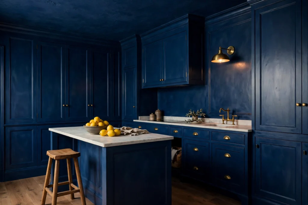
23. The Color-Drenched Kitchen
The recipe: One deep, moody color on walls, cabinets, trim and sometimes the ceiling, in varying sheens, with natural stone counters, wood or woven textures and metal hardware in a contrasting finish.
Paint starting points: Farrow & Ball Hague Blue or a similarly saturated green, gray-blue or charcoal.
Color drenching means using one color almost everywhere, which sounds terrifying and looks wonderful. The room becomes a cocoon with no visual breaks. Because cabinets and walls merge, the kitchen feels bigger and more intentional. Switching sheen between surfaces (matte on walls, satin on cabinets) adds depth.
Best for: Small kitchens with limited windows, galley kitchens and design lovers who like a bold statement.
Pro tip: Choose bright, warm lighting and a light counter so the room doesn’t feel heavy.
24. Neutral Kitchen With a Muted Rainbow Tile Accent
The recipe: White or greige cabinets, plain neutral walls, a backsplash or feature wall in small tiles using muted rainbow shades (dusty pink, sage, ochre, soft blue), wood counters or shelves, simple hardware.
If you love color but fear commitment, let the backsplash be the party. Grouped muted tiles add interest, especially where exposed brick or wood already dominates. Because the cabinets and walls remain neutral, you can change the look later by swapping the tile, or simply live with it for years.
Best for: Rental refreshes, eclectic homes and anyone who wants color with an easy exit strategy.
Pro tip: Pull one or two colors from the tile into small accessories, like a vase or a towel, so everything feels connected.
25. Earth Tones: Stone, Sand and Wood
The recipe: Sand or oatmeal cabinets, warm beige walls, natural stone counters, wood open shelves and flooring, woven baskets, linen, ceramic and matte black or bronze hardware.
Paint starting points: Sherwin-Williams Universal Khaki (SW 6150) or Accessible Beige (SW 7036) with warm creams.
An all-natural kitchen doesn’t have to be bland. When you layer sand, oat, clay and wood in varying textures, you get a palette that feels like a quiet beach house. This is the palette for people who want calm above all, and it’s forgiving for resale.
Best for: Wellness-minded homeowners, modern organic and coastal styles.
Pro tip: Texture is everything here. Combine rough, smooth, matte and glossy surfaces so the room has depth.
Best Kitchen Colors for Specific Situations
Small Kitchens
Light, reflective colors make a compact kitchen feel more open. Whites, creams and pastels bounce natural light around, and pairing light shades with wood adds warmth. If you want color, consider a soft sage, a pale blue or a color-drenched scheme where cabinets and walls match so the room has no visual edges.
Keep the number of colors to two or three. Using too many colors in a small kitchen makes the space feel chopped up, and a very strong color such as black is best used sparingly if the room is tight. A big kitchen can handle stronger colors, especially with plenty of natural light.
Dark or North-Facing Kitchens
You have two smart options. Warm it up with creamy whites, buttery yellows, soft greige or warm sage so the room feels sunnier than it is. Or embrace the darkness with deep navy, green or charcoal, which look rich and intentional in low light. What doesn’t work is a cool pale gray, which turns flat and gloomy. Layer in warm bulbs and reflective surfaces like glossy tile or brass.
Open-Plan Kitchens
When the kitchen is visible from the living room, think of the whole space as one palette. Pick a main color that continues across both rooms, then let the kitchen carry the bolder second color. House colors that feel connected from room to room are increasingly a priority for homeowners as open layouts become the norm. Repeat one accent (a metal finish, a wood tone) in both spaces so the eye travels smoothly.
Also Read : Black and Copper Kitchens: Getting the Warm, Moody Look Right
How to Pair Cabinets With Countertops, Backsplash, Floors and Hardware
A palette is only as good as the way its parts work together.
Countertops. Choose them first if you’re building from scratch, because the pattern and veining are harder to match than paint. White or cream cabinets love almost any counter. Dark cabinets need lighter counters for balance. Colored cabinets (green, blue) look best with a quiet stone or solid surface so the cabinets can lead.
Backsplash. The backsplash is the easiest place to add contrast or texture. With busy counters, choose a plain backsplash. With plain counters, add a handmade tile, a pattern or a soft color. Tile can also echo your cabinet color in a lighter shade.
Flooring. Floors set your undertone. Warm wood leans warm; gray-toned floors lean cool. Don’t try to match your cabinet to your floor exactly. Contrast in tone (light cabinets, mid-tone floor) looks more considered than matchy.
Hardware and metals. Brass and gold add warmth to blue, green, pink and black. Black hardware looks crisp on white, sage and light wood. Chrome and nickel suit cooler palettes. A good approach is to choose one dominant metal and one supporting metal, and repeat each at least three times so it looks deliberate.
Appliances. Stainless is neutral and fits any palette. Black stainless suits dark and modern kitchens. If your appliances are white, keep walls and cabinets warm white so nothing clashes.
Kitchen Color Trends Worth Knowing in 2026
Trend reports point in a consistent direction: away from stark, clinical whites and toward warmth, nature and comfort. Cool gray paired with bright white is now a signal of a dated kitchen. Creamy whites, mushroom and taupe, earthy greens, terracotta, cognac and deep navy are all gaining ground, and each has a natural analog in stone, soil, plants or wood. Matte and layered finishes are popular, and the mood is wellness and sustainability rather than shock value.
The smartest way to use trends is selectively. Pick one trend color for a flexible element such as an island or backsplash, and let timeless materials carry the rest. A forever kitchen beats a trend kitchen every time.
Budget and Renter-Friendly Ways to Change Your Kitchen Colors
You don’t need a gut renovation to transform a kitchen.
- Paint the cabinets. One weekend, good prep (degrease, sand, prime) and a durable cabinet enamel can change everything. Pair it with new hardware for the biggest return per dollar.
- Paint only the island or lower cabinets. Cheap, bold and reversible.
- Swap the hardware. New knobs and pulls in brass or black refresh a palette in an hour.
- Use peel-and-stick tile on the backsplash, which is great for renters.
- Change the soft goods. Towels, rugs, stools, pendant shades and dishware are the cheapest way to introduce an accent color.
- Upgrade the lighting. New bulbs at the right color temperature can change how all your colors look.
Common Kitchen Color Mistakes (and How to Avoid Them)
- Choosing from a tiny chip. A small swatch lies. Paint a large sample board or poster board and move it around the room.
- Ignoring undertones. If a color looks “off” next to your counter or floor, trust that instinct.
- Using too many colors. Stick to three main colors plus metals and natural materials.
- Testing in one light only. Check morning, afternoon and evening, with the lights you’ll actually use.
- Forgetting the sheen. Gloss and matte versions of the same color look like different colors.
- Following trends blindly. If you won’t love it in five years, use it on something replaceable.
- Matching everything. A kitchen where every item is the same tone feels flat. Aim for harmony, not identical.
- Skipping the transition. Look at how the kitchen colors connect to adjacent rooms.
A Simple 7-Step Process for Choosing Your Palette
- List your fixed elements (counters, floors, appliances) and note their undertones.
- Note your light: which direction the windows face and what bulbs you use.
- Choose your style direction: modern, farmhouse, coastal, traditional or eclectic.
- Pick your dominant color from the palettes above that suit your fixed elements.
- Add a secondary and an accent using the 60-30-10 rule.
- Sample on large boards and view them for several days in all lights.
- Finalize sheen and hardware, then commit with confidence.
Final Thoughts
There’s no single best kitchen color palette. There’s the best palette for your light, your fixed surfaces, your style and your budget. If you want a safe starting point, go with warm white and oak, sage and cream, or navy and white. If you’re ready to be bold, try terracotta, deep green or a color-drenched scheme. And if you’re nervous, begin with the island, the backsplash or the accessories and build from there.
Sample generously, trust your eyes in your own light, and remember that a kitchen is meant to be lived in. The best palette is the one that makes you happy to walk in at 7 a.m. and happy to linger at 9 p.m.
Frequently Asked Questions About Kitchen Color Palettes
1. What is the most popular kitchen color palette right now?
Warm whites with natural wood, earthy greens like sage and olive, navy, and soft neutrals such as mushroom and greige are the most popular. The overall direction is warmer and more natural than the cool gray and stark white of the last decade.
2. What color makes a small kitchen look bigger?
Light, reflective colors such as warm white, cream, pale sage and soft blue help a small kitchen feel open. A color-drenched scheme, where walls and cabinets share one color, can also make the room feel larger because it removes visual breaks.
3. How many colors should I use in a kitchen?
Two to three main colors is ideal, plus your metals and natural materials. Use the 60-30-10 rule: a dominant color, a secondary color and a small accent.
4. Are white kitchens still in style?
Yes, but softer. Creamy and warm whites, layered with texture and wood, feel current. Stark bright white paired with cool gray is what now looks dated.
5. What colors go well with dark wood cabinets?
Cream, soft blue, sage green and warm white all work. A painted blue island is a popular way to modernize dark wood cabinets without replacing them.
6. Should kitchen cabinets be lighter or darker than the walls?
Either works. Light cabinets on slightly deeper walls feel classic. Deeper cabinets on lighter walls feel modern and anchored. The key is clear contrast in value so the cabinets don’t disappear.
7. What is the best paint finish for kitchen walls and cabinets?
Satin or eggshell suits walls because it balances beauty with washability. Semi-gloss or a durable satin enamel is best for cabinets and trim because it resists grease and cleans easily.
8. Can I use a bold color in a small kitchen?
Yes, with care. Use it on lower cabinets or an island, keep walls light, and make sure there’s good lighting. Color-drenching can also work beautifully in small kitchens.
9. How do I choose a color that matches my countertops?
Identify the countertop’s undertone (warm, cool or neutral) and choose cabinet and wall colors with the same undertone. Hold a large paint sample right against the counter and view it in your kitchen’s light.
10. How do I test kitchen paint colors before committing?
Paint large sample boards, tape them to different walls and cabinets, and look at them in morning, afternoon and evening light with your actual bulbs. Live with them for at least a few days before deciding.




2 Comments on “Kitchen Color Palettes Ideas: 25 Combinations That Actually Work in Real Homes”