
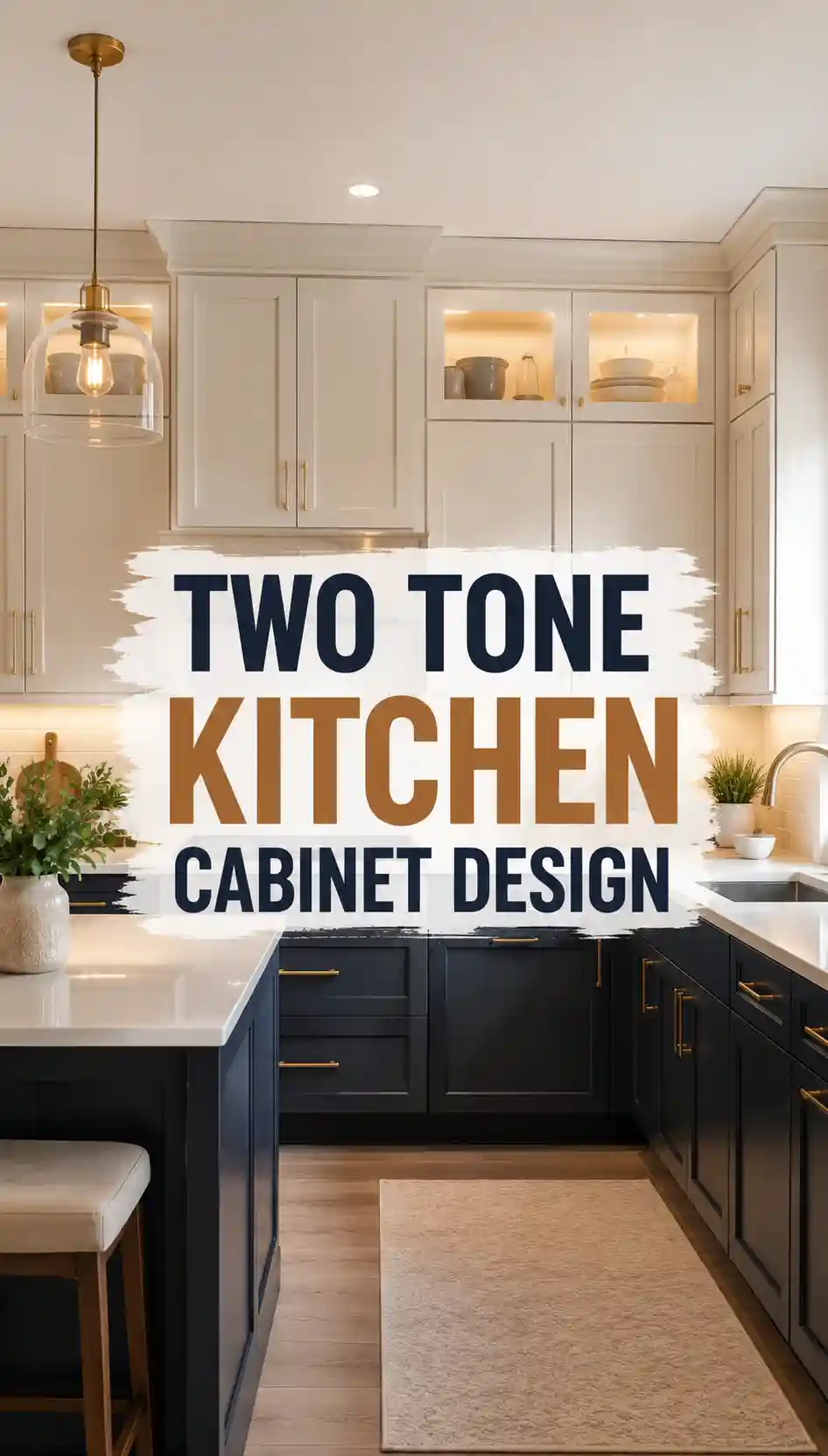
Two-tone cabinets work on a simple rule: one colour carries the room and the second one earns its place. In a typical 3.6 by 3 metre kitchen with around 6 metres of base cabinets, keeping the darker tone to the lower run or to the island alone stops the room feeling split in half, and it keeps the bolder colour where it is easiest to change later.
Repainting just the lower cabinets or the island in a standard kitchen usually takes a professional team 3 to 5 days and costs roughly £900 to £2,000, against £6,000 or more for a full cabinet replacement. Decide the split first — uppers and lowers, or island only — because that single choice drives the paint quantity, the hardware and the countertop.
What actually counts as two-tone?
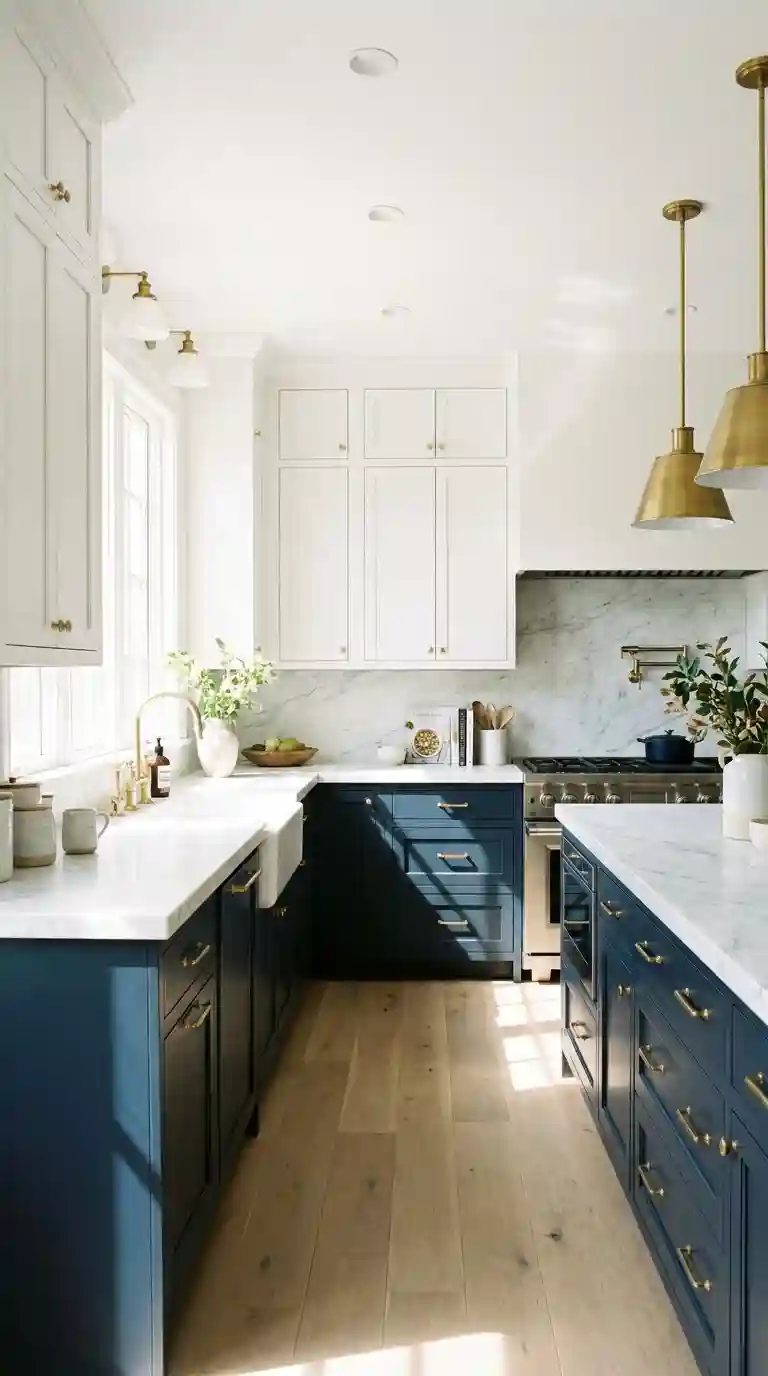
Two-tone simply means two colours, finishes or materials across the cabinetry — most often a lighter tone up top and a darker one below, or a different colour on the island. The photo above shows the idea in a calm form: pale uppers keep the wall feeling open while the darker base run anchors the room.
It only works when the split follows the cabinetry itself. Paint changes at a natural break — the worktop line, the edge of the island, or a tall unit — rather than mid-door. A split that cuts across a run of doors looks like a mistake, however good the colours are.
Which split works best: uppers and lowers, or an island?
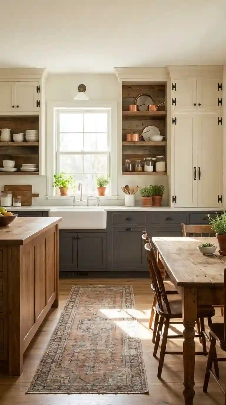
The classic split — light uppers, dark lowers — suits most kitchens because it follows how the eye reads the room. Keep the uppers within one or two shades of the wall colour so the wall reads as one surface, and put the darker tone below the worktop, where scuffs and spills are easiest to hide. The photo above shows the balance: pale uppers, a dark base run, and brass handles tying the two together.
The island-only split is the lower-commitment option: keep the perimeter cabinets one colour and paint just the island, which in a standard kitchen is about 2.4 by 1 metre of cabinetry. It works best when the island colour also appears once more in the room — in bar stools, a pendant finish or a rug — so it reads as a choice rather than a leftover.
What colour pairings actually work?
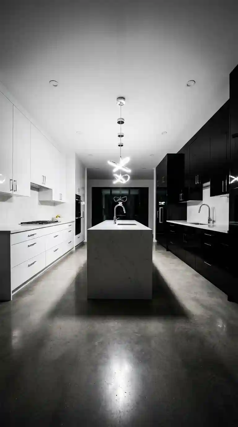
Black and white is the highest-contrast pairing, so it needs the most restraint: keep black to about a third of the cabinetry — usually the lowers or the island — and let white carry the uppers and the walls. The photo above shows why the pairing lasts: with a plain worktop and one metal finish, the contrast reads as intentional rather than harsh.
Wood and paint is the softer two-tone. A walnut or oak island against painted perimeter cabinets adds warmth without a second colour to match, and it ages better than paint alone because knocks on wood read as patina. Keep the wood to one area — island, open shelving or lowers — so it stays a feature rather than a theme.
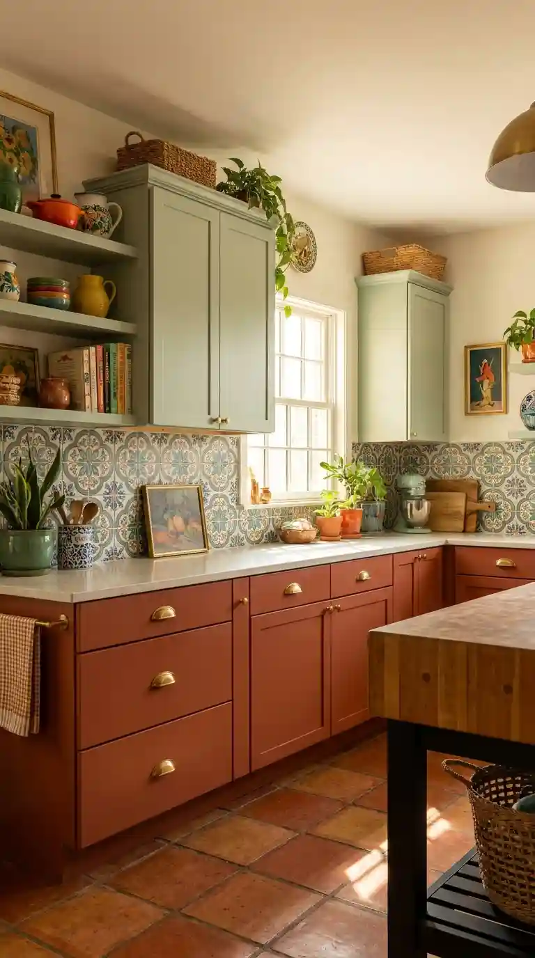
Bold colours work when only one of the two is bold. Pair deep navy, forest green or terracotta lowers with white or cream uppers, and keep the worktop and backsplash neutral so the colour has room to breathe. Two strong colours at once — mustard against charcoal, for example — usually fight each other and date fastest. For a full tour of green cabinetry, see these green kitchen ideas.
How do you make it work in a small kitchen?
In a kitchen under about 9 square metres, two-tone still works — but the darker colour should cover no more than the lower run, and ideally just one run or a small peninsula. Keep the uppers the same colour as the walls so the top half of the room reads as open, and use glass fronts on two or three uppers to break up the wall without adding a third colour.
How do you choose colours without clashing undertones?
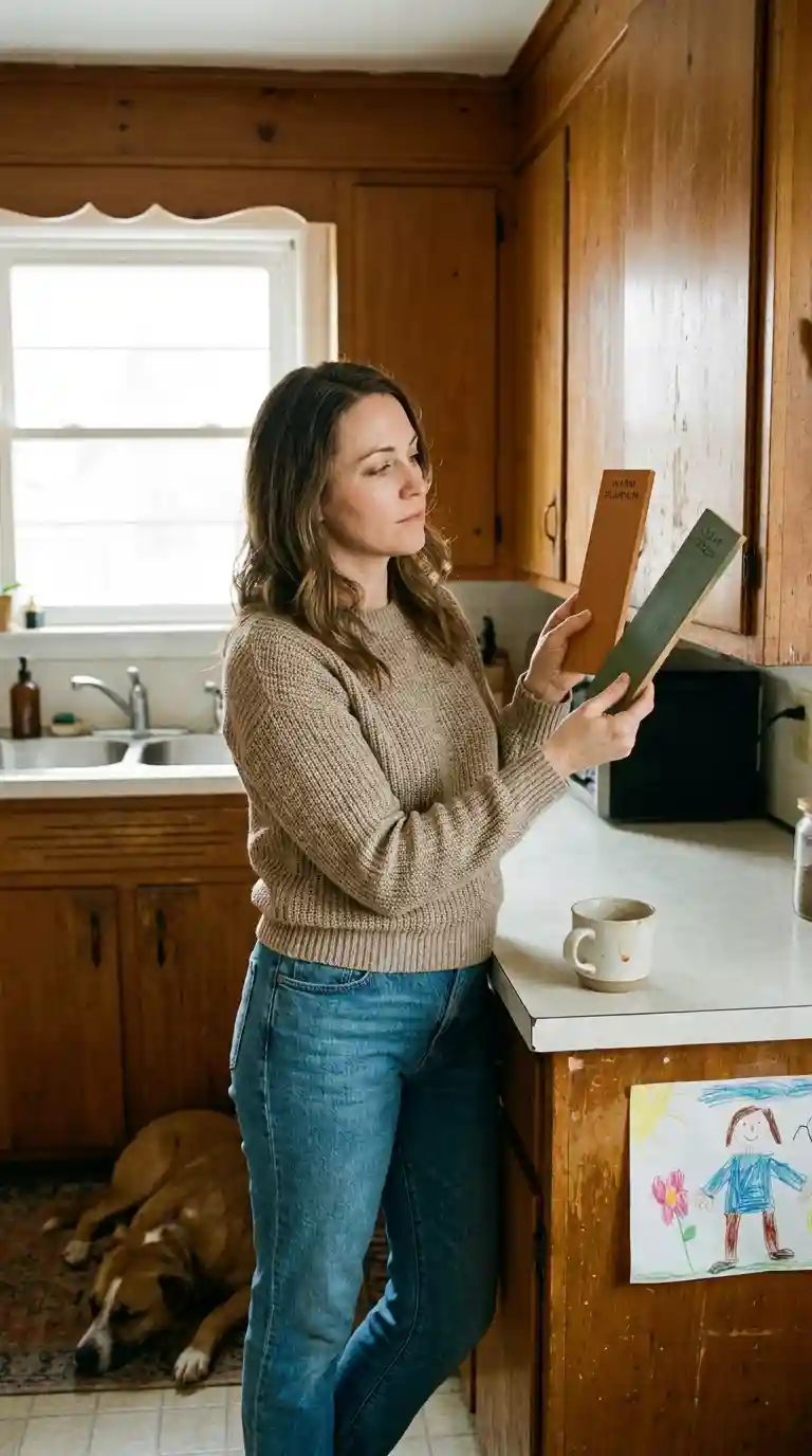
Start with one neutral and one colour, never two strong colours. Then check undertones: hold both samples against a sheet of white paper in daylight — a grey that leans blue will clash with a cream that leans yellow, even if both look neutral in the shop. Buy sample pots, paint a 60 by 60 centimetre board of each, and live with both boards in the kitchen for three days, checking them in morning and evening light before committing. For 25 combinations with full recipes, see these kitchen colour palettes.
What countertop and backsplash tie both colours together?
The countertop is the bridge between the two cabinet colours, so pick it after the cabinets, not before. A neutral quartz in white, cream or soft grey works with almost any pairing; if you want stone with veining, choose one whose veins pick up the darker cabinet colour. For a standard 3.6 metre run, allow roughly £800 to £1,500 for quartz, against £300 to £600 for laminate.
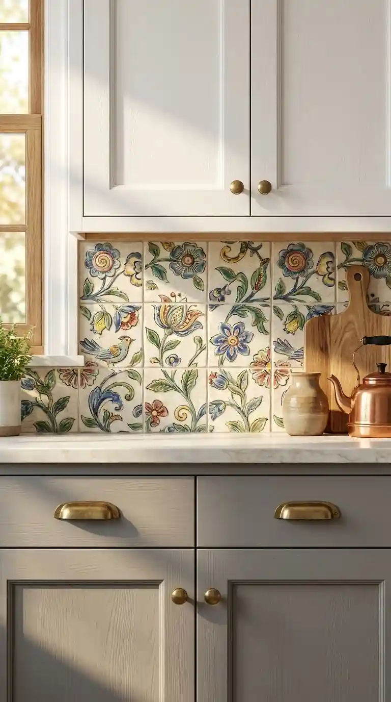
The backsplash sits at the seam between the two colours, so keep it quiet: a plain white subway tile or a soft neutral mosaic lets the cabinets stay the focus. A patterned tile can work if it pulls both cabinet colours, but it should be the only pattern in the room — patterned tile plus a veined worktop plus two cabinet colours is one pattern too many.
How do hardware, finishes and door styles pull it together?
Hardware is the one finish that touches both colours, so use a single metal throughout — brass for warm palettes, chrome or nickel for cool ones. Keep the style consistent too: one knob or pull design across every door, with a longer pull on drawers. Mixing metals across the two cabinet colours is the fastest way to make a deliberate split look accidental. Warm metals are covered in depth in these black and copper kitchen ideas.
Finish is a second, quieter two-tone: matte lowers with a satin or gloss upper adds depth even when the colours are close, and matte hides fingerprints better on the doors that get touched most. Avoid pairing two high-gloss finishes in different colours — reflections make the contrast look harder than it is.
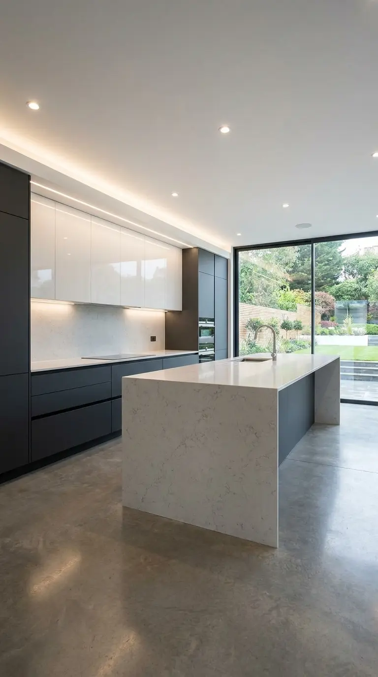
For a modern kitchen, flat-panel, handle-less doors suit two-tone best, because the colour change itself provides the interest — the photo above shows a waterfall edge carrying the island colour down to the floor. Keep the palette to two tones plus the worktop, and hide appliances behind matching panels so nothing else competes.
In a traditional or farmhouse kitchen, shaker doors carry two-tone well, and open shelving in wood softens the split between painted cabinets. Use vintage-style hardware — bin pulls or cup pulls in one finish — to tie the two colours to the room’s older character rather than fighting it.
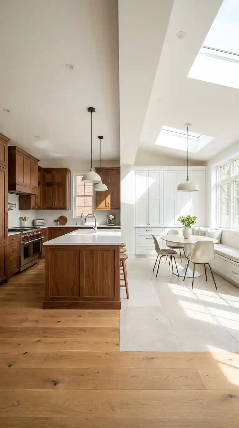
A vertical split — one colour on the cooking run, another on the tall units or the far wall — suits open-plan kitchens, where the change can line up with a natural break such as a doorway or a change in ceiling height. The photo above shows walnut against white: the split works because the wood appears on a full run, not scattered across single doors.
What does a realistic budget and timeline look like?
The costliest mistakes are all decided before painting starts: two colours with clashing undertones, a third accent colour that turns two-tone into three-tone, and a bold pairing chosen without thinking about resale. Fixing a wrong colour after spraying costs roughly the same as the first paint job, so sample boards and undertone checks are the cheapest insurance in the project.
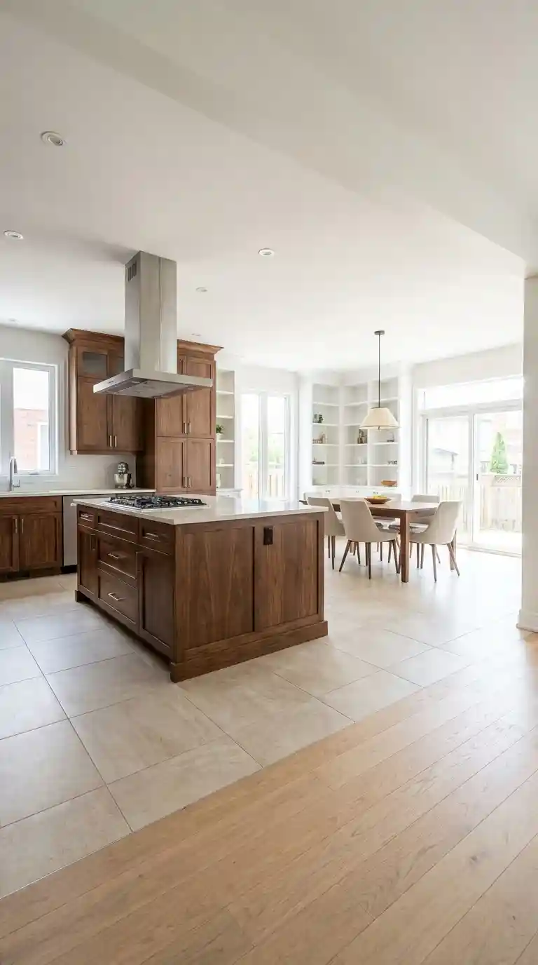
Repainting is the budget route: a professional repaint of the lower cabinets or island runs roughly £900 to £2,000, against £6,000 or more for replacement cabinets, and takes 3 to 5 days. A cheaper first step is hardware alone — a full set of knobs and pulls for a standard kitchen costs about £150 to £400 and changes how both colours read. For renters, peel-and-stick vinyl on the island gives the look without touching the landlord’s cabinets.
Two-tone also changes how the kitchen works: colour can mark zones in an open-plan room, with the cooking run in one tone and the seating side of the island in another, so guests read where to stand. Darker lowers hide daily wear, which means the cabinets that take the most knocks need repainting least often.
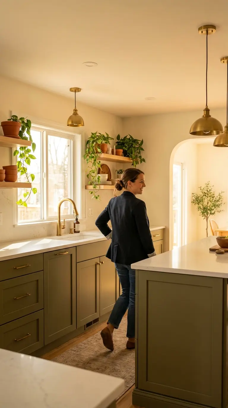
Two-tone has moved past trend into standard practice, but only the neutral-based pairings are safe long-term: white with navy, white with black, cream with charcoal. The photo above shows a finished renovation — the reason it still looks current is that the bold colour sits on the island, the one piece that is cheapest to repaint if tastes change.
Start with the split, then the undertones, then the worktop — in that order. If the split follows the cabinetry, the undertones match and the worktop stays neutral, the two colours will look deliberate from the doorway, which is the only test that matters.
Frequently Asked Questions
What is a two tone kitchen cabinet design?
Two-tone means using two colours, finishes or materials across the cabinetry — usually a lighter tone on the uppers and a darker one below, or a different colour on the island. The split should follow the cabinetry, such as the worktop line or the edge of the island.
Should the darker cabinets go on top or bottom?
On the bottom, in almost every kitchen. Lighter uppers keep the room feeling open, while darker lowers ground the space and hide scuffs better. Dark uppers can make the ceiling feel lower, especially in a small kitchen.
Do two tone kitchens make a small kitchen look smaller?
No, provided the darker colour stays on the lowers and the uppers match the walls. In a kitchen under about 9 square metres, keep the dark tone to one run or a small peninsula and add glass fronts to two or three uppers.
Is it expensive to create a two tone kitchen?
Not necessarily. Repainting just the lowers or the island costs roughly £900 to £2,000 and takes 3 to 5 days, against £6,000 or more for full replacement. Hardware alone, at about £150 to £400, is a cheaper first step.
What countertop works best with two tone cabinets?
A neutral quartz or stone in white, cream or soft grey, ideally with veining that picks up the darker cabinet colour. Pick the worktop after the cabinets, not before, so it bridges both tones rather than competing with them.



7 Comments on “Two-Tone Kitchen Cabinets: Getting the Split Right”