
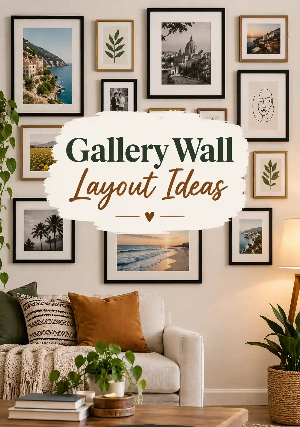
There is a very specific kind of panic that happens right before someone hangs their first gallery wall. Frames spread across the living room floor, a hammer in one hand, and a genuine fear of turning a blank wall into a crooked mess of nail holes that can never be undone. I have talked more than one client down from that exact panic, and almost every single time, the fix comes down to one thing. Planning the gallery wall layout properly before a single nail goes into the wall.
A gallery wall layout is one of those design projects that looks effortless when it is done well and looks genuinely chaotic when it is rushed. The difference rarely comes down to taste or having beautiful art. It comes down to spacing, structure, and a bit of patience before committing to anything permanent.
This guide pulls together everything I have learned from planning and hanging gallery walls in real homes, from tiny apartment hallways to sprawling staircases. We are going to walk through layout styles, spacing rules, frame selection, room specific approaches, and the small details that separate a gallery wall layout that looks intentional from one that looks like it happened by accident.
Let us get into it.
Also Read : TV Wall Design Ideas That Transform Your Living Room From Ordinary to Stunning
Why Getting Your Gallery Wall Layout Right Matters So Much
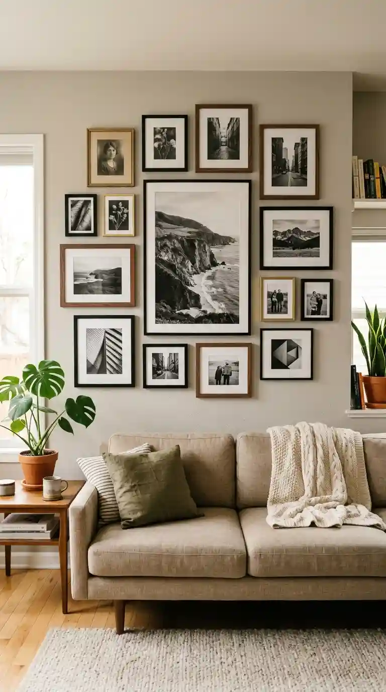
A gallery wall carries a lot of visual weight in a room, often more than people expect going into the project. Unlike a single piece of art hung in one spot, a gallery wall layout involves multiple pieces working together, which means the relationship between them matters just as much as any individual frame.
A well planned gallery wall layout draws the eye in a deliberate way, moving smoothly from one piece to the next rather than feeling scattered or confusing to look at. A poorly planned layout, even with genuinely beautiful individual pieces, can feel chaotic and unfinished, leaving visitors unsure of where to actually look first.
I have watched clients transform an entire room simply by fixing an existing gallery wall layout that had bothered them for years without them quite understanding why. Sometimes it was uneven spacing. Sometimes it was frames of wildly mismatched styles fighting each other rather than working together. Once we rebuilt the layout with a bit more intention, the whole wall suddenly felt calm and cohesive instead of visually noisy.
There is also a genuinely practical reason to get your gallery wall layout right before hammering anything into the wall. Nail holes are not easily undone, and a rushed layout often means a frustrating cycle of moving pieces, patching holes, and repainting sections of wall that could have been avoided entirely with a bit of upfront planning.
Understanding the Core Principles Behind Every Good Gallery Wall Layout
Before diving into specific layout styles, it helps to understand the handful of underlying principles that separate a successful gallery wall layout from one that feels random or unbalanced, regardless of which specific style you eventually choose.
Consistent spacing between frames is one of the most important elements within any gallery wall layout. Most professionals recommend somewhere between two and three inches of consistent gap between frames, which is close enough to read as a cohesive grouping while still giving each individual piece room to breathe.
A clear anchor piece, usually your largest or most visually significant frame, gives a gallery wall layout a genuine focal point to build around. Placing this anchor slightly off center rather than dead in the middle tends to feel more natural and less rigid than a perfectly symmetrical starting point.
Height matters enormously within a gallery wall layout, and the general guideline used by museums and professional designers places the visual center of the arrangement somewhere around fifty seven to sixty inches from the floor, roughly matching average eye level for most adults standing in the room.
Negative space deserves just as much consideration as the art itself. A current and increasingly popular direction within gallery wall layout design actually recommends keeping around two thirds of the wall empty, letting the remaining third hold your actual artwork, which creates a calmer, more curated feeling compared to an overly packed arrangement.
Tonal cohesion across frame finishes or color palettes, even when the actual art varies quite a bit in subject matter, helps a gallery wall layout feel intentional rather than like a random assortment of unrelated pieces thrown together.
Planning Your Gallery Wall Layout Before You Hang Anything
This is genuinely the step most people skip, and it is exactly why so many gallery wall layouts end up feeling rushed or uneven once they are actually on the wall.
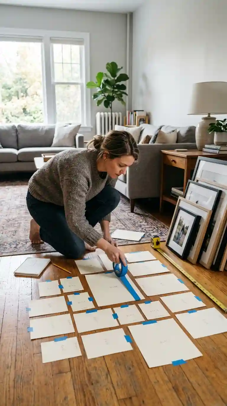
Trace each frame onto kraft paper or newspaper, cut out the shapes, and arrange these paper templates directly on the floor first. This lets you experiment freely with your gallery wall layout without committing to anything, since you can move paper around endlessly without worrying about extra nail holes.
Once you have a floor arrangement you like, tape the paper templates directly onto the wall using painter’s tape. This step lets you actually see your gallery wall layout in place, step back, and adjust before a single nail goes anywhere near the wall.
Take a photo of your taped layout and live with it for a day or two if possible. Something that looked perfect in the moment sometimes reveals an awkward gap or an unbalanced grouping once you have walked past it a few times throughout your normal routine.
Measure consistently as you plan, keeping your gap between frames steady throughout the entire gallery wall layout, since even slightly inconsistent spacing becomes noticeably distracting once the arrangement is actually hanging and catching the eye from different angles around the room.
Consider low damage hanging options, including adhesive strips rated for your frame weight, picture hanging rails mounted along the ceiling, or removable mounting putty for particularly lightweight pieces, especially if you anticipate wanting to adjust your gallery wall layout again down the road.
Read Also : 40 Durable Mudroom Flooring Ideas That Survive Every Season Without Losing Their Charm
Symmetrical Gallery Wall Layout Ideas
Symmetry remains one of the most reliable, foolproof approaches within gallery wall layout design, particularly well suited to more formal or traditionally styled rooms.
A grid based gallery wall layout, using identical or closely matched frame sizes arranged in even rows and columns, creates an immediately calm, orderly feeling. This approach works particularly well in a room with clean, structured furniture, since the repetition of the grid echoes that same sense of order found elsewhere in the space.
Mirrored pairs, where frames are arranged in a symmetrical pattern around a central axis, offer a slightly softer take on full grid symmetry while still maintaining that same sense of intentional balance within the overall gallery wall layout.
A classic three, five, or seven frame system, using an odd number of pieces arranged symmetrically around a central anchor, has remained a consistently popular gallery wall layout structure because odd numbered groupings tend to feel more visually dynamic than perfectly even ones, even within an otherwise symmetrical arrangement.
Symmetrical gallery wall layouts suit hallways particularly well, since the narrow, linear nature of most hallways benefits from the calm, orderly rhythm that a repeated, evenly spaced arrangement naturally provides as someone walks through the space.
Asymmetrical and Organic Gallery Wall Layout Ideas
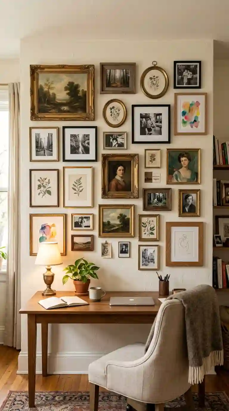
For a more relaxed, personal feeling, an asymmetrical gallery wall layout offers genuine flexibility, mixing different frame sizes and shapes in a pattern that feels collected over time rather than purchased and installed all at once.
Balance still matters enormously within an asymmetrical gallery wall layout, even though the arrangement itself is not symmetrical. Distributing visual weight evenly, meaning larger or darker pieces balanced across the overall composition rather than clustered entirely on one side, keeps an organic layout from feeling lopsided or unintentional.
Staircase diagonal layouts, following the natural upward or downward slope of a staircase wall, represent one of the most popular asymmetrical gallery wall layout applications, using the architecture of the space itself to guide the placement and flow of each frame.
The current, increasingly popular direction within organic gallery wall layout design leans toward what many designers are calling everyday exhibits, mixing framed prints with ceramics, small mirrors, dried botanicals, and textile pieces rather than relying purely on traditional framed art alone.
An asymmetrical gallery wall layout genuinely benefits from being built gradually over time rather than installed all at once, since this collected, evolving quality is a big part of what makes this particular style feel authentic rather than like a single purchased set arranged according to a template.
Gallery Wall Layout Ideas for Above a Sofa or Console
The wall space above a sofa or console table is one of the most common locations for a gallery wall layout, and getting the proportions right relative to the furniture below makes a significant difference in how balanced the overall composition feels.
A widely used sizing guideline suggests your gallery wall layout should span roughly two thirds of the width of the furniture beneath it, whether that furniture is a sofa, a console table, or a bed headboard. This proportion consistently reads as intentional rather than too small or overwhelming compared to the piece below.
Centering your gallery wall layout horizontally above the furniture, while still following the fifty seven to sixty inch height guideline for the overall composition’s visual center, creates a balanced relationship between the art and the furniture piece anchoring that section of the room.
A lower commitment option involves leaning several pieces against the wall directly on top of a console table or mantle, overlapping slightly at varied heights rather than mounting anything permanently. This approach works particularly well for renters or anyone who enjoys refreshing their gallery wall layout seasonally without dealing with new nail holes each time.
Leaving adequate breathing room between the top of your furniture and the bottom edge of your gallery wall layout, typically somewhere between six and twelve inches, prevents the arrangement from feeling like it is crowding or crushing the furniture directly underneath it.
Gallery Wall Layout Ideas for Staircases and Hallways
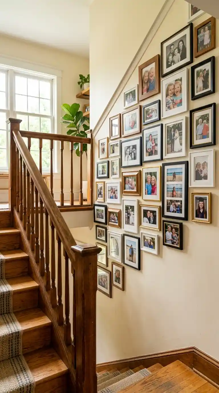
Staircases and hallways present a genuinely unique challenge for gallery wall layout planning, since the space is often narrow, frequently walked through quickly rather than lingered in, and shaped by an unusual sloped or elongated wall.
A diagonal gallery wall layout, following the exact angle of the staircase as it ascends or descends, creates a genuinely striking visual effect that echoes the architecture of the space itself rather than fighting against it with a purely horizontal or grid based arrangement.
For a hallway specifically, a quiet grid layout, using identical frames arranged in perfect, evenly spaced alignment, tends to work particularly well. The narrow nature of most hallways benefits from this kind of calm, orderly rhythm rather than a busier, more eclectic arrangement that can feel overwhelming in a tight, frequently traveled space.
Since hallways and staircases are typically viewed while walking through rather than sitting and studying from a distance, keeping your gallery wall layout relatively simple and legible at a glance tends to work better than an intricate, densely packed arrangement that requires slowing down to properly take in.
Lighting deserves particular attention in these spaces, since staircases and hallways often receive less natural light than a living room or bedroom. A few well placed picture lights or general ambient fixtures can make a genuine difference in how well your gallery wall layout actually reads throughout the day.
Also Read : Mid Century Decor: The Ultimate Guide to a Style That Refuses to Go Out of Fashion
Gallery Wall Layout Ideas for Family Photos
Family photo gallery wall layouts remain one of the most consistently popular and emotionally meaningful applications of this entire design concept, and the current direction within this specific category has shifted noticeably toward a more restrained, intentional approach.
Smaller, more curated groupings of three to four frames have become increasingly favored over the large, dense grids that used to dominate family photo gallery wall layout design, giving each individual photograph genuine breathing room rather than competing for attention within a crowded arrangement.
Black and white photography, often mixed with a few color images, has become a particularly popular choice within family focused gallery wall layout design, since the consistent tonal palette across black and white images creates cohesion even when the actual photo subjects and moments vary quite a bit.
Mixing media within a family photo gallery wall layout, combining traditional framed photographs with a textured print, a small piece of art, or even a fabric backed frame, adds a layer of sophistication that a purely uniform grid of matching photo frames sometimes lacks.
Seasonal photo rotation has become an increasingly common practice, where families keep the same frames and gallery wall layout permanently mounted but swap the actual photographs inside every six months or so, keeping the display feeling current without requiring any new holes in the wall.
Choosing Frames That Work Together in a Gallery Wall Layout
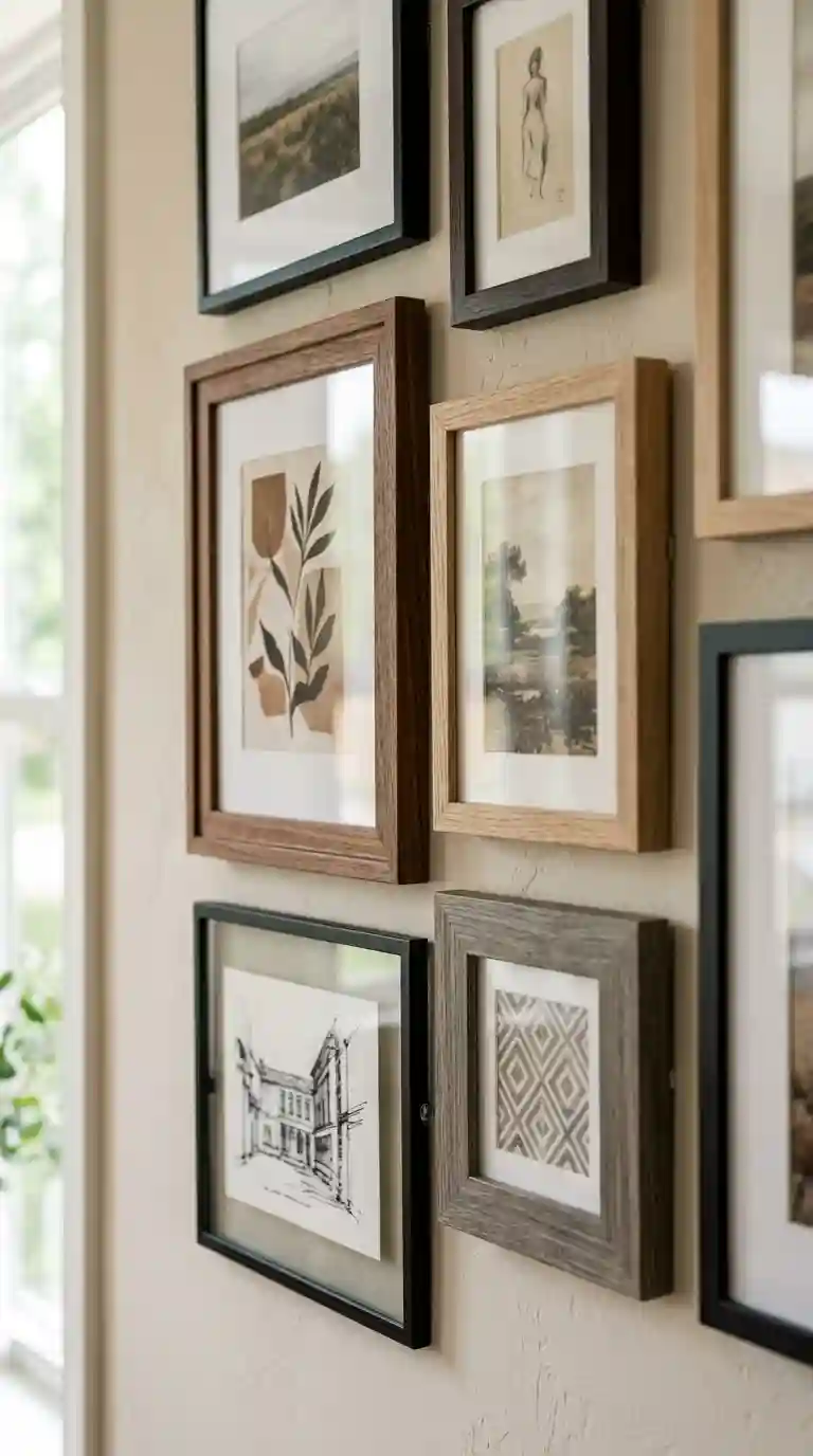
Frame selection genuinely shapes how cohesive a gallery wall layout feels, and this decision deserves just as much thought as the actual artwork or photographs going inside each frame.
Matching frames throughout an entire gallery wall layout creates the most immediately cohesive, orderly look, particularly well suited to a grid based or symmetrical arrangement where consistency is the whole point of the composition.
Mixed frames within a single tonal family, meaning several different frame styles that share a similar wood tone or finish even though the actual shapes and sizes vary, offers a genuinely popular middle ground within current gallery wall layout design, providing visual interest without tipping into total chaos.
Fully eclectic frame mixing, combining ornate vintage frames alongside sleek modern ones, works well for a gallery wall layout that is meant to feel collected over years rather than purchased as a matching set, though this approach does require a slightly more practiced eye to keep the overall composition from feeling disjointed.
Frameless or minimally framed options, including canvas prints or photo tiles mounted directly to the wall without any visible frame, have become an increasingly popular choice for a cleaner, more contemporary gallery wall layout that leans into simplicity rather than the traditional gallery aesthetic.
Whatever frame approach you choose, staying within a consistent color palette or finish family, even amid variety in size and shape, tends to be the single most reliable trick for keeping an eclectic gallery wall layout from feeling accidental rather than intentional.
Color and Tonal Harmony Within a Gallery Wall Layout
Color plays a genuinely significant role in how successful a gallery wall layout ultimately feels, even in arrangements that mix a wide variety of art styles and subject matter.
Choosing a consistent color palette across your artwork, whether that means sticking to warm earth tones, cool blues, or a purely monochromatic black and white approach, helps tie together pieces that might otherwise feel completely unrelated to each other within the same gallery wall layout.
Neutral frame finishes, particularly warm wood tones or matte black, tend to provide the most versatile foundation for a gallery wall layout that includes art with varied and sometimes clashing color palettes, since the neutral frame color absorbs some of that visual tension.
A monochromatic gallery wall layout, using entirely black and white photography or art within similarly toned frames, creates an immediately sophisticated, gallery like feeling that works particularly well in more formal or minimalist rooms.
Introducing a single unexpected color accent within an otherwise neutral gallery wall layout, whether through one boldly colored print or a single frame in an unexpected finish, can add genuine personality and visual interest without disrupting the overall sense of cohesion across the arrangement.
Small Space Gallery Wall Layout Ideas
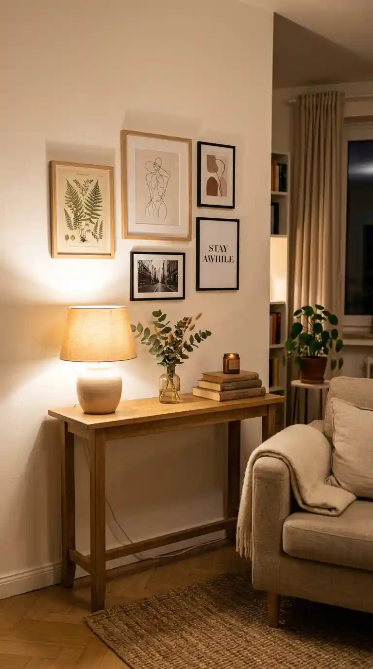
Smaller rooms and apartments genuinely benefit from a slightly adjusted approach to gallery wall layout planning, since the same principles that work in a spacious living room can quickly overwhelm a more compact space.
Keeping your gallery wall layout to a smaller number of frames, generally somewhere between three and five pieces, tends to work better in a small room than attempting a large, dense grid that might feel appropriate in a bigger space but genuinely overwhelms a compact one.
Vertical gallery wall layouts, stacking frames upward along a narrower section of wall, make efficient use of limited horizontal space while still creating genuine visual impact, particularly well suited to a small hallway or the narrow wall beside a doorway.
Lighter, more minimal frame styles tend to suit small space gallery wall layout design better than heavy, ornate frames, which can visually crowd a compact room even before accounting for the art itself.
Choosing one strong anchor piece and building a smaller, simpler arrangement around it, rather than attempting an elaborate multi piece composition, often produces a more successful result in a limited space than trying to force a layout better suited to a larger wall.
Also Read : 75 Gorgeous Orange Decor Ideas That Will Instantly Warm Up Every Room In Your Home
Gallery Wall Layout Ideas for Different Interior Styles
Not every home shares the same design language, and the most successful gallery wall layout approaches take your overall interior style into account rather than following a single universal formula.
For a modern minimalist home, a restrained gallery wall layout using three to five pieces, generous negative space, and a neutral color palette in pale natural wood or matte black frames captures the calm, uncluttered feeling central to this particular aesthetic.
For a traditional or classic home, a symmetrical grid based gallery wall layout using coordinated frames and a more formal arrangement suits the sense of order and elegance typically found throughout this style of interior.
For a bohemian home, a fully eclectic, asymmetrical gallery wall layout mixing varied frame styles, textures, and even non traditional elements like dried botanicals or small textile pieces reflects the collected, layered feeling that defines this particular aesthetic.
For a Japandi inspired home, blending Japanese minimalism with Scandinavian warmth, a gallery wall layout using just a few generously spaced pieces in pale natural timber frames captures the restrained, textural quality central to this increasingly popular design direction.
For a coastal or relaxed casual home, a slightly looser, more organic gallery wall layout using lighter frame finishes and a mix of photography and simple art tends to suit the easygoing, unpretentious feeling typically found throughout this style.
How I Approach Building a Real Gallery Wall Layout From Start to Finish
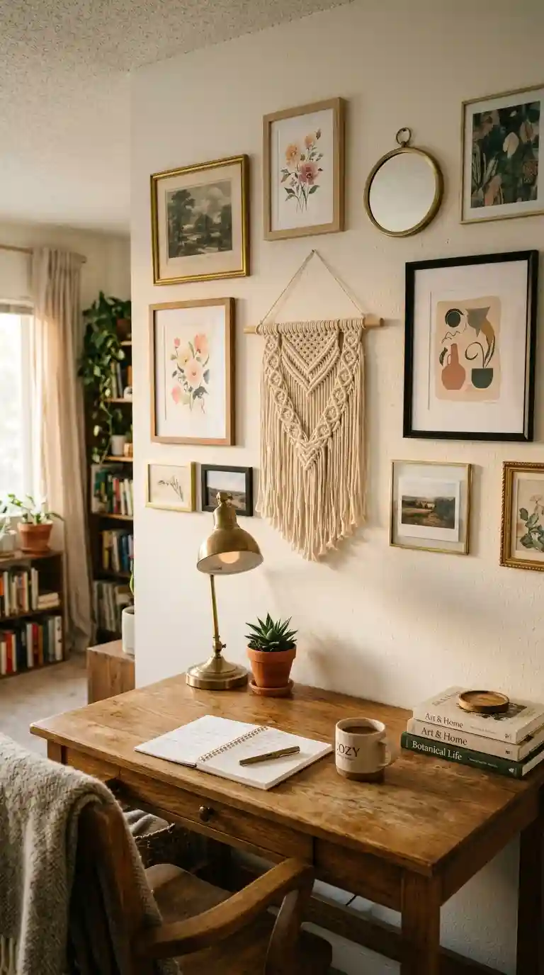
Every gallery wall layout project I take on starts with a conversation about what the client actually wants the wall to say, since a gallery wall layout genuinely tells a bit of a story, whether that story is about family, travel, a specific art collection, or simply an appreciation for a particular color palette or style.
I remember working with a client who had been putting off her gallery wall layout for nearly two years, terrified of committing to nail holes she might regret. We spent an entire afternoon laying paper templates on her living room floor, testing different arrangements before ever taping anything to the actual wall. What eventually went up was an asymmetrical gallery wall layout mixing three different frame finishes, all loosely built around a family photo she had been wanting to display for years. She told me afterward that the planning process alone had removed almost all of her anxiety about getting it wrong, because by the time we actually picked up a hammer, we already knew exactly where every single piece belonged.
I have also worked on staircase gallery wall layout projects, which come with their own particular challenge of following a diagonal line while still maintaining consistent spacing between each frame. These projects genuinely reward patience, since even a small miscalculation in spacing becomes noticeably obvious once you are standing at the bottom of the stairs looking up at the entire arrangement.
What I have learned across every gallery wall layout I have helped plan is that the single biggest factor separating a successful result from a disappointing one is almost never the quality or beauty of the individual art pieces. It comes down to the planning process itself, the willingness to test an arrangement with paper and tape before committing, and a genuine attention to consistent spacing throughout the entire composition.
Common Mistakes That Undermine a Good Gallery Wall Layout
After planning so many of these projects, certain mistakes come up again and again, quietly undoing an otherwise promising gallery wall layout.
Skipping the planning stage entirely and hanging frames directly onto the wall without any paper template testing beforehand is probably the most common and most costly mistake, often leading to a frustrating cycle of unnecessary nail holes and constant readjustment.
Inconsistent spacing between frames is another frequent issue, and even a relatively small variation becomes surprisingly noticeable once an entire gallery wall layout is actually hanging and being viewed from across the room.
Hanging a gallery wall layout too high on the wall, ignoring the standard eye level guideline, is a mistake I see constantly, resulting in an arrangement that feels disconnected from the furniture and general sightlines within the room.
Overcrowding the composition, filling far more than the recommended third of the wall with artwork, can push an otherwise nice gallery wall layout toward feeling chaotic and overwhelming rather than curated and intentional.
Mixing too many unrelated frame styles and colors without any unifying element, whether that is a shared tonal palette, a consistent frame finish, or a cohesive subject matter across the art itself, often results in a gallery wall layout that reads as accidental rather than genuinely collected.
Related Post : 45 Genius Apartment Wall Decor Ideas That Instantly Make Rented Rooms Feel Like Home
Budget Friendly Gallery Wall Layout Ideas
You do not need an expensive art collection or a large budget to create a genuinely striking gallery wall layout. Some of the most compelling arrangements I have seen relied more on thoughtful curation than significant spending.
Mixing in personal photographs alongside a small number of purchased prints allows you to fill out a gallery wall layout meaningfully without needing to buy an entire collection of expensive framed art all at once.
Secondhand and thrifted frames, even in mismatched styles, can be unified through a coat of matching spray paint, creating a cohesive frame finish across an entire gallery wall layout for a fraction of the cost of buying new matching frames.
Printing your own photography or art at home or through an affordable online printing service, rather than purchasing pre framed pieces from a retailer, meaningfully reduces the overall cost of building out a larger gallery wall layout.
Templated gallery wall kits, which have become increasingly popular and widely available, offer a genuinely low effort, low cost way to achieve a professionally balanced gallery wall layout without needing to do all of the spacing and planning calculations yourself from scratch.
Starting small and adding to your gallery wall layout gradually over time, rather than attempting to complete the entire arrangement in a single weekend, spreads out the cost naturally while also building that genuinely collected, lived in feeling that so many current gallery wall layout trends are actively chasing.
Maintaining and Updating Your Gallery Wall Layout Over Time
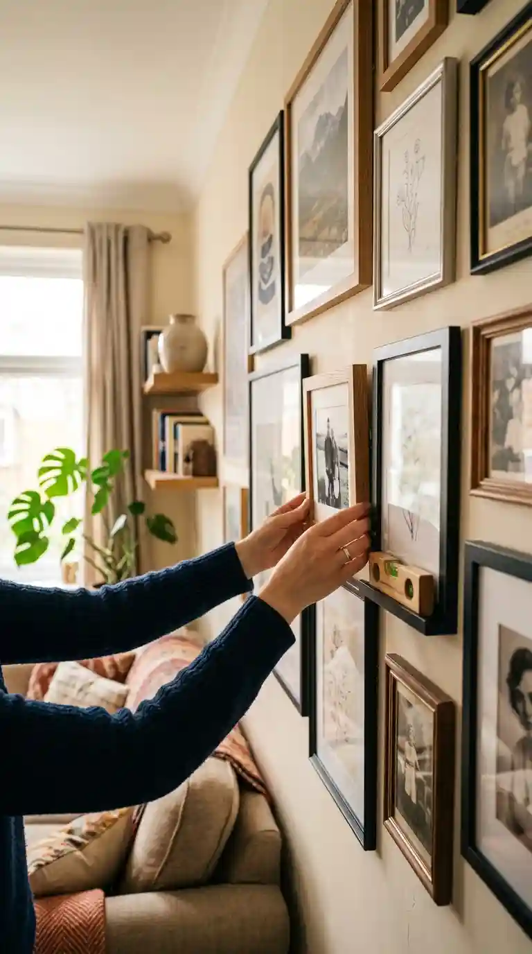
Once your gallery wall layout is up and looking great, a bit of ongoing attention keeps it feeling fresh and properly maintained for years to come.
Check your frames periodically for levelness, since normal household activity, from foot traffic to simply closing a door with a bit too much force, can gradually shift frames out of alignment over time without anyone immediately noticing.
Dust your frames and glass regularly, since a gallery wall layout accumulates the same dust as any other surface in your home, and a quick regular wipe down keeps the entire arrangement looking crisp rather than visibly neglected.
Rotate seasonal photographs or swap in new pieces periodically if your gallery wall layout includes family photos or a rotating art collection, keeping the same frames and overall structure in place while refreshing the actual content inside every so often.
Reassess your gallery wall layout every couple of years as your taste evolves or your art collection grows, since even a well planned arrangement can benefit from the occasional adjustment as your home and preferences naturally change over time.
FAQ About Gallery Wall Layout Ideas
What is the best height for a gallery wall layout?
The general guideline places the visual center of a gallery wall layout around fifty seven to sixty inches from the floor, which matches average eye level and is the same standard used in museum art installations.
How much space should be between frames in a gallery wall layout?
Most designers recommend keeping a consistent gap of two to three inches between frames throughout a gallery wall layout, since this spacing feels cohesive while still giving each piece enough breathing room.
How do I plan a gallery wall layout without making extra holes in the wall?
Trace your frames onto paper, cut out the shapes, and arrange them on the floor first, then tape the paper templates directly to the wall to test the full gallery wall layout before hanging anything permanently.
Should a gallery wall layout be symmetrical or asymmetrical?
Both approaches work well depending on your style. Symmetrical layouts suit more formal or structured rooms, while asymmetrical layouts feel more relaxed and collected, often working better in casual or eclectic spaces.
How big should a gallery wall layout be above a sofa?
A widely used guideline suggests your gallery wall layout should span roughly two thirds of the width of the sofa or furniture beneath it, creating a balanced proportional relationship between the art and the furniture.
What frames work best for a gallery wall layout?
Matching frames create the most cohesive, orderly look, while frames within a shared tonal family offer variety with cohesion, and fully eclectic mixed frames suit a more collected, personal gallery wall layout.
How many pictures should be in a gallery wall layout?
This varies by space and preference, but a common structure uses three, five, or seven pieces arranged around a central anchor, with smaller rooms generally suited to fewer frames than larger open walls.
Can I create a gallery wall layout without hanging anything permanently
Yes, leaning frames against the wall on a mantle, console, or shelf at varying overlapping heights creates a low commitment gallery wall layout that works particularly well for renters or anyone wanting flexibility.
What is the two thirds rule for a gallery wall layout?
This guideline suggests keeping roughly two thirds of the wall empty and using the remaining third for your actual gallery wall layout, creating a calmer, more curated feeling than an overly packed arrangement.
How do I choose an anchor piece for my gallery wall layout?
Choose your largest or most visually significant piece as the anchor, placing it slightly off center at eye level, then build the rest of your gallery wall layout outward from that central point.
What is the best gallery wall layout for a staircase?
A diagonal layout that follows the slope of the staircase, maintaining consistent spacing between each frame as it ascends or descends, tends to work best for this particular architectural feature
Final Thoughts on Gallery Wall Layout Ideas
A gallery wall layout has genuine power to transform a plain, forgettable wall into one of the most personal, conversation starting features in an entire home. The difference between a gallery wall layout that feels effortlessly curated and one that feels rushed and chaotic almost always comes down to patience during the planning stage, not talent or an expensive art collection.
Take the time to test your arrangement with paper templates before committing to anything permanent, keep your spacing consistent throughout the entire composition, and choose a structure, whether symmetrical or organic, that genuinely fits both your space and your personal style.
Whatever direction you take, the best gallery wall layouts are the ones that feel like an honest reflection of the person living with them, built with a bit of care and a willingness to step back, adjust, and get it right before reaching for the hammer.





One comment on “Gallery Wall Layout Ideas: The Ultimate Guide to a Wall People Actually Stop and Look At”