

Orange is the colour most people are afraid of and most pleased with once it is up — but only when the shade is right. A litre of sample paint costs £4 to £6, a cushion cover £12 to £25, and either one will tell you within a week whether orange belongs in your home. This guide is about using the warmest colour on the wheel without letting it take over: which shades work, where to put them, what to pair them with, and the mistakes that make rooms feel smaller and louder than intended.
Which orange should I actually choose?
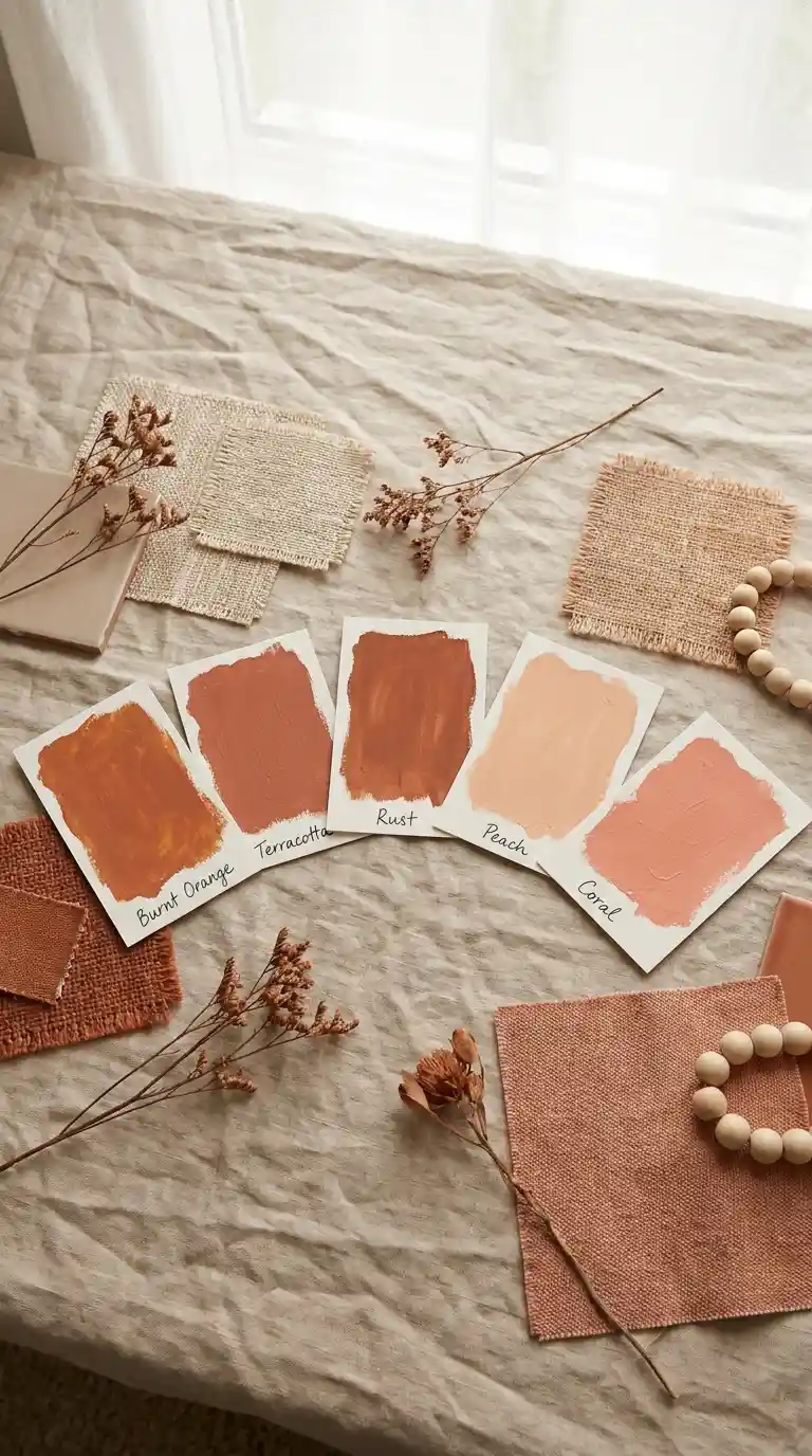
Start here, because nine out of ten orange regrets are shade regrets. The family splits into five useful members, shown on the cards above. Burnt orange is deep and brown-toned — the current favourite for living rooms. Terracotta is earthier and slightly pink, like clay pots. Rust sits between the two with an autumnal feel. Peach is the softest, almost pastel, and coral brings a fresh pink undertone. For a first attempt, terracotta is the safest: it reads as warm and natural in almost any light, while a bright tangerine can look electric under cool LEDs.
A practical test that costs nothing: hold the sample card against a white sheet of paper in daylight. If the orange looks harmonious next to white, it will behave in your room. If it vibrates or looks neon, step one shade deeper and one step more muted. Most paint brands now sell 100ml testers for £4 to £6 — buy three adjacent shades, not one, because the middle one is rarely the winner.
Where does orange earn its place?
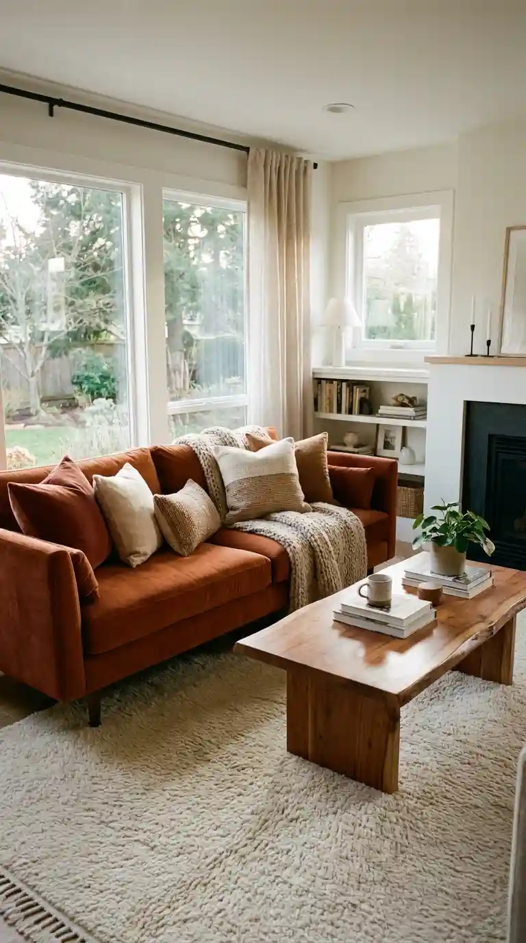
Living rooms first. Orange is a social colour — it raises energy and encourages conversation — which is exactly what you want where people gather. The room above shows the classic move: one burnt orange sofa doing the heavy lifting, with everything else (cream walls, wooden coffee table, bookshelves) staying quiet. A single large orange piece reads as confident; ten small orange bits read as clutter. If a full sofa feels like too much commitment, our pink and orange living room ideas show how the colour behaves in softer combinations.
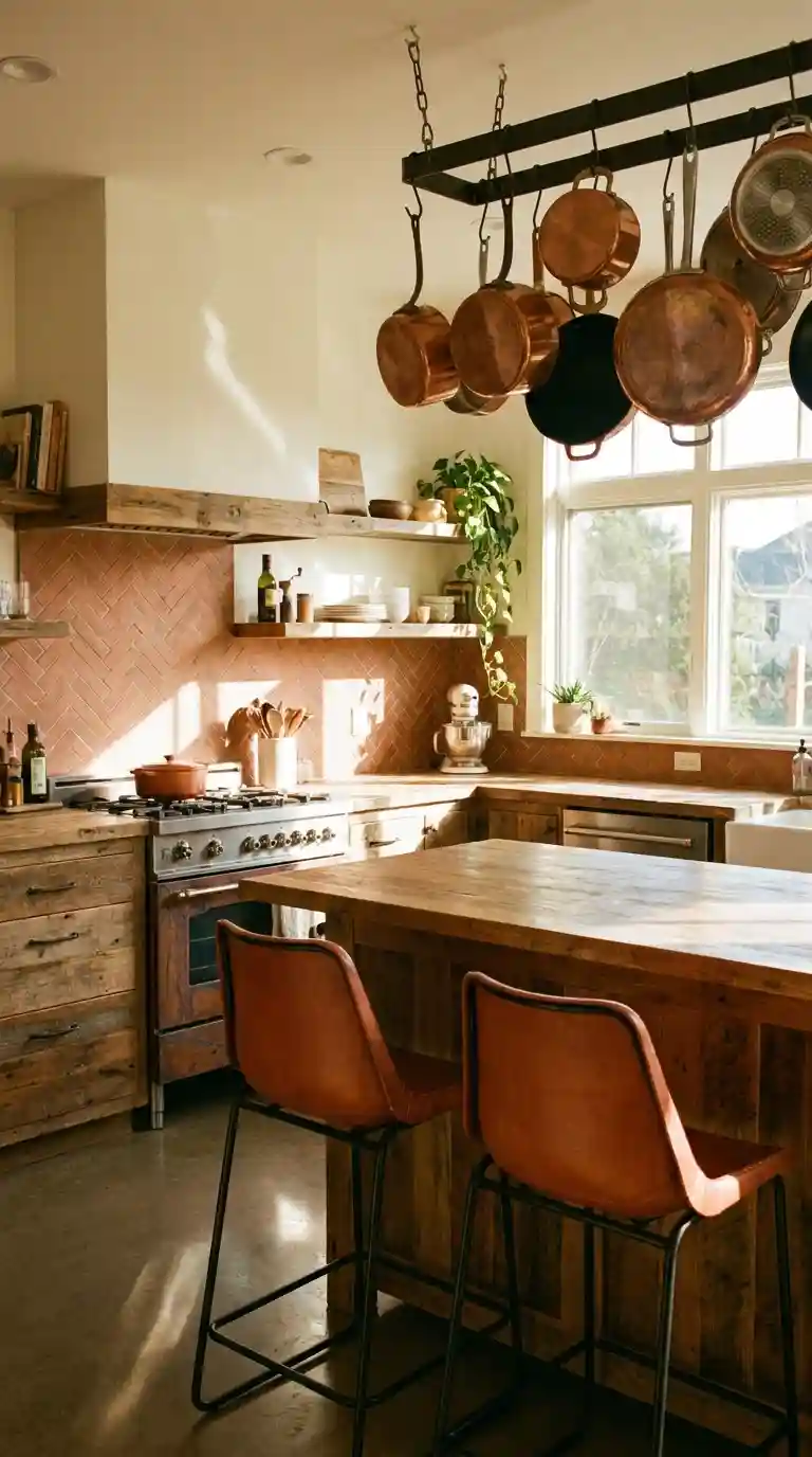
Kitchens come second. Terracotta tiles, copper pots and warm wood are a natural trio — the rustic kitchen in the photo below proves it. Orange also stimulates appetite, which is why it appears in so many restaurant interiors; a dining corner with rust-coloured chairs or a terracotta pendant will make weeknight dinners feel warmer. Bedrooms need more care, which deserves its own section.
Isn’t orange too stimulating for a bedroom?
Bright orange, yes. Muted orange, no — and the distinction matters. Sleep researchers consistently find that saturated, high-energy colours hinder rest, but soft peach, apricot and washed terracotta have the opposite reputation: warm, cocooning, calm. The rule for bedrooms is simple: keep orange below 30% of the room’s visual weight, and keep it muted.
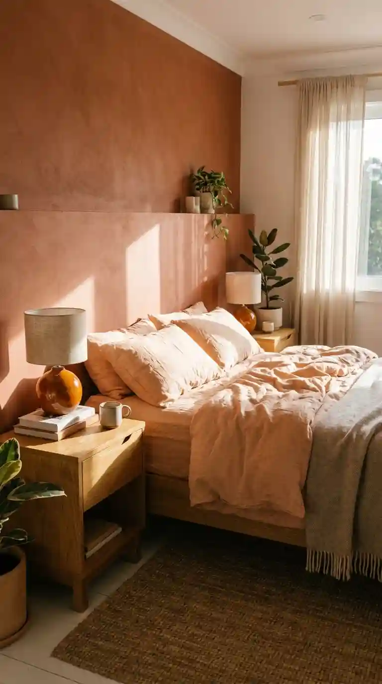
The bedroom above is the template: a terracotta plaster feature wall behind the bed, peach bedding, and small orange ceramic lamps on the nightstands. Everything else — sheer curtains, wooden furniture, plants — is neutral. Notice what is missing: no orange on all four walls, no neon, no competing patterns. Most people find this level of orange genuinely restful, because the warmth reads as candlelight rather than alarm.
How do I use orange without repainting anything?
Textiles and accessories are the low-commitment route, and they are where most successful orange rooms start. A pair of rust-coloured cushion covers (£12 to £25 each) on a neutral sofa, a terracotta throw at the foot of the bed, a set of amber glass vases on a shelf — each one is reversible in seconds. Metallics count too: copper, brass and aged bronze all share orange’s warm undertones, so a copper pendant or brass lamp base extends the palette without adding a single new colour.
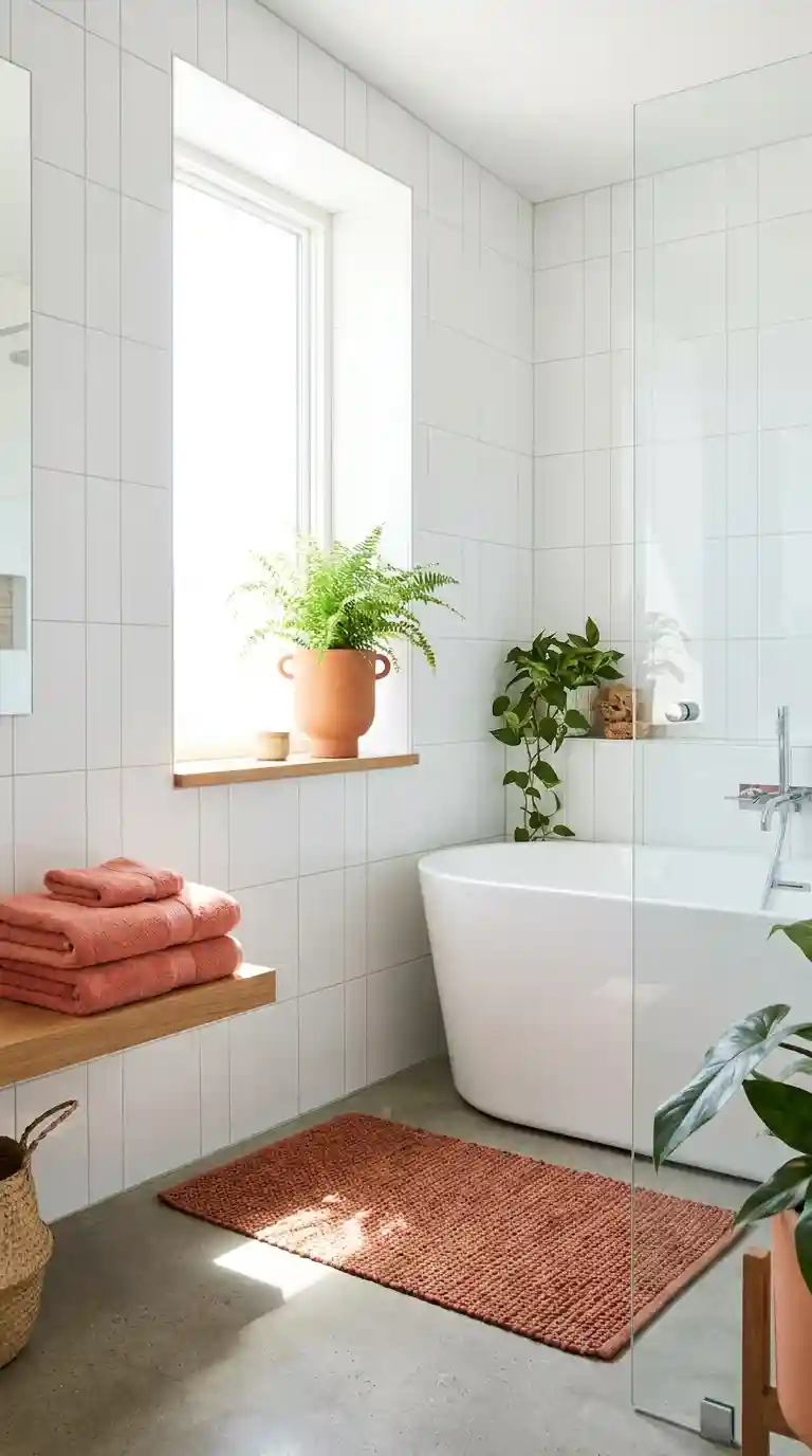
Bathrooms are the perfect small-dose laboratory. The bright bathroom above uses a terracotta bath mat and folded orange towels against white tile — perhaps £40 of textiles total — and the room feels transformed. Because bathrooms are small and mostly white, even a little orange goes a long way. If you love it there, you will love it bigger; if not, the towels go back in the cupboard.
Which colours actually go with orange?
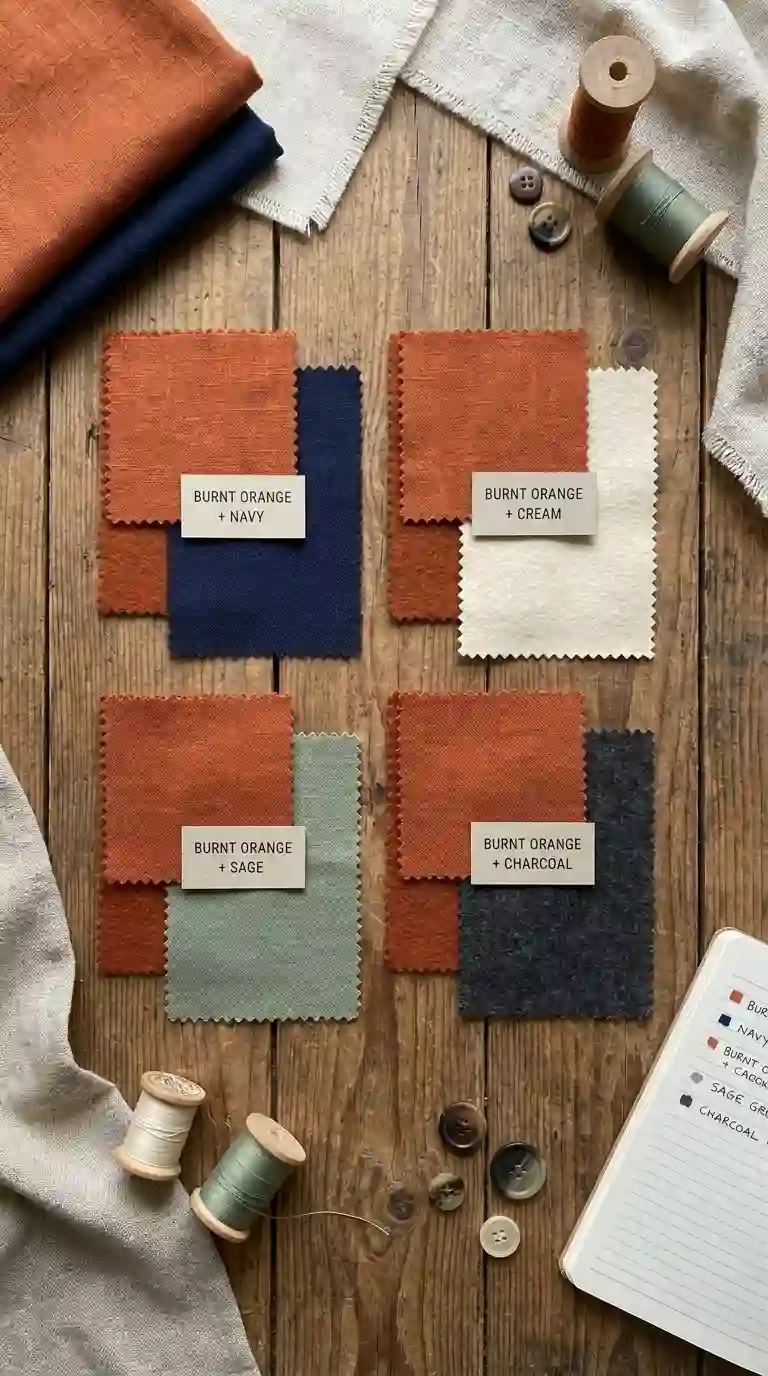
Four pairings cover nearly every successful orange room, shown in the swatches above. Cream is the safest — it lets orange breathe without competing, and it keeps the room light. Navy is the boldest: the two sit opposite on the colour wheel, so the contrast is electric but harmonious. Sage green gives an earthy, natural palette that feels very current. Charcoal grey creates a sophisticated, moody backdrop that makes burnt orange glow. A common approach is the 60-30-10 rule: 60% neutral (cream or white), 30% secondary (navy, sage or wood), 10% orange.
One combination deserves a special mention: terracotta and green is a pairing with real staying power, as our terracotta and green living room guide explores in depth. And if your taste runs to paler neutrals generally, the principles in our ivory living room ideas show how to keep a warm palette calm.
Can orange work in a small or dark room?
Yes, with discipline. In a small room, use orange as an accent (under 10% of what you see), choose lighter shades like peach or coral, and put the colour where the eye travels vertically — tall curtains, a floor lamp with an amber shade, a tall vase. Vertical placement draws the eye up and makes ceilings feel higher, which counteracts the enclosing effect of a warm colour.
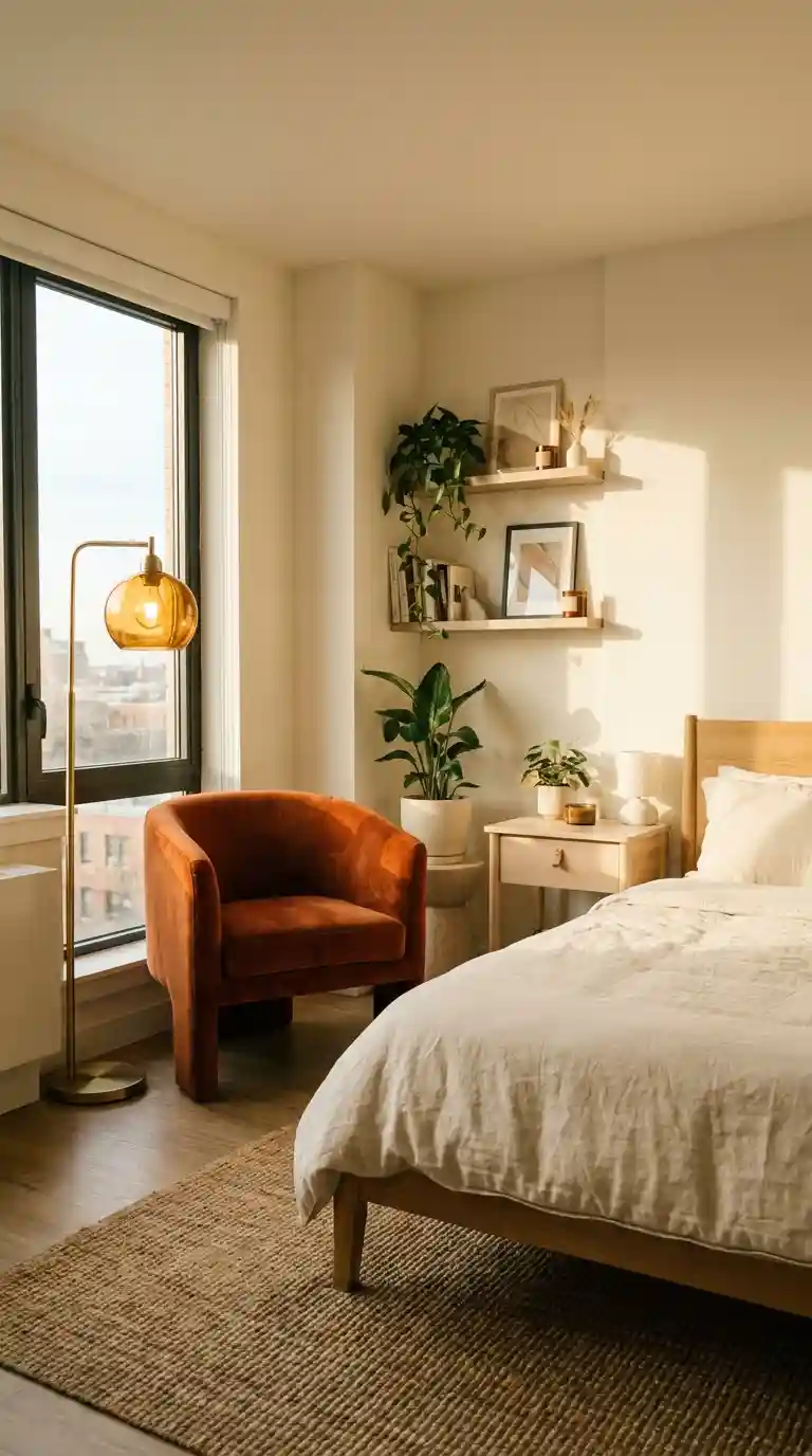
The bedroom above demonstrates it: a burnt orange velvet armchair and a tall amber-shaded lamp create two vertical orange moments in an otherwise cream room. The colour never touches the walls, so the room feels no smaller — just warmer. In dark rooms, the same logic applies, but lean towards peach and apricot rather than burnt orange; deep shades absorb the little light available, while lighter ones bounce it.
What are the mistakes that make orange go wrong?
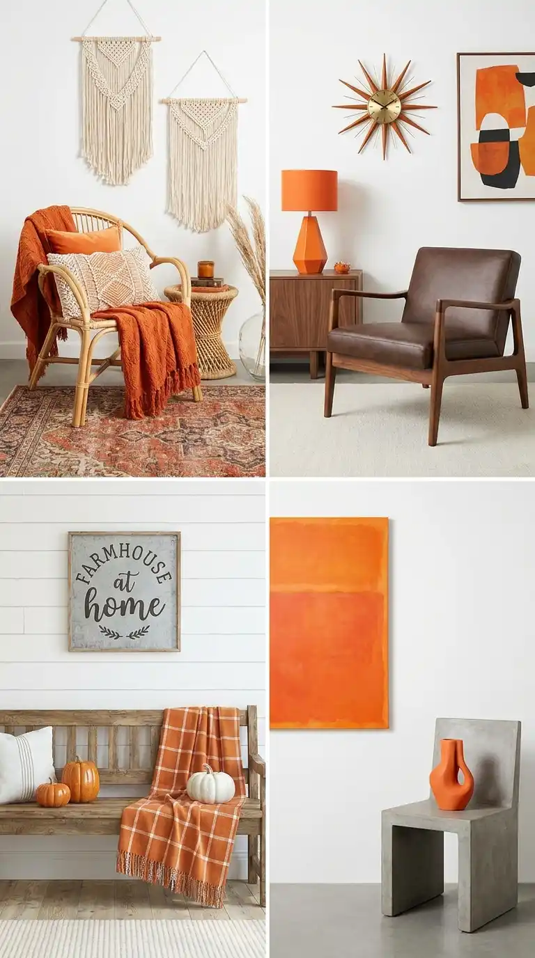
Four mistakes account for most orange disasters. First, choosing a shade that is too bright — the neon tangerine that looked fun on the paint chip and looks frantic on four walls. Second, using orange without neutral balance; every successful orange room in the collage above is at least 60% neutral. Third, ignoring undertones: mixing a red-leaning orange with a yellow-leaning one makes both look wrong, so check new purchases against what you own. Fourth, ignoring the light — the same terracotta reads cosy in a south-facing room and muddy in a north-facing one, so always test in situ.
The collage also shows orange’s range: boho, mid-century, farmhouse and minimalist rooms can all carry it. The through-line is restraint — one orange hero per room, neutrals everywhere else. For broader lessons on mixing bold colour well, our colourful home decor guide covers the same balancing act across the whole palette.
How do I test orange before committing?
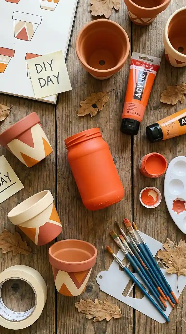
Because orange is such a strong colour, testing is non-negotiable. For paint, buy sample pots (£4 to £6) and paint A3 boards, not the wall — move the boards around the room for three to five days, checking morning, afternoon and lamplight. For textiles, order swatches and live with them for a week; most fabric retailers send them free or for a few pounds. A cheaper trial still: paint a terracotta plant pot, as the DIY flat-lay above suggests — a £3 pot and leftover paint tells you whether you enjoy living with the colour.
Pay attention to the 48-hour rule: if you still like the sample after two full days of glancing at it, it is a keeper. If you are tired of it by day three, imagine year three. Most people find their final choice is one shade deeper and one step more muted than their first instinct — the testers exist to teach you that cheaply.
Your orange decor questions, answered
What colour goes best with orange?
Cream for safety, navy for drama, sage green for an earthy feel, charcoal for sophistication. Start with cream if you are unsure — it flatters every shade of orange.
Does orange make a room look smaller?
Dark, saturated orange on large surfaces can, yes. Lighter shades like peach and coral, used as accents, do not — and vertical placement can actually make a room feel taller.
Can I use orange in a bedroom?
Absolutely, in muted forms: peach bedding, a terracotta feature wall, small ceramic lamps. Keep it under 30% of the room and avoid anything neon near the bed.
How do I add orange without repainting?
Textiles first: cushion covers, throws, towels, a rug. Then accessories: vases, candles, plant pots, artwork. All of it is reversible in an afternoon.
What is the difference between terracotta and burnt orange?
Terracotta is earthier with a pink-clay undertone; burnt orange is deeper, browner and slightly more dramatic. Terracotta is the safer first choice; burnt orange makes the stronger statement.
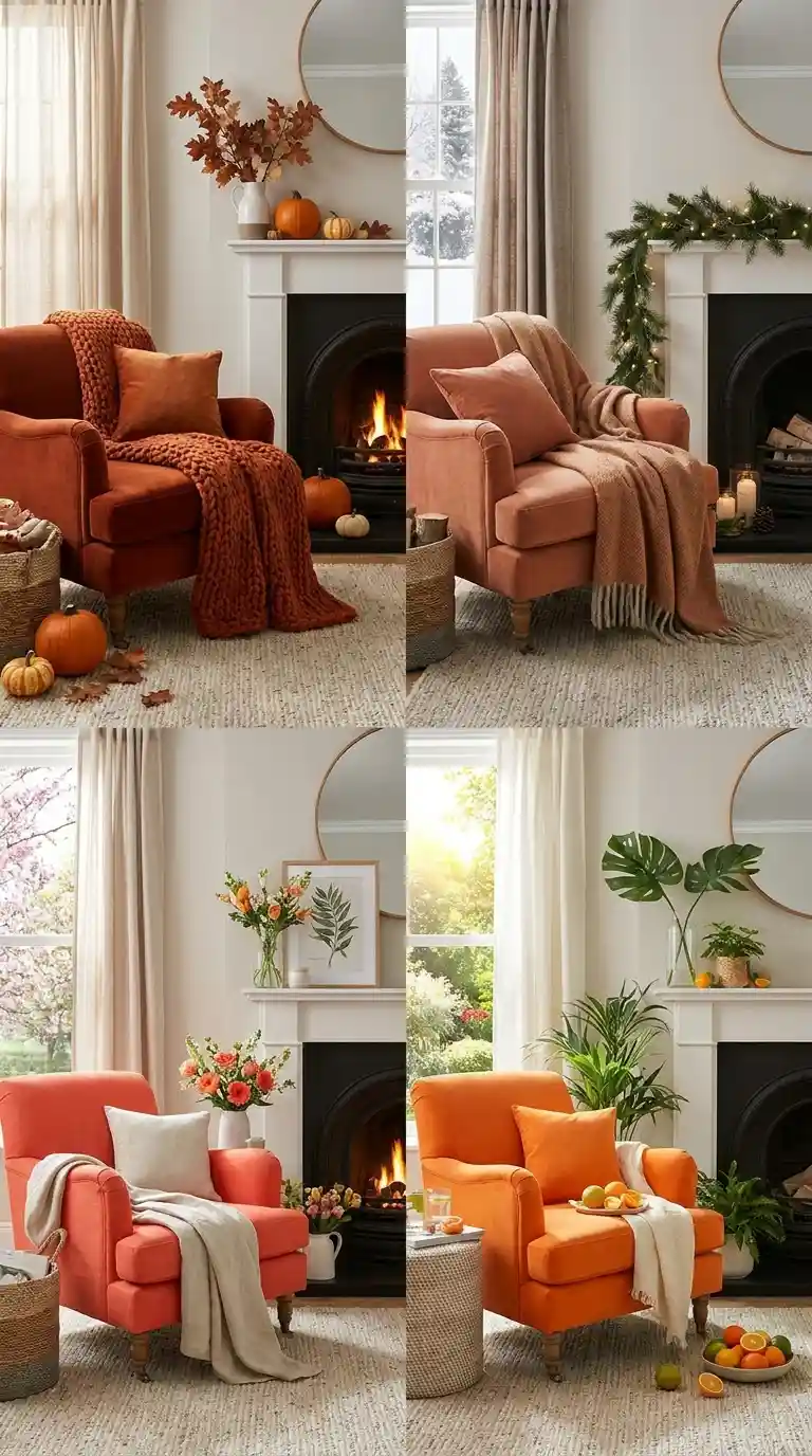
One last thought: orange is the easiest colour to rotate with the seasons. The collage above shows the same armchair styled four ways — pumpkins for autumn, garland for winter, fresh flowers for spring, tropical plants for summer. A couple of cushion covers and a throw, swapped quarterly for under £50, keeps the colour feeling intentional all year rather than like a phase you are stuck with.





One comment on “Decorating with Orange: The Warmest Colour Done Right, Without Overdoing It”