
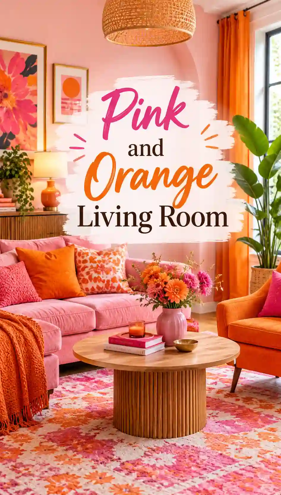
Pink and orange. Say it out loud and it already sounds like a sunset, a bowl of grapefruit, a market stall piled with marigolds and bougainvillea. For a long time, decorating rules told us to keep these two colours apart, as if they were rival siblings who could never share a room. Then designers, fashion houses and ordinary homeowners quietly proved the rulebook wrong.
A well-planned pink and orange living room feels warm, generous and a little bit joyful in a way that grey and beige simply cannot manage. It is the kind of room people walk into and immediately smile at. But here is the honest part: it is also one of the easiest colour schemes to get wrong. Pick the wrong pink next to the wrong orange and you end up with a space that feels like a sugary dessert shop at closing time.

This guide is here to stop that from happening. We will walk through the shades that actually work together, how to divide the colours so the room feels balanced, how daylight changes everything, and how to choose walls, sofas, rugs, cushions, lighting and art. We will also look at different decorating styles, small-room and renter-friendly tricks, a rough budget breakdown, the mistakes to avoid, and a set of frequently asked questions at the end.
Whether you are repainting a whole room or just thinking about a couple of cushions, you will leave with a plan you can really follow.
Read Also : 45 Gorgeous Pink Living Room Ideas That Will Completely Transform Your Space
Why Pink and Orange Work So Well Together in a Living Room
The short answer is that they are neighbours. On the colour wheel, pink is simply a lighter, softer version of red, and orange sits right next to red. That makes the pair what designers call analogous colours: shades that share a common ancestor, so they naturally feel related instead of fighting for attention.
Think about a real sunset. The sky does not give you pink or orange on their own. It gives you a slow melting gradient from peach to coral to rose, and our eyes find that deeply comforting. A pink and orange living room borrows that same logic. When you choose shades that share warmth, the room reads as one calm, glowing picture rather than two competing colours.
There is also a mood benefit. Orange is associated with energy, conversation and appetite, which is why it appears so often in kitchens and dining spaces. Pink brings softness, nostalgia and a sense of care. Put them together in a living room, the place where you talk, relax and entertain, and you get energy balanced by comfort. It is a social colour scheme, which is exactly what a living room should be.
There is a practical reason it works too. Most living rooms include wood, brass, cream fabrics and green plants. Every one of those things already sits comfortably with warm pinks and oranges. You are not forcing a strange palette onto your space; you are turning up the volume on warmth that is probably already there.
The catch is that pink and orange share a lot of intensity, so they need a referee. That referee is usually a neutral, a bit of green, or a carefully chosen ratio, all of which we cover below.
Know Your Shades: The Pink and Orange Families

When people say they want a pink and orange living room, they could mean fifty completely different rooms. A soft peach and blush space is nothing like a hot pink and tangerine one. Before you buy a single thing, it helps to understand the two colour families and what each shade does.
The pink family
- Blush pink: A pale, slightly warm pink. It acts almost like a neutral and makes a lovely wall colour, especially in rooms that need a gentle glow.
- Dusty rose: A greyed, muted pink with a vintage feel. It is sophisticated and works beautifully with terracotta and rust.
- Salmon and coral-pink: Pinks with a visible orange undertone. These are the easiest to blend with orange because they already lean in that direction.
- Bubblegum and candy pink: Bright, playful and cool-leaning. Lovely in small doses, but they can feel sweet fast.
- Hot pink and fuchsia: Saturated, confident and dramatic. These are statement shades for cushions, art, armchairs or a single bold sofa.
- Magenta: A deep, purple-leaning pink. It looks rich beside deep orange and gives a more luxurious, jewel-toned feel.
The orange family
- Peach and apricot: Soft, light and friendly. These pair almost effortlessly with blush and dusty rose.
- Terracotta: An earthy, clay-like orange-brown. It is the most grown-up orange and the safest choice for large surfaces.
- Burnt orange and rust: Deep, autumnal and cosy. They anchor pinks beautifully and photograph well.
- Tangerine and bright orange: Fresh, loud and full of energy. Use them as accents, or commit fully if you are feeling brave.
- Amber and marigold: Golden oranges that lean towards yellow. They bring sunshine and sit well with wood and brass.
Pairings that work, and why
| Pink | Orange | The result |
|---|---|---|
| Blush | Peach or apricot | Soft, romantic, calm and airy |
| Dusty rose | Terracotta | Earthy, warm, sophisticated |
| Coral-pink | Burnt orange | Cosy, sunset-like and rich |
| Hot pink or fuchsia | Tangerine | Bold, playful and high-energy |
| Magenta | Rust | Dramatic, jewel-toned and luxe |
| Bubblegum | Marigold | Retro, cheerful and fun |
The golden rule hiding in that table: match the intensity. Soft goes with soft, deep goes with deep, bright goes with bright. A pale blush next to a screaming neon orange will almost always look off, because one colour overpowers the other. Choose a pair from the same row and you are already most of the way to a successful room.
The 60-30-10 Rule for a Pink and Orange Living Room
If you take only one idea from this article, take this one. The 60-30-10 rule is a simple designer shortcut for dividing colour so a room feels balanced instead of chaotic. It works especially well when you are using two strong colours.
- 60% is your dominant colour. This is usually the walls, the large rug and the biggest pieces of furniture. In a pink and orange living room, this is often a neutral, a soft blush, or a pale peach.
- 30% is your secondary colour. This is the sofa, curtains, an accent wall or armchairs. It supports the dominant colour without competing with it.
- 10% is your accent. This is cushions, throws, art, vases, lamps and small objects. It is where your boldest colour gets to show off.
Here are three ways to apply it.
Version one: the gentle blush room. 60% warm white or soft blush walls and cream upholstery, 30% dusty rose curtains and an armchair, 10% terracotta and burnt orange cushions, vases and a throw. The result is calm with a warm heartbeat.
Version two: the terracotta-led room. 60% neutral cream and natural wood, 30% terracotta sofa or accent wall, 10% hot pink cushions, a pink lamp and a bold piece of art. The pink feels like a surprise that makes people smile.
Version three: the maximalist sunset. 60% mixed warm pinks across walls and rug, 30% orange velvet sofa, 10% tangerine, magenta and gold accents scattered everywhere. This is the loudest option, and it only works because the ratios are still holding the room together.
Notice what these three have in common: one colour always leads. If pink and orange each take exactly half the room, they compete. When one is clearly the lead and the other is the supporting act, the eye knows where to rest.
A small trick to make this easier: repeat each colour at least three times in different parts of the room. If you have an orange cushion on the sofa, put an orange vase on the shelf and an orange thread in the rug. Repetition is what turns a collection of coloured objects into a deliberate scheme.
Start With Light: How Daylight Changes Pink and Orange
Before you commit to a paint colour, spend a day watching your living room. Light changes pink and orange more dramatically than almost any other colours, and what looks perfect in the shop can look completely different on your wall.
North-facing rooms get cooler, bluer light. Cool light can make pinks look slightly grey or lilac and oranges look flat. Choose warm shades here, such as peachy pinks, salmon and terracotta, to bring warmth back into the room.
South-facing rooms get warm, strong light for most of the day. Almost any pink and orange will glow here, and you have the freedom to use cooler pinks and deeper tones without the room feeling cold.
East-facing rooms are bright and golden in the morning and cooler in the afternoon. They suit rooms you mostly use early in the day. Soft peach and apricot look beautiful at breakfast time.
West-facing rooms are dull in the morning and glow dramatically at sunset. Terracotta and burnt orange come alive in that evening light, and it can feel like the room is lit from inside.
A few practical steps will save you from expensive mistakes:
- Buy sample pots and paint large squares, at least a metre wide, on two different walls.
- Look at them in morning light, midday light and at night under your lamps.
- Check them next to your actual sofa, floor and curtains, not in isolation.
- Live with them for at least two days before deciding.
Artificial light matters too. Warm white bulbs flatter pink and orange and make a room feel like a hug. Cold white bulbs make the same colours look harsh and slightly clinical. We come back to this in the lighting section.
Must Read : 50 Brilliant Living Room Layout Ideas That Will Instantly Transform The Way You Live
Walls: Painting a Pink and Orange Living Room

Walls are the biggest surface in the room, so this is where you make the biggest decision. You have more choices than you might think, and not all of them involve painting every wall.
Option 1: Soft pink walls with orange furniture and accents
This is the most forgiving route. A pale blush, peach-pink or dusty rose on the walls creates a gentle backdrop, and orange pieces such as a rust armchair, a terracotta pouf or burnt orange curtains give the room its personality. Because the walls are quiet, the orange can be as bold as you like.
A peachy pink works especially well here. Adding a hint of orange to a pale pink shifts it away from sugary territory and towards a more elegant, sunset-like tone. It is a small adjustment that makes a very large difference.
Option 2: Warm orange or terracotta walls with pink accents
If you love colour and have a room with good light, terracotta walls are a wonderful choice. The clay tone feels natural, grounded and sophisticated. Bring in pink through a blush sofa, rose velvet cushions or a hot pink piece of art, and the room feels like a warm desert evening.
Terracotta also hides the common problem of orange looking too loud. Because it is brownish, it behaves almost like a neutral, which gives the pink room to shine.
Option 3: One accent wall
Not ready to commit to a whole room? Paint a single wall, usually the one behind the sofa or the fireplace wall, in your boldest shade. A deep coral or burnt orange accent wall against soft pink or cream walls gives you the full effect without overwhelming a smaller room. Keep the other three walls pale and warm so the accent wall feels like a feature, not a mistake.
Option 4: Colour-drenching
Colour-drenching means painting the walls, skirting boards, doors and sometimes even the ceiling in the same colour. In a pink and orange living room, a drenched dusty rose or terracotta room can feel incredibly cosy and modern. It is a confident choice that suits rooms with plenty of natural light, and it works best when you add contrast through furniture, wood and art.
Option 5: Wallpaper and murals
If painting feels too plain, a pink and orange wallpaper can do the heavy lifting. Floral prints, abstract brush strokes, retro geometrics and painterly patterns all work well. Choose a design where both colours appear with a neutral, such as cream or soft grey, so the pattern feels balanced and the colours do not shout.
A smart way to use wallpaper in a living room is on a single feature wall, in the alcoves of a fireplace, or on the ceiling for an unexpected surprise.
A note on finish
Matt and eggshell finishes make pink and orange feel soft and velvety, and they hide wall imperfections. Glossier finishes reflect more light and make colours feel brighter but show every bump. For a living room, a matt or eggshell on the walls and a satin finish on woodwork is a reliable combination.
Choosing a Sofa for Your Pink and Orange Living Room

The sofa is the heart of any living room, and it is also the biggest single purchase. It makes sense to think carefully before you decide whether it should carry colour or stay quiet.
The neutral sofa approach
A cream, white, oatmeal or light grey sofa is the safest base for a pink and orange room. It lets the colour come from cushions, rugs and walls, which means you can change the look cheaply whenever you want. If you are unsure about the scheme, this is the route to take. A curved white sofa with pink and coral cushions is a particularly popular look and feels both modern and soft.
The pink sofa
A pink sofa is a bold, fashionable choice, and it is easier to live with than people expect. The trick is to choose the right shade. A dusty or blush pink feels grown-up and works with almost any style. A deeper pink or rose velvet feels luxurious. A bubblegum or hot pink sofa makes a loud, playful statement, so build the rest of the room around it with calmer elements.
Pair a pink sofa with orange through cushions, a throw, a rug or an armchair. A rust or terracotta armchair next to a blush sofa is one of the most reliable combinations you can create.
The orange sofa
An orange sofa is rarer, and it is a real statement. Burnt orange and rust velvet are the easiest to live with because they feel rich and slightly retro. A bright tangerine sofa is a confident choice best suited to a room with plenty of white and natural wood. Softer pink walls and pale pink cushions stop an orange sofa from feeling overwhelming.
Mixing pink and orange seating
A pink sofa with an orange armchair, or an orange sofa with two pink chairs, creates a sociable, layered feel. It works best when the two pieces are different in shape or texture, for example a smooth velvet sofa with a textured bouclé chair, so they feel chosen rather than matched.
Fabric matters
Velvet makes both colours look deep and luxurious. Bouclé and linen bring a softer, more relaxed feel. Leather in tan or caramel looks wonderful with blush pink walls and gives the room a vintage, library-like warmth. If you have children or pets, performance velvet or a washable cover will save you a great deal of worry.
Must Read : 45 Breathtaking Dark Blue Living Room Ideas That Turn Any Space Into A Cozy Retreat
Rugs: The Easiest Way to Bring Pink and Orange Together

If you want the most impact for the least risk, start with a rug. A good rug anchors the seating area, adds pattern and pulls the two colours into one picture. It is also a smart way to test whether you love the scheme before you paint anything.
Look for rugs where pink and orange appear together, such as stripes, abstract patterns, vintage-inspired Persian and Turkish designs, or modern geometric prints. A vintage-style rug in faded rose and burnt orange adds history and instantly softens bold furniture. A large striped or colour-blocked rug in bright pink and orange becomes the centre of a modern room.
A few tips for choosing well:
- Go big. The front legs of your sofa and armchairs should sit on the rug. A rug that is too small makes the room feel disconnected.
- Check the other colours. Look for a rug with cream, black or soft grey in the pattern so it works with a neutral sofa.
- Match the intensity. If your walls are soft, a bolder rug adds interest. If your walls are bold, choose a calmer rug.
- Think about wear. Wool wears well and hides marks. Cotton and viscose can look beautiful but are harder to clean.
If you already own a rug you love in a neutral shade, you can still layer a smaller pink or orange sheepskin, runner or rug on top for a relaxed, collected look.
Cushions, Throws and Textiles: Where the Colour Really Lives
Textiles are the most flexible part of your colour scheme. They are cheap to change, easy to experiment with and powerful enough to transform a room in an afternoon. If you are nervous about committing to this palette, begin here.
Building a cushion mix
A good cushion arrangement uses a mix of colours, patterns and textures. For a pink and orange room, try a combination like this on a neutral sofa:
- Two larger cushions in a solid colour, for example blush and terracotta
- Two medium cushions in a pattern that includes both colours
- One small, textured cushion in a contrasting shade, such as burgundy, cream or deep green
Vary the textures. Velvet, linen, bouclé and knit all catch the light in different ways, so the arrangement feels rich rather than flat. A touch of geometric black and white also gives the eye a place to rest between the colours.
Curtains
Curtains are the second largest textile surface in the room. Sheer white or cream curtains let light in and keep the room feeling fresh. If you want to add colour, choose a soft pink, peach or terracotta linen. Hang them high and wide, close to the ceiling, so the windows feel larger.
Throws and blankets
A chunky knit or wool throw in burnt orange draped over a blush sofa is a classic combination for good reason. Add a second, thinner throw in a pattern for layering. Keep them in a basket or folded over an armchair so they look intentional.
The three-colour textile rule
To keep textiles from looking random, limit yourself to three main colours plus a neutral. For example: blush, terracotta and burgundy with cream. Repeating those four shades across cushions, curtains, throws and rugs gives a clear, cohesive result.
Supporting Colours: What to Put Beside Pink and Orange

Pink and orange are both loud voices. To make the room feel finished, they need good company. These supporting colours do the quiet work of calming, grounding and sharpening the scheme.
White and cream. The safest and most reliable partners. White keeps the room crisp and modern, while cream and ivory feel softer and more traditional. If you are ever unsure, add more white.
Warm grey and greige. Grey stops a pink room from becoming too sweet, and pink stops a grey room from feeling dull. Choose a warm or taupe-leaning grey rather than a cold blue-grey, which can clash with orange.
Green. Green sits opposite red on the colour wheel, so it makes pink and orange look richer. Sage, olive and deep forest green all work, and living plants are the easiest way to add it. A trailing pothos, a big fiddle-leaf fig or a bunch of eucalyptus in a terracotta pot instantly makes the palette feel fresh.
Turquoise, teal and powder blue. Blue is the natural opposite of orange, so a peacock, teal or powder blue accent makes orange glow. A teal vase, a blue armchair or a patterned cushion with a flash of turquoise brings energy without taking over.
Natural wood. Oak, walnut, teak and rattan all share the warm undertone of pink and orange. A wooden coffee table, shelving or flooring grounds the scheme and keeps it from feeling too much like a candy shop.
Black. A little black goes a long way. Thin black frames, a black metal lamp or a black-and-white geometric cushion add sharpness and give the eye a break from all the warmth.
Brass and gold. Metallic warmth is beautiful against both colours. Brass lamps, gold-framed mirrors and bronze candle holders add a little glamour.
Burgundy and plum. Deeper, wine-like tones bridge the gap between pink and orange and add richness. A burgundy cushion among blush and terracotta ones can make a scheme look much more expensive.
A good rule of thumb is to choose no more than two supporting colours. Pink, orange, a neutral and one accent, such as green or teal, is plenty. Every extra colour makes the room harder to read.
Six Styles of Pink and Orange Living Room
Pink and orange are not tied to one look. How you use them depends on the mood you want, so here are six directions that work, with the key ingredients for each.
1. Modern and minimal
Keep the lines clean and the palette controlled. Think white or very pale blush walls, a low-profile sofa in cream or soft pink, a single terracotta accent chair and a bold abstract piece of art. Use orange sparingly, perhaps three or four objects, and let negative space do its work. A glass or white coffee table keeps the look airy, which suits smaller rooms especially well.
2. Bohemian and relaxed
Boho rooms love layers, and pink and orange are natural boho colours. Mix rattan, jute, macramé, kilim cushions, vintage rugs and lots of plants. Use dusty rose, rust, marigold and terracotta in different patterns without worrying about matching them exactly. The look is intentionally collected, as if you picked every piece up on a trip.
3. Mid-century modern
Mid-century design already loves burnt orange and warm wood. Add a teak sideboard, tapered-leg furniture and a sunburst mirror, then bring in dusty pink through an armchair, a rug or the walls. Brass lamps and geometric prints complete the effect. This is one of the most grown-up ways to use the combination.
4. Maximalist and bold
If you believe more is more, this style is for you. Layer saturated pink walls, an orange velvet sofa, patterned wallpaper in the alcoves, a gallery wall in mismatched frames and a rich Persian rug. Add magenta, burgundy and gold accents everywhere. The secret is repetition: the same colours should appear again and again so the chaos feels deliberate.
5. Soft Scandinavian
Scandi style is usually pale, so pink and orange arrive in whispers. White walls, light wood floors, a pale grey sofa, a peach throw, blush cushions and a small terracotta pot. The mood is calm, cosy and quietly cheerful, and it is perfect if you want colour without commitment.
6. Retro and playful
Think seventies and early eighties. Rounded furniture, chunky shapes, bold stripes and graphic patterns in hot pink, tangerine and mustard. A curved sofa, a low circular coffee table and a bright striped rug will get you there. Keep the walls simple so the furniture can play.
Whichever you choose, stay consistent. A boho rug in a mid-century room or a glossy glam lamp in a rustic space can still work, but one style should clearly lead.
Read Also : Terracotta And Green Living Room: The Warm Earthy Combo That Is Taking Over Home Design In 2026
Wall Art and Accessories That Pull the Palette Together
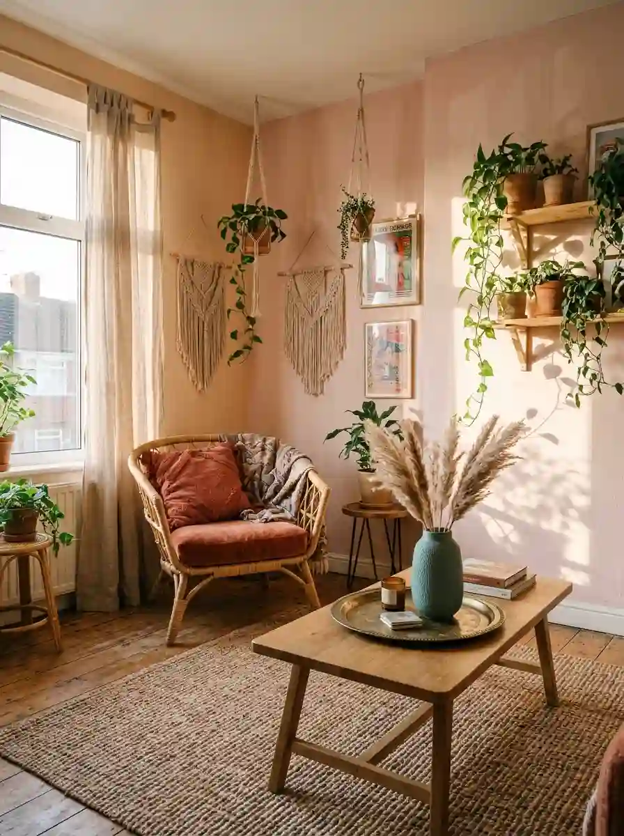
Art and accessories are where the personality arrives. They are also the cheapest way to make a pink and orange scheme feel considered.
Choose art that holds both colours. An abstract canvas in coral, peach and blush above the sofa is one of the simplest ways to tie the room together. Colour-field paintings, watercolour florals, retro posters and bold brush-stroke prints all work. A large single piece usually looks more modern than a lot of small ones.
Create a gallery wall. If you prefer a collected look, mix framed prints, photographs and small mirrors in a loose grid. Use a consistent frame colour, such as black, walnut or brass, so the mix of colours feels intentional.
Use vases and ceramics. Terracotta pots, blush ceramic vases, glossy orange bowls and hand-thrown pottery all repeat the palette in three dimensions. Group them in odd numbers, such as three vases of different heights on a console table.
Add fresh and dried flowers. Pink peonies, orange ranunculus, dahlias, marigolds, dried pampas grass and bunny-tail grass all suit this palette. Fresh flowers are the easiest seasonal update you can make.
Pick a statement mirror. A round brass mirror above a console or a sunburst mirror above the sofa reflects light and adds a metallic warmth.
Don’t forget books and candles. Stacks of books in coloured spines, candles in terracotta holders and a tray to corral small items make the coffee table look styled without feeling staged.
Lighting: Making Pink and Orange Glow
Lighting can make or break this scheme. The right bulbs make pink and orange feel like a warm hug, while the wrong ones make them look flat or garish.
Choose warm white bulbs. Look for a colour temperature of around 2700 to 3000 kelvin. Cooler, bluer bulbs wash out pink and make orange look harsh.
Layer your light. Use three types: ambient light from a ceiling fixture or pendant, task light from floor and table lamps, and accent light from small lamps, candles or picture lights. Multiple low sources make the room feel far cosier than a single overhead light.
Pick lamp shades carefully. Fabric shades in cream, blush or soft orange glow beautifully and throw a flattering light across walls. Opaque dark shades can feel heavy.
Add a dimmer. A dimmer switch lets you move from bright daytime lighting to a soft sunset glow in the evening, which suits this palette better than almost any other.
Think about statement fixtures. A sculptural pendant, a rattan shade or a globe light in brass adds a design moment overhead. A coloured glass lamp in amber or pink can become a focal point on its own.
Small Living Rooms and Renters: How to Get the Look Without the Commitment
You do not need a big room or a landlord’s permission to enjoy this palette.
For small living rooms
- Keep walls light. Pale blush, peach and cream make the room feel bigger. Add bold orange through accessories.
- Use one big colour moment. A single statement rug, sofa or piece of art creates more impact than lots of small colourful items.
- Choose furniture with visible legs. Raised furniture lets light and floor show through, which makes the room feel lighter.
- Use mirrors. A large mirror opposite a window doubles the light and the sense of space.
- Pick one or two patterns. In a small room, too much pattern becomes busy fast.
For renters
- Start with textiles. Cushions, throws, curtains and rugs are completely portable.
- Use removable wallpaper. Peel-and-stick options in pink and orange patterns can transform a feature wall and come off when you move.
- Lean art instead of hanging it. A large canvas leaning against the wall on a console looks relaxed and leaves no holes.
- Swap lampshades. A new shade in blush or peach changes the whole mood of a corner.
- Bring in plants and pots. Terracotta pots and flowers add orange and pink naturally.
- Add a throw over a neutral sofa. It is the fastest, cheapest colour injection there is.
The beauty of this approach is that you can test the palette for a month before you invest in anything permanent.
Common Mistakes to Avoid in a Pink and Orange Living Room
Most pink and orange rooms that disappoint fail for the same few reasons. Here is how to avoid them.
1. Giving both colours equal weight. When pink and orange each fill half the room, they compete. Choose one to lead and one to support.
2. Ignoring undertones. A cool, bluish pink next to a warm, yellow-leaning orange can look discordant. Choose shades that share warmth, or deliberately bridge them with a neutral.
3. Matching intensities badly. Pale pastel pink with neon orange feels off. Keep soft with soft and bold with bold.
4. Skipping neutrals. Without white, cream, wood or grey, there is nowhere for the eye to rest. Neutrals are what make colour feel intentional.
5. Forgetting texture. A room of flat, shiny, same-textured items can look cheap. Mix velvet, linen, wood, wool and metal.
6. Testing paint in the shop. Colours change completely in your own light. Always sample at home.
7. Using too many other colours. Pink, orange, a neutral and one accent is enough. Five or six colours become noise.
8. Matching everything perfectly. A room where every item is the exact same pink looks flat. Mix several shades of each colour for a richer result.
9. Overlooking the floor. If your flooring is a strong colour, such as orange-toned wood, choose a rug and walls that balance rather than compete with it.
10. Rushing. The best rooms are built slowly. Start with the big pieces, then layer in colour as you learn what you love.
How Much Does a Pink and Orange Living Room Cost?
Costs vary hugely by location and quality, but it helps to think in tiers.
Low budget (refresh). New cushions, a throw, a plant, a lampshade and one piece of art. This can transform a room for a modest outlay and takes an afternoon.
Medium budget (update). Paint, a new rug, curtains, a coffee table and several accessories. This changes the room’s whole character and usually takes a weekend or two.
Higher budget (full redesign). A new sofa, armchairs, custom curtains, wallpaper, lighting and art. This is a long-term investment, so choose classic shapes in versatile colours and let accessories carry the boldest shades.
A useful principle is to spend the most on things you use daily and that last longest, such as the sofa, and the least on trend-led accessories, such as cushions, which you can swap as your taste changes.
Also Read : Ivory Living Room Ideas: Warm, Elegant and Effortlessly Timeless
A Simple Step-by-Step Plan to Style Your Room
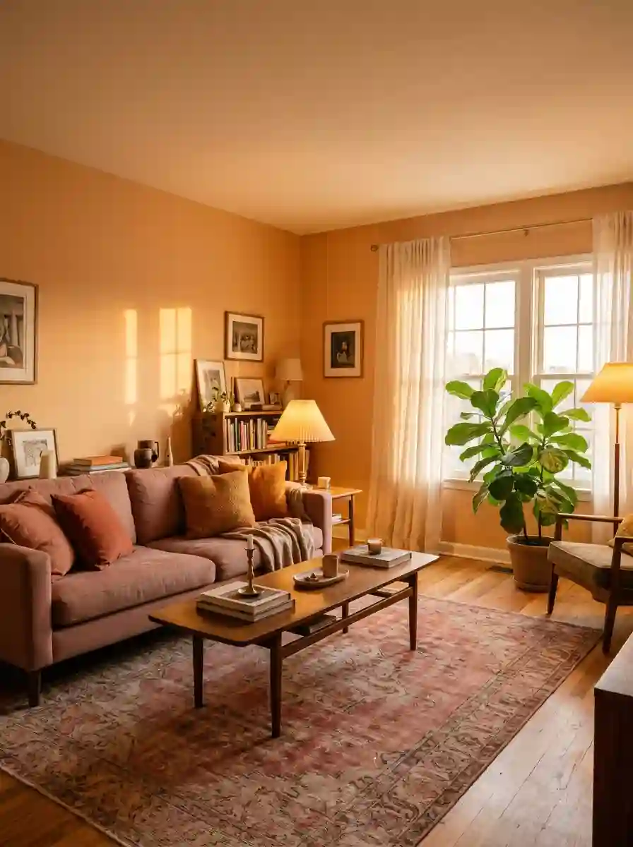
If all of this feels like a lot, follow this order.
- Observe your light. Notice the direction of your windows and how the room looks at different times.
- Choose your lead colour. Decide whether pink or orange will dominate.
- Pick your shade pair. Use the pairing table above and match intensities.
- Test paint samples. Paint large squares and live with them for two days.
- Choose your big pieces. Sofa, rug and curtains come first.
- Add supporting colours. Pick one neutral and one accent, such as green or teal.
- Layer textiles. Add cushions and throws using the three-colour rule.
- Add art and objects. Repeat each colour at least three times.
- Sort the lighting. Use warm bulbs and at least three sources.
- Edit. Step back, remove anything that feels like too much, and enjoy the room.
Final Thoughts
A pink and orange living room is not a risky experiment once you understand how the two colours behave. Choose shades that share warmth and intensity. Let one colour lead and the other support. Respect your light. Use neutrals, wood and green plants as peacekeepers. Repeat each colour in at least three places. And remember that a room only has to feel like yours.
Start small if you are unsure, with a cushion, a throw or a rug, and see how the colours make you feel. Or go all in with a terracotta wall and a blush sofa. Either way, you are building a room that feels like a sunset you can sit in, and that is a pretty lovely thing to come home to.
Frequently Asked Questions
1. Do pink and orange really go together in a living room?
Yes, they do. They sit close together on the colour wheel, so they share warmth and feel related. The key is to match intensity, with soft shades paired with soft and bold with bold, and to let one colour lead while the other supports.
2. What is the best shade combination for a beginner?
Blush pink with terracotta is the easiest and most forgiving pairing. The pink is gentle, the terracotta is earthy and nearly neutral, and together they feel warm and grown-up. Add cream and natural wood to finish.
3. Which colour should I use on the walls?
A soft blush or peach is the safest wall colour, with orange added through furniture and accessories. If you love colour and have good light, terracotta walls are a stylish alternative. For smaller rooms, keep the walls pale.
4. What neutral colours work best with pink and orange?
White, cream, warm grey and greige are the most reliable. Natural wood, rattan and jute also act as neutrals and add warmth and texture.
5. How do I stop a pink and orange living room looking childish?
Choose deeper, dustier shades such as dusty rose, terracotta and burnt orange rather than bubblegum and neon. Add grown-up materials like wood, brass, linen and velvet, and keep patterns refined. Balance with neutrals and plenty of texture.
6. Can I use pink and orange in a small living room?
Absolutely. Use pale walls, one or two statement pieces and plenty of light. Mirrors and furniture with visible legs help the room feel larger. A single bold rug or sofa makes more impact than many small items.
7. What is the 60-30-10 rule?
It is a guideline for balancing colour. Around 60 percent of the room is your dominant colour, 30 percent is a secondary colour and 10 percent is an accent. In a pink and orange room, one colour usually leads while the other appears as the supporting or accent shade.
8. What lighting is best for this colour scheme?
Warm white bulbs of around 2700 to 3000 kelvin flatter both colours. Use layered lighting from lamps, pendants and candles, and add a dimmer for evening. Cold white bulbs can make the colours look harsh





2 Comments on “Pink and Orange Living Room: 25+ Bold Ideas, Palettes and Styling Tips That Actually Work”