

There’s a moment most of us have had. You walk into a room that’s perfectly fine, with a gray sofa, white walls and a beige rug, and you feel absolutely nothing. Nothing is wrong with it. Nothing is right with it either. It looks like a showroom, and you live there.
That’s usually the moment people start searching for colorful home decor.
Color is the quickest way to put a personality back into a space. A mustard cushion, a cobalt vase or a bright rug can change how a room feels in a single afternoon. The trouble is that most people hesitate. We worry about clashing, about regretting a bold wall, about the room looking like a kindergarten classroom. So we buy another gray throw and tell ourselves we’ll be braver next year.
This guide is here to make you braver this year. You’ll learn how color actually works in a home, how to pick a palette you won’t get sick of, and how to use the famous 60-30-10 rule (and when to ignore it). Then we’ll go room by room, from the living room to the bathroom, and finish with budget ideas, renter-friendly tricks, the mistakes to avoid and ten frequently asked questions.
No design degree required. Just a willingness to let your home look like the person who lives in it.
Also Read : Traditional Home Decor Ideas: The Ultimate Guide to Timeless, Character Filled Rooms
Why Colorful Home Decor Is Having a Moment
For over a decade, the safe choice was neutral. White walls, gray floors, a few wooden accents. It photographed well, it suited every buyer and it never offended anyone. It also made a lot of homes feel interchangeable.
Now the pendulum is swinging back. People are spending more time at home, and they want that home to feel good, not just look tidy. Designers talk about “dopamine decor,” which is a playful way of saying that surrounding yourself with things you love makes you happier. Maximalism, grandmillennial style and eclectic mixing have all pushed color back into the conversation. Even people who describe themselves as minimalists are adding one bold chair or one loud piece of art.
There’s a practical side too. Social media has trained us to notice rooms that feel distinctive. A space with a point of view is memorable, and it’s far easier to love a room that tells your story than one that tells nobody’s.
And here’s the good news. You don’t need to repaint your whole house to join in. Colorful home decor is mostly about small, movable, affordable pieces: textiles, art, ceramics, lamps. You can start tiny and grow as your confidence does.
How Color Affects the Way a Room Feels
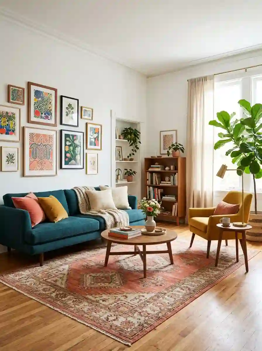
Before we pick palettes, it helps to understand what color actually does to a space. A quick caveat first: color psychology is real but not magic. Research on how colors affect mood is mixed, and our reactions are shaped by culture, memory and personal taste. Red might feel energizing to one person and stressful to another. Treat the guidelines below as a starting point, not a rulebook.
With that said, designers lean on some fairly consistent associations.
Warm colors: red, orange and yellow
Warm colors tend to feel social, cozy and energetic. They make large rooms feel more intimate and they suit spaces where people gather, like dining rooms, kitchens and living rooms. Yellow in particular reads as cheerful, though a very saturated yellow can feel loud over big areas. Terracotta, rust and saffron are warm shades that feel grounded rather than shouty.
Cool colors: blue, green and purple
Cool colors usually feel calm and spacious. Blue is the classic choice for bedrooms and bathrooms. Green sits in the middle, which is why it’s so popular: it connects to nature, works with both warm and cool palettes and feels restful without being sleepy. Purple depends heavily on shade. Lavender and lilac read soft and dreamy, while plum and aubergine feel rich and dramatic.
Pink, and the myth that it’s just for kids
Pink has been quietly rehabilitated. Dusty rose, blush and coral work as near-neutrals, while hot pink and magenta are serious statement colors. Pair pink with deep green, navy or charcoal and it instantly grows up.
Neutrals are still your best friend
Here’s something that surprises people: a colorful home isn’t a home without neutrals. White, cream, warm gray, wood tones and black give your eye somewhere to rest. Think of neutrals as the plain rice that lets a spicy curry shine. Without them, every color fights for attention.
Saturation matters more than hue
This is the big secret. A room doesn’t feel loud because it contains blue. It feels loud because the blue is extremely saturated and there’s a lot of it. A muted sage and a vivid emerald are both “green,” but they behave nothing alike. If bright color makes you nervous, try deepening or softening the shade before you give up on the hue entirely.
Before You Buy Anything: Find Your Color Story
The biggest reason colorful rooms go wrong is buying pieces one at a time with no plan. You fall in love with a pink vase, then a green throw, then an orange print, and suddenly nothing relates. A little groundwork prevents this.
Step 1: Notice what you already love
Look at your wardrobe, your favorite mug, the photos you save, the postcards on your fridge. Most people have a color pattern they’ve never named. If your closet is full of forest green and mustard, you already know your palette. Your home should feel like an extension of what you naturally gravitate toward, not a copy of a trend.
Try this: open your phone’s photo gallery or a Pinterest board and screenshot ten rooms you love. Look for repeats. Are they warm or cool? Pale or deep? Patterned or plain? The repeats are your style, and they’re far more reliable than a trend report.
Step 2: Check your light
Light changes color dramatically. A north-facing room gets cooler, flatter light, so blues can feel chilly and grays can look dull. A south-facing room gets warmer, brighter light that makes almost anything look good. Artificial lighting matters too: warm bulbs push colors toward yellow, cool bulbs push them toward blue.
Before committing to a paint color or a large piece, look at a sample in the actual room at morning, midday and evening. Colors you adore in a shop can look totally different at home.
Step 3: Pick one hero color
Choose the color you want to notice first when you walk in. Everything else supports it. It might be a rich teal, a warm terracotta or a cheerful yellow. Having one hero stops a colorful room from becoming a confusing one.
Step 4: Add two supporting colors and a neutral
Two supporting shades, plus a neutral base, is the sweet spot for most homes. If your hero is teal, supporting colors might be mustard and blush, with warm white and natural wood as the neutral. That’s already a rich, layered scheme, and it’s easy to maintain.
Step 5: Look for a thread
The easiest way to link different colors is a thread, meaning one shared quality. It could be the same undertone (all warm, all cool), the same level of saturation (all muted, all jewel-toned) or a repeated color showing up in small doses across the room. A rug that contains your hero color, your supporting color and your neutral is a gift. It does the linking for you.
Must Read : Gallery Wall Layout Ideas: The Ultimate Guide to a Wall People Actually Stop and Look At
The 60-30-10 Rule (and How to Break It)
If you’ve researched color at all, you’ve met the 60-30-10 rule. It’s one of the most common formulas designers use to keep a room balanced, and it’s genuinely useful when you’re starting out.
Here’s how it works:
- 60% of the room is your dominant color. This is usually your walls, big rug and largest furniture.
- 30% is a secondary color that supports the first. Think curtains, an accent chair or bedding.
- 10% is your accent color, often the brightest or boldest. Cushions, art, vases and small accessories carry it.
The point is proportion. Because the boldest color only covers a small slice, it pops without overwhelming. A living room that’s 60% warm white, 30% deep teal and 10% mustard will feel balanced and lively all at once.
A colorful twist on the formula
Here’s where the rule gets interesting for colorful home decor. The dominant 60% doesn’t have to be neutral. If you love color, try making your 60% a soft, muted tone like sage, dusty blue or warm terracotta, then bring in a stronger 30% and a punchy 10%. You still get balance, but the whole room feels more saturated.
When to break it
The rule is a guide, not a law. Designers who love it will tell you it’s a starting point. Real rooms are full of books, art, plants and objects that don’t follow percentages. You can use a color family instead of one single shade. You can have more than one accent. You can go full maximalist and layer six colors, as long as something ties them together, like a shared undertone or a repeated shade.
A good test: squint at the room. If your eye jumps around chaotically, you’ve got too many equal-weight colors competing. If your eye moves smoothly with a couple of places to land, you’re fine, rule or no rule.
Colorful Color Combinations That Actually Work
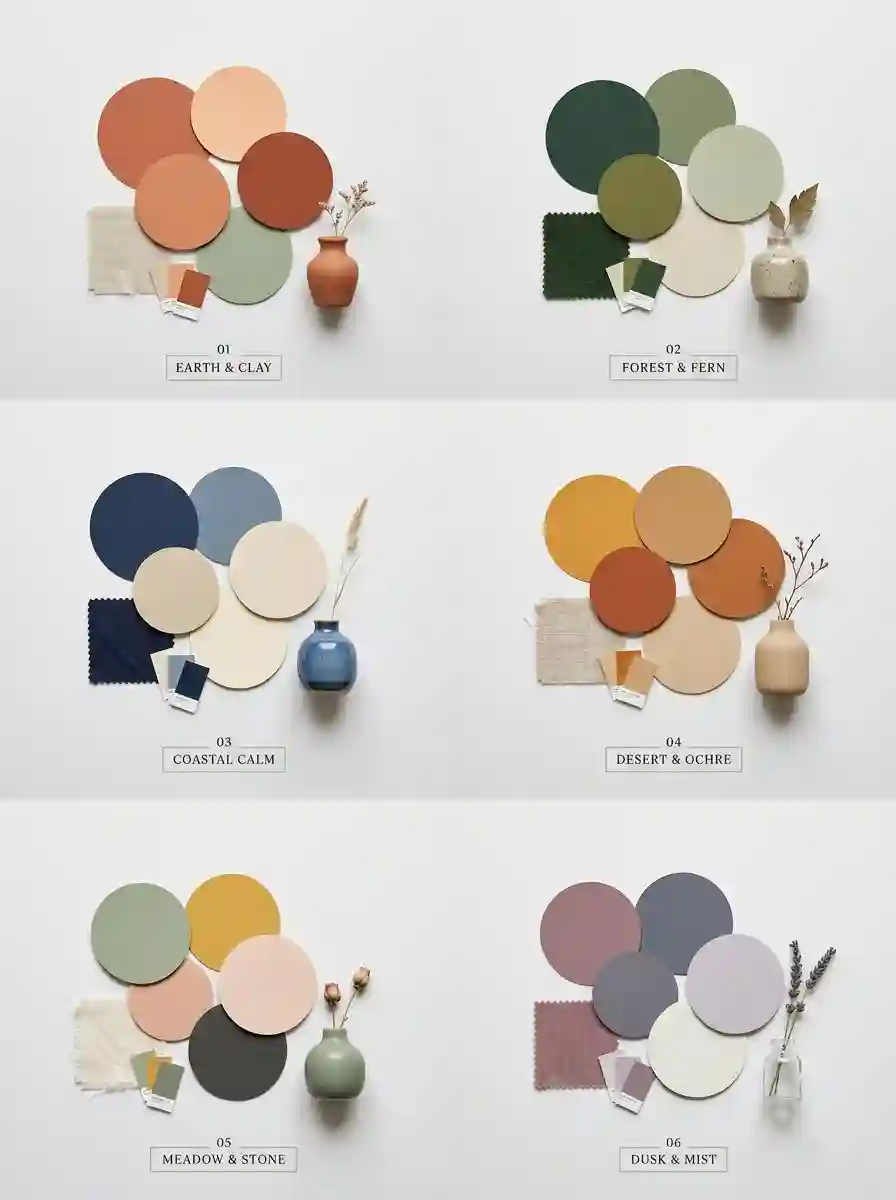
Sometimes you just want someone to hand you a palette. These six combinations work reliably in homes, and each one suits a different mood.
1. Teal, mustard and blush. Rich, warm and a little retro. Great for living rooms and reading corners. Add brass or wood for warmth.
2. Terracotta, olive green and cream. Earthy and grounded, with a Mediterranean feel. This is a gentle way into color for people who usually prefer neutrals.
3. Navy, coral and white. Crisp and fresh. Navy anchors the scheme, coral adds energy and white keeps it airy. A solid choice for kitchens and bedrooms.
4. Emerald, hot pink and gold. Bold and glamorous. This one wants confidence. Use it in a dining room, powder room or on a statement wall.
5. Sage, lavender and warm gray. Soft and calming. This is colorful in a quiet way, ideal for bedrooms and bathrooms.
6. Cobalt, sunshine yellow and natural wood. Playful and bright, a little Scandinavian-meets-Mediterranean. Fantastic for kitchens, kids’ rooms and home offices.
The color schemes behind the palettes
If you want to build your own, it helps to know the basic schemes from the color wheel:
- Complementary: colors opposite each other, such as blue and orange. High energy and high contrast.
- Analogous: neighbors on the wheel, like blue, teal and green. Harmonious and easy on the eye.
- Triadic: three evenly spaced colors, like red, yellow and blue. Playful, but easiest when one color dominates and the others are muted.
- Monochromatic plus a pop: many shades of one color with a single contrasting accent. Elegant and surprisingly bold.
Colorful Home Decor, Room by Room
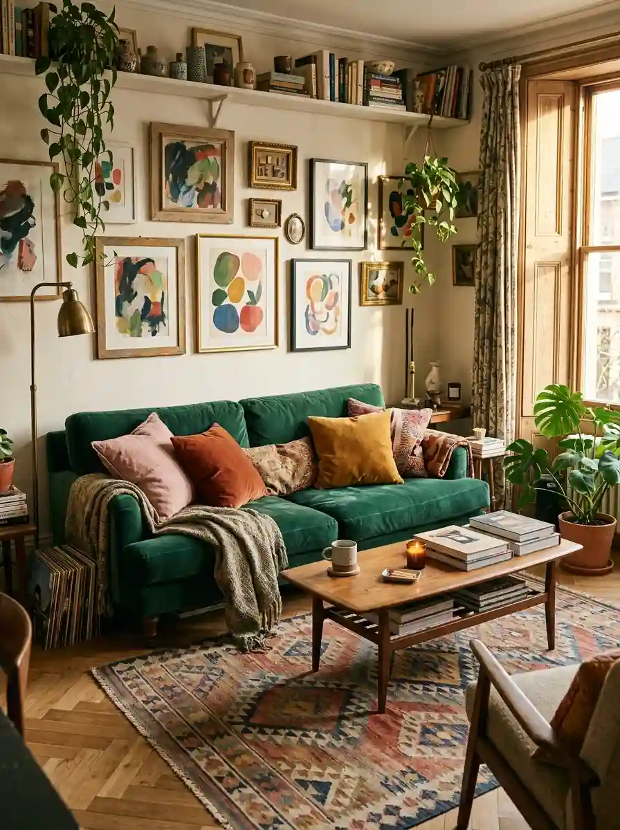
Now for the fun part. Color behaves differently in each room because each room has a different job. Here’s how to approach every space.
The living room: your color showcase
The living room is where most people start, and for good reason. It’s the room guests see, and it can handle the most variety.
Start with the sofa or the rug. If you want one big colorful anchor, a jewel-toned sofa in teal, emerald or deep pink is a showstopper. If a colorful sofa feels too permanent, keep it neutral and put the color in a patterned rug instead.
Layer your cushions. Pillows are the cheapest, fastest way to test a palette. Mix three or four sizes, vary the textures (velvet, linen, woven) and repeat each color at least twice across the room so it feels intentional.
Try a gallery wall. A wall of mixed frames in a controlled palette adds color at eye level. Choose art that shares at least one color so the collection feels related.
Add a statement chair. A single bold accent chair in mustard, rust or cobalt gives the room a focal point without much commitment.
Bring in plants. Greenery is a color, too. Big leafy plants add life and soften saturated shades.
The kitchen and dining area: color you can eat in
Kitchens love color, because they’re already full of it. Think of produce, ceramics, glassware and cookware.
Paint or swap the cabinets. If you’re ready for a bigger move, sage, navy, butter yellow or deep green cabinets feel fresh and modern. If not, change only the hardware, since colorful knobs and pulls are a small change with a big payoff.
Use colorful tableware as decor. Stoneware canisters, bright bowls, patterned plates on open shelves and colored glassware all do double duty. They’re beautiful and useful.
Show off cookware. A cast-iron pot in cherry red or cobalt looks wonderful sitting on the stove.
Set a vivid table. Mix and match napkins, placemats and candles in two or three shades. A bright tablecloth transforms a plain dining table instantly.
Don’t forget the dining room’s mood. Warm colors like terracotta, burgundy and saffron are traditionally associated with appetite and conversation, which makes them popular for dining rooms.
The bedroom: color that lets you rest
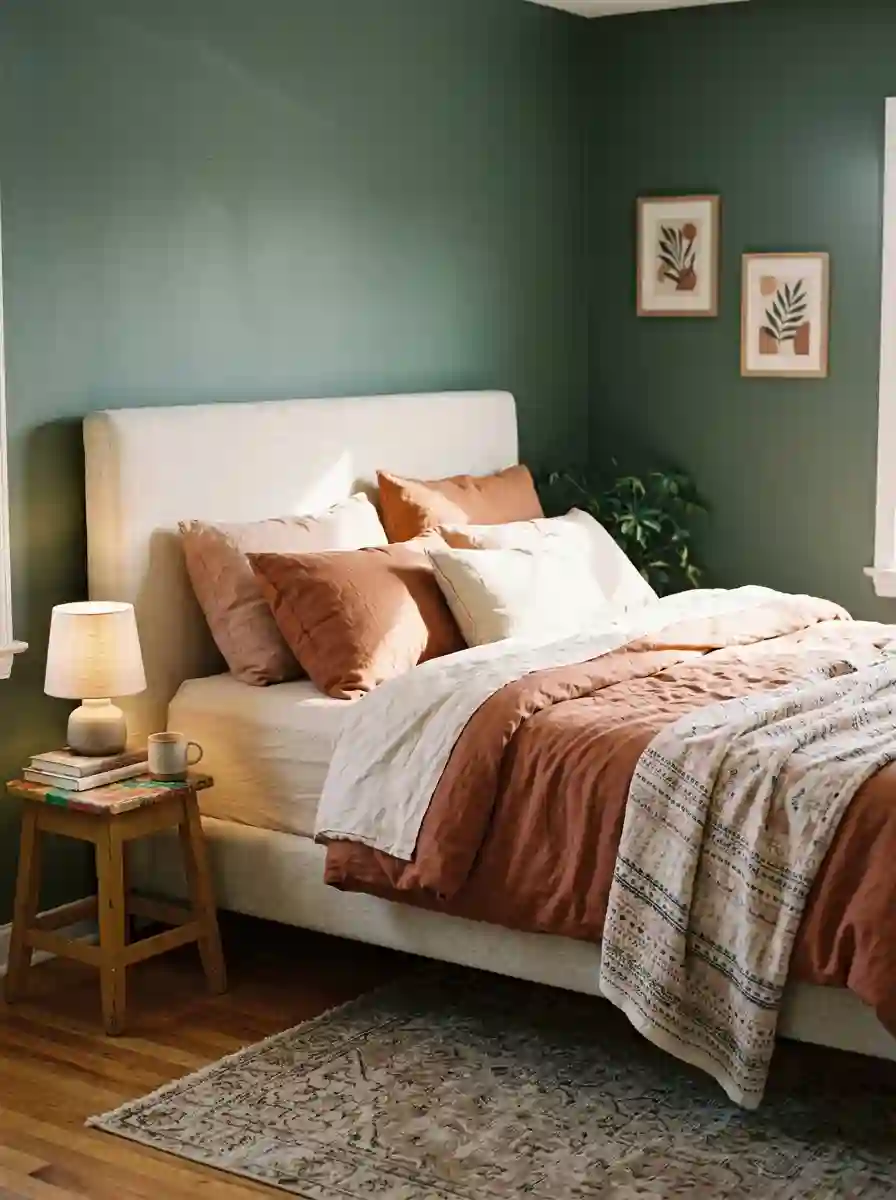
Bedrooms are where you want color to calm you down rather than wind you up. That doesn’t mean boring, though.
Go for softer saturation. Sage, dusty blue, soft lavender, warm terracotta and muted pink all feel restful but still colorful.
Layer color through bedding. Bedding is the easiest way to change a bedroom’s whole feel. A patterned quilt, a coordinated throw and a few contrast pillows deliver a lot of impact.
Paint the wall behind the bed. A deep green, navy or plum headboard wall gives the room a focal point and a cozy, cocoon-like feel.
Keep the brightest colors small. Save neon and high-saturation shades for a lamp, a print or a small stool where they add cheer without keeping you awake.
The bathroom: small space, big personality
Bathrooms are the perfect place to experiment, because they’re small, you spend short bursts of time in them and a bold choice costs little.
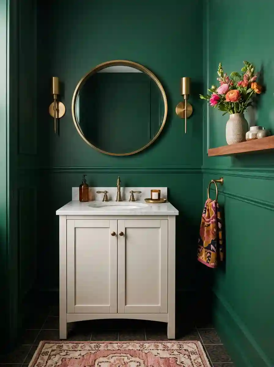
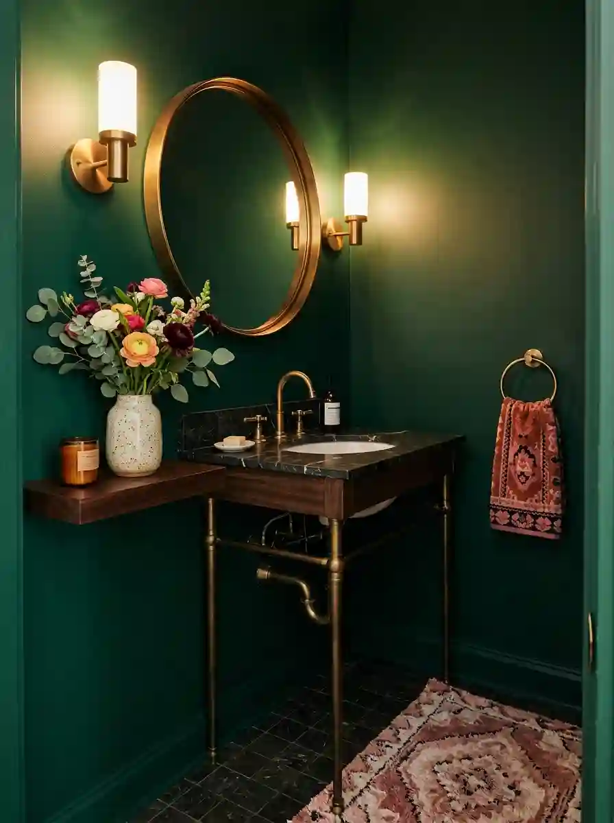
Be brave with the walls. A powder room is the one place where nearly every designer says to go dramatic. Deep green, inky blue, cheerful tangerine or a vivid wallpaper all work wonderfully.
Swap the small things. A colorful shower curtain, a patterned bath mat, bright towels and a bold soap dispenser give you a full refresh without any renovation.
Play with tile. If you’re updating, colored tile such as green zellige, pink subway or checkerboard patterns bring serious personality.
Mind the moisture. Choose washable, quick-drying textiles and moisture-friendly plants like ferns or pothos.
Read Must : 51 Genius Home Office Organization Ideas That Will Instantly Transform Your Workday
The entryway and hallway: a first impression in color
Hallways are often forgotten, which makes them a great opportunity. A colorful runner, a painted console table, a bold mirror or a gallery of small framed prints greets everyone who comes in. Because you only pass through, you can use a stronger shade here than you might feel comfortable with in a living room. A bright front door or a saturated entry wall sets the tone for the rest of the house.
The home office: color that keeps you alert
Yellow, green, and bright blue are popular in workspaces because they tend to feel fresh and energizing. You don’t need much. A colorful bookshelf arrangement, a bold desk lamp, a framed print and a bright chair make a room feel inspiring rather than corporate. Keep the area directly behind your screen calm so your video calls don’t look chaotic.
The kids’ room: playful without a theme
Children love color, but you don’t need cartoon characters on every surface. Choose a flexible base, like soft white or pale blue, and let color arrive through rugs, bedding, art and storage baskets. These are easy to swap as your child’s tastes change, and your wallet will thank you. Let kids pick one or two favorite colors for their own accents so the room genuinely feels like theirs.
Colorful Decor Pieces That Do the Heavy Lifting
You don’t need to buy everything. A handful of well-chosen pieces carry most of the visual weight. Here are the categories worth investing in, and how to use each.
Textiles: the easiest win
Cushions, throws, curtains and bedding are the most forgiving way to add color. They’re inexpensive, easy to wash, easy to store and easy to change with the seasons. Mix solids with patterns, repeat each color at least twice and vary the textures. A velvet cushion beside a woven one looks richer than two matching ones.
Rugs: your largest canvas
A colorful rug can anchor an entire room. Choose one with several colors in it so you can pull accent shades out into your cushions, art and lamps. Vintage and flat-weave rugs are especially forgiving because their colors are often softened and layered, so they tend to blend with other items instead of fighting them.
Art and wall decor: color at eye level
Art is the most personal color choice you can make. A single large abstract canvas can set the tone for an entire room, while a gallery wall lets you collect colors from many sources. Don’t forget textiles on the wall, such as tapestries, woven hangings or framed fabric, which add both color and texture.
Lighting: color that glows
Lamps and shades can be decorative focal points in their own right. A colored glass lamp, a painted ceramic base or a bright pendant adds color even when the light is off. Smaller details, such as colorful switch plates and cabinet hardware, quietly tie a scheme together.
Ceramics, glassware and tabletop pieces
Vases, bowls, candle holders and colored glassware are low-risk ways to add small hits of color. Livingetc’s advice here is worth borrowing: if you want colorful pieces to feel stylish rather than childish, stick to solid blocks of color instead of busy patterns. A cluster of three vases in different heights and related colors can look incredibly polished.
Furniture: for the committed
A colorful sofa, sideboard, bookcase or chair is a bigger investment, but it makes the biggest statement. If you’re nervous, begin with something small and movable, like an accent chair, a painted side table or a bright stool. You can also give an old piece of furniture new life with a coat of paint, which is cheap and completely reversible.
Plants and flowers: living color
Plants add green, but flowers add every shade imaginable. A bunch of seasonal blooms on the table can change the entire palette of a room for the week. Don’t worry about fancy arrangements. A simple jar of tulips or marigolds does the job.
How to Mix Pattern and Texture Without Chaos
Color rarely arrives alone. It usually comes with pattern, and that’s where many people lose their nerve. The good news is that mixing patterns is a skill with a few simple rules.
Vary the scale. Combine one large-scale pattern, one medium and one small. If everything is the same size, it fights. If they differ, they layer.
Share a color. Patterns that contain at least one common shade look related even when they’re totally different. Stripes, florals and geometrics can sit side by side if they all include, say, a touch of teal.
Add a solid. Every pattern-heavy room needs a few plain surfaces to let the eye breathe. A solid sofa, a plain wall or a simple lamp gives the busier pieces room to shine.
Lean on texture. When you want richness but less visual noise, texture is your secret weapon. Chunky knits, linen, velvet, rattan, wood and ceramic add depth without extra color.
Pull from global traditions. Ikat, kilim, block print, suzani, batik and folk embroidery are full of color combinations that have been tested over centuries. They’re a wonderful source of palettes that already know how to work together.
Colorful Home Decor on a Budget (and for Renters)

Here’s the truth: you don’t need a big budget or a landlord’s permission to live in a colorful home. Some of the most effective changes cost very little and come off easily.
Start with the cheap and movable
- Cushion covers. Buy covers, not whole cushions. They’re cheaper and store flat.
- Throws and blankets. Drape one over a chair or the foot of the bed.
- Thrifted ceramics. Charity shops and flea markets are full of colorful vases, bowls and plates for a few dollars each.
- Fresh flowers or cut branches. Instant color that costs almost nothing.
- Books with colorful spines. Arrange them by color for a rainbow shelf, or turn them backwards for a neutral look.
Renter-friendly ideas
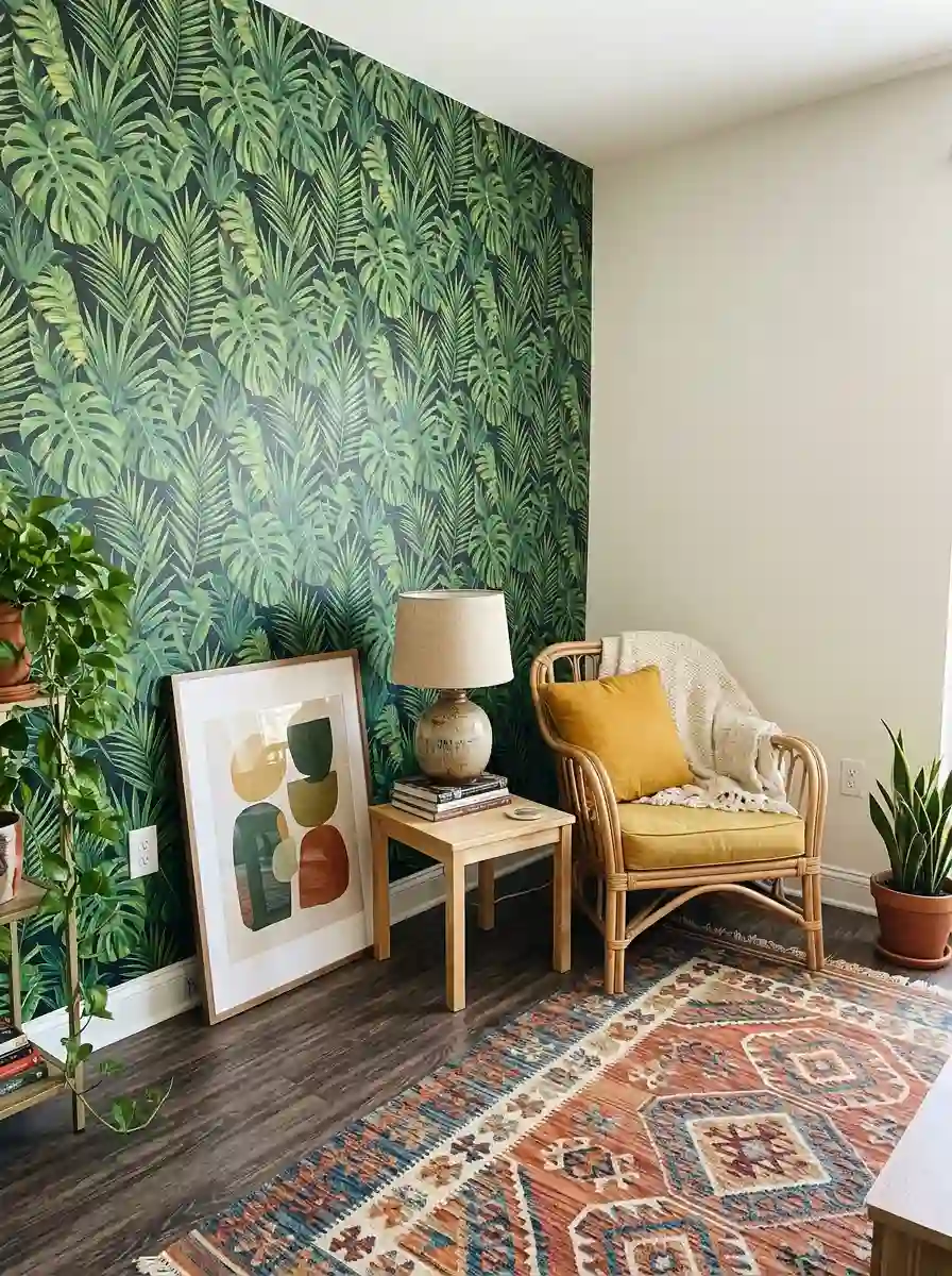
- Peel-and-stick wallpaper. Great for a feature wall, the back of a bookshelf or inside a cabinet. Test a small area first and follow the manufacturer’s instructions for removal.
- Removable wall hooks and strips. Hang art and lightweight pieces without drilling.
- Leaning art. Lean large prints on shelves, dressers and floors instead of hanging them.
- Rugs. A bold rug can hide a boring floor and change the whole feel of a rented room.
- Curtains. Colorful or patterned curtains add color at the window and are easy to take with you when you move.
- Lamps and shades. Swap plain shades for colored or patterned ones, or add a colorful lamp to a corner.
- Peel-and-stick tile stickers. Useful for bathrooms and kitchen backsplashes. Check how they’re meant to be removed before buying.
Read Also : Mid Century Decor: A Style That Refuses to Go Out of Fashion
Paint without regret
If you’re allowed to paint, test sample pots on the actual wall and look at them in different light for a few days. Choose a color you’d be happy to live with for years. If you’re a renter who’s allowed to paint but must return the walls to white later, paint a single wall or a piece of furniture instead of the whole room to keep the repainting job small.
Spend where it counts
Save money on trendy accessories, which you’ll swap often, and spend on pieces you’ll keep, such as a rug, sofa or quality art. A good rule is to buy the big items in versatile shades and let the small, cheap pieces carry the trends.
Colorful Home Decor Styles to Borrow From
Color looks different depending on the style it lives in. These are the main approaches, so you can find the one that matches your taste.
Maximalist. More is more. Layered patterns, saturated walls, collected art and plenty of objects. It works best when there’s a thread, like a shared undertone, holding everything together.
Bohemian. Earthy and global, with rugs, textiles, plants and warm colors like rust, mustard and deep teal. Relaxed and collected over time.
Eclectic. A mix of eras and influences. A vintage chair beside a modern sofa, a folk textile next to a contemporary print. Color is the glue.
Scandinavian with a pop. A calm neutral base with wood tones, plus one or two vivid accents like a red chair or a yellow lamp. Perfect if you love minimalism but crave a little life.
Mid-century modern. Clean lines paired with mustard, teal, burnt orange and olive. Retro, optimistic and surprisingly timeless.
Grandmillennial. Traditional patterns such as florals, chintz, skirted tables and scalloped edges, updated with bright colors and a sense of humor.
Coastal and Mediterranean. Blues, whites, terracotta and sunny yellow, with natural materials and glazed ceramics. Fresh and airy.
You don’t have to pick one and stick to it forever. Most real homes borrow from several. The goal is a space that feels like you, not a style label.
Common Colorful Decor Mistakes (and Easy Fixes)
Everyone makes a few of these. Here’s how to spot them and fix them.
Mistake 1: Matching everything. A room where every color matches perfectly can feel flat and staged. Aim for related rather than identical. A teal vase doesn’t need a teal cushion directly beside it.
Mistake 2: Too many equal colors. When five colors take up the same amount of space, nothing is the star. Choose a hero color and let others play supporting roles.
Mistake 3: Ignoring undertones. A warm yellow-based green and a cool blue-based green can clash even though both are green. Hold paint chips, fabrics and decor up together in daylight before buying.
Mistake 4: Skipping neutrals. Without calm areas, a colorful room is exhausting. Leave breathing room with white, cream, wood or soft gray.
Mistake 5: Painting every wall the same bold shade. A single dramatic wall, or a bold ceiling, usually has more impact than four saturated walls.
Mistake 6: Forgetting about light. Colors shift between morning and evening and between natural and artificial light. Always test in your actual space.
Mistake 7: Buying a whole trend at once. Trends fade. Buy a few trend pieces in small, affordable formats and invest in colors you’ve loved for years.
Mistake 8: Not repeating colors. A color that appears only once looks accidental. Repeat each shade at least twice in different spots, like a cushion, a print and a vase.
Mistake 9: Overcrowding. Colorful doesn’t have to mean cluttered. Give every piece a little space to be noticed.
The fix for almost all of these: step back, squint and remove one or two things. Editing is half of good decorating.
How to Keep Your Colorful Home Looking Good Over Time
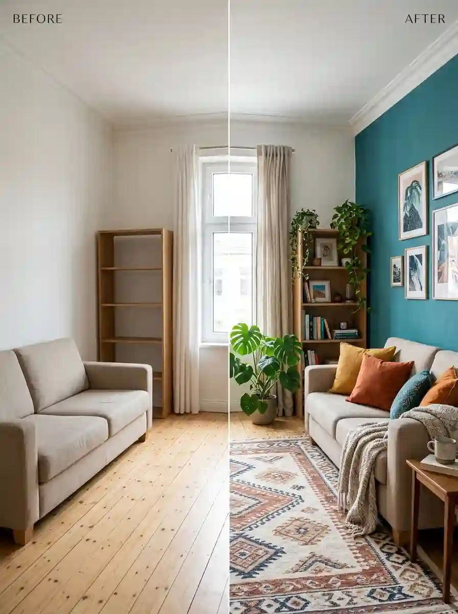
A colorful home isn’t a one-time project. It’s something you can adjust as your taste and your life change.
Keep your big pieces flexible. Choose versatile shades for your sofa, rug and curtains, then let accessories carry the boldest colors. That way, a refresh means swapping a few things instead of starting over.
Rotate with the seasons. Lighter, brighter textiles in spring and summer, deeper richer shades in autumn and winter. Store what you’re not using so each rotation feels fresh.
Edit every few months. Stand in the doorway and ask what you actually love. Move, donate or store what you don’t.
Buy what you love, not what’s trending. The pieces that last are the ones you genuinely adore. If you keep returning to a color, it will probably still feel right in five years.
Keep things clean. Bright textiles show dirt and sun fade. Wash covers regularly and rotate cushions, rugs and curtains so sun exposure is even.
Read Also : 45 Genius Apartment Wall Decor Ideas That Instantly Make Rented Rooms Feel Like Home
Final Thoughts: Make Your Home Feel Like You
Colorful home decor isn’t about following rules perfectly or copying a showroom. It’s about making your home a place that lifts your mood the moment you walk in. Start small, pay attention to what makes you smile, and let your confidence grow one cushion, one lamp and one painted wall at a time.
Here’s a simple plan for this weekend. Pick one room. Choose a hero color and two supporting shades. Add three colorful pieces, such as cushions, a print and a vase. Live with it for a week. If it feels good, add more. If something feels off, remove it. That’s all it takes.
Your home doesn’t have to match anyone else’s. It just has to feel like yours.
Frequently Asked Questions
1. What is colorful home decor?
Colorful home decor means using bold, bright or varied colors in your furnishings, accessories, walls and textiles instead of relying on neutrals. It can be as small as a few colorful cushions or as full-on as saturated walls, patterned rugs and a maximalist mix of art and objects.
2. How do I start decorating with color if I’m nervous?
Start with small, easy-to-change pieces like cushions, throws, vases and art prints. Choose one color you love, repeat it in two or three spots and see how it feels. Once you’re comfortable, move on to larger items like rugs, curtains or a painted accent wall.
3. What is the 60-30-10 rule in decorating?
It’s a guideline for balancing color in a room. About 60% of the room is a dominant color, about 30% is a secondary color and about 10% is a bold accent. It’s a helpful starting point, but not a strict law. Many designers adjust or break it to suit the room.
4. How many colors should I use in one room?
Most rooms feel balanced with three to five colors including neutrals. You can use more if they share a common undertone or if some appear only in small amounts, like in art or a patterned rug. The key is to have one clear hero color so the eye knows where to look first.
5. How do I make colorful decor look stylish, not childish?
Choose deeper, more sophisticated shades, pick solid blocks of color over busy cartoonish patterns, and mix in natural materials like wood, linen, rattan and metal. Keep a few calm neutral areas, and pay attention to quality and proportion rather than quantity
6. Which colors work best in a living room?
It depends on the mood you want. Warm tones like terracotta, mustard and rust feel welcoming and social. Greens and blues feel calm and fresh. Deep jewel tones like emerald, teal and plum feel rich and dramatic. A neutral base with two or three colorful accents works in almost every living room.
7. Can I use colorful decor in a small room?
Yes. Color doesn’t make a small room feel smaller as long as you use it thoughtfully. Light and mid-tone colors can make a room feel airy, while a deep dramatic color can make it feel cozy and intentional. Use fewer, larger pieces rather than lots of tiny items to avoid clutter.
8. How can renters add color without painting?
Renters can use peel-and-stick wallpaper, bold rugs, colorful curtains, throws, cushions, leaning art, lamps with colorful shades and removable wall hooks. Always check your lease and test any adhesive product in a small hidden area first.
9. What colors go well together in home decor?
Reliable combinations include teal with mustard and blush, terracotta with olive and cream, navy with coral and white, sage with lavender and warm gray, and cobalt with yellow and natural wood. When in doubt, choose colors that share the same undertone, and add a neutral.
10. How do I stop colorful decor from feeling messy?
Pick a hero color, repeat your colors in at least two places, leave some plain areas for your eye to rest, and group small items on trays or shelves instead of scattering them. When a room starts to feel busy, remove a few pieces. Editing usually fixes it faster than adding more.





One comment on “Colorful Home Decor: 25 Ideas, Palettes and Room-by-Room Tips to Make Your Home Feel Alive”